Something 'magical' is coming soon! (teaser)
'19' is a magical number:
The 1st letter of the alphabet is 'A'
The 9th letter of the alphabet is 'I'
Introducing: WYSIWYG Web Builder AI !
Improve your online presence easily with the help of WYSIWYG Web Builder's AI-powered tools. Make your website content better, reach a global audience by translating it, create eye-catching visuals to impress your visitors, and generate custom code for your web projects with ease. WYSIWYG Web Builder AI combines all these important features in one place, giving you a complete platform to take your web design projects to new levels.
The AI tools in WYSIWYG Web Builder are implemented using the OpenAI API (Chat GPT, DALL·E).
You will need an OpenAI API key in order to use this functionality.
AI is just one of the more than 125 new features and improvement we have planned for version 19.
This topic will undergo frequent updates to unveil exciting new features. Be sure to check back regularly so you don't miss out on anything.
This image was generated with AI.
Note:
WYSIWYG Web Builder 19 is planned for later this year.
The exact release date is unknown at this time. But we tell you more as soon as we know it!
*** Special Offer ***
If you buy version 18 today you will get version the next version for free when it becomes available!
This offer is also valid for all licenses purchased within 60 days before the official release date (as usual).
https://www.wysiwygwebbuilder.com/purchase.html
Other registered users of WYSIWYG Web Builder will get a 50% discount when upgrading to the new version in the first few weeks after the release.
Stay tuned for more information!
Generating Text with AI
Note: You will need an OpenAI API key in order to use this functionality.
Text Generation and Enhancement: Create text, headings, articles, and more by entering custom prompts or choosing predefined ones. You have the flexibility to modify text length, tone, grammar, and overall style to suit your needs.
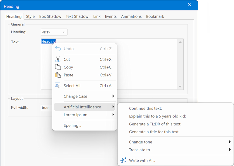
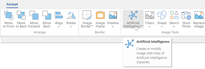
For standard text, you can use the Artificial Intelligence button on the Ribbon to open the "Generate Text with AI" dialog. However, this functionality is available for almost all text input fields within WYSIWYG Web Builder via the context menu!
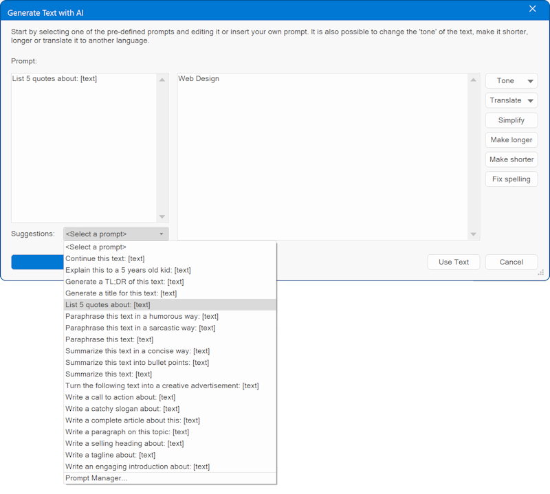
In the dialog, you can enter a custom prompt or choose one of the pre-defined prompts from the Suggestions drop down list. After inputting your prompt, simply click the 'Generate' button.
Once you're satisfied with the generated text, you can click the 'Use Text' button to save it. However, you also have the flexibility to enhance or refine the text further. This includes the ability to adjust its length, modify the tone (casual, professional, confident, friendly), streamline it for clarity, improve grammar, or even translate it into a different language!
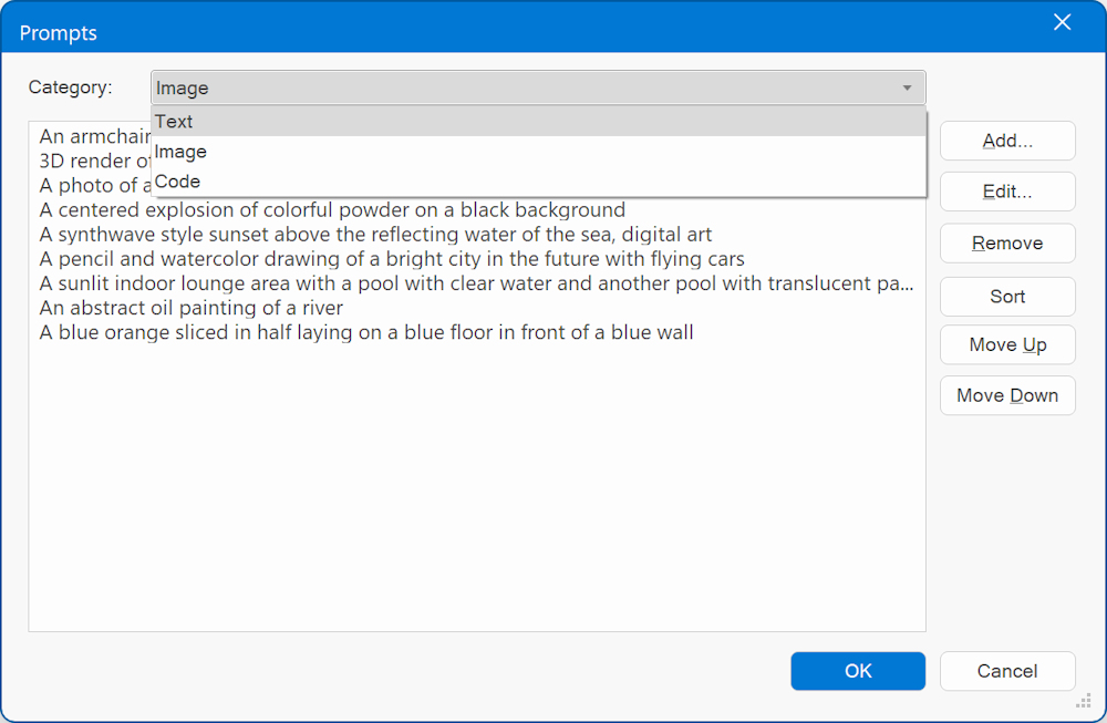
Predefined prompts can be modified via the Prompt Manager.
Generating Images with AI
Note: You will need an OpenAI API key in order to use this functionality.
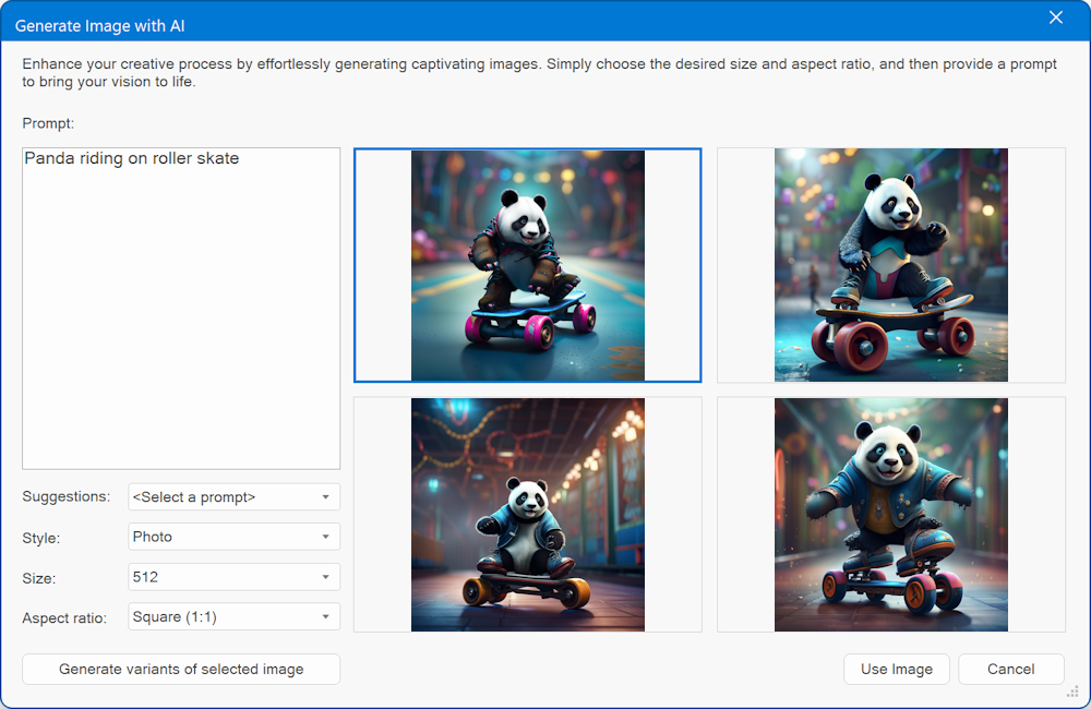
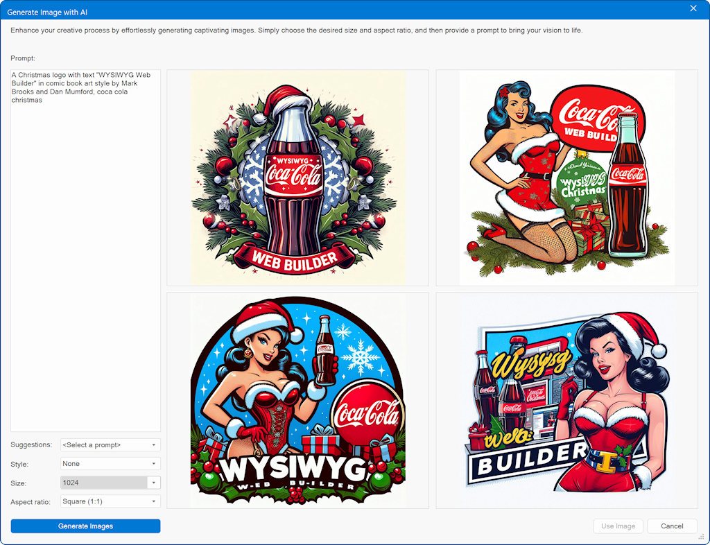
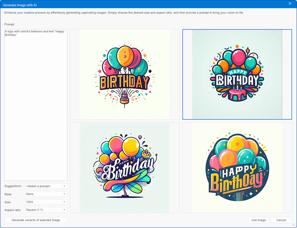
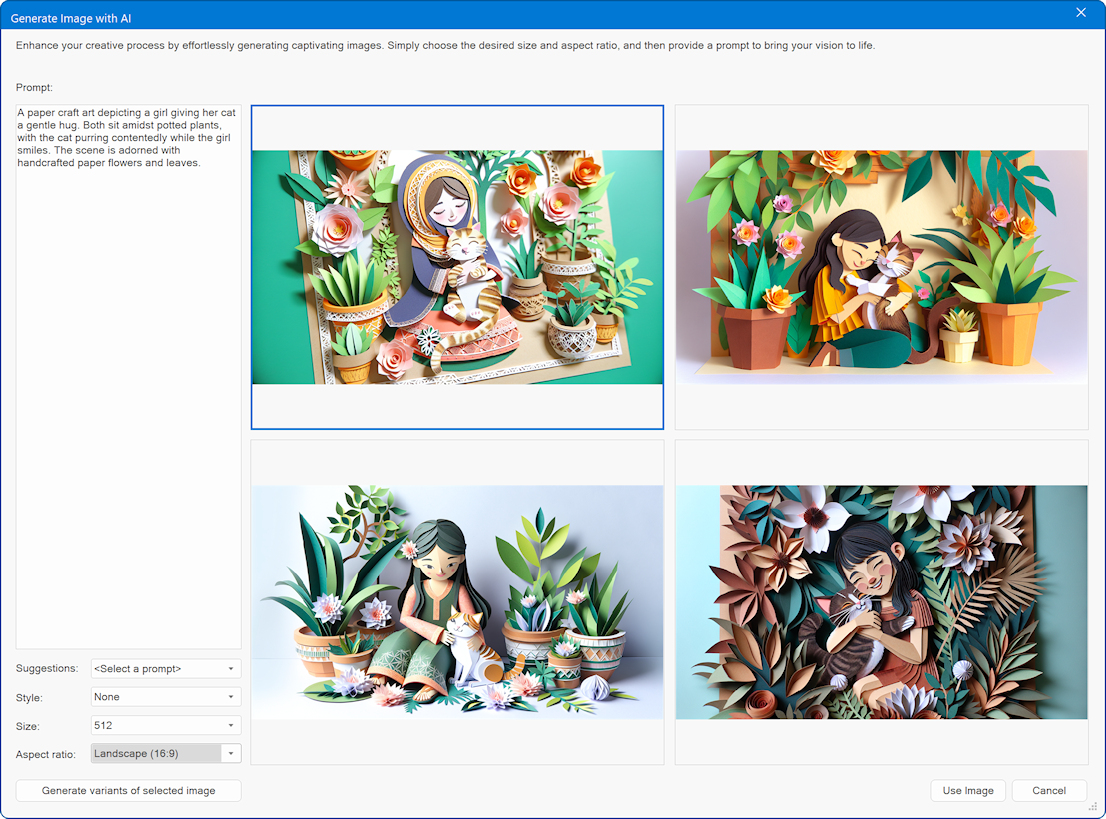
Image Generation and Manipulation: Generate new images based on text input, create variations of existing images, and enhance images using in-painting techniques. You can specify desired changes, such as adding objects, replacing screen content, or altering hairstyles. Anything you can think of!
For the image object, you can use the Artificial Intelligence button on the Ribbon to open the "Generate Image with AI" dialog. However, this functionality is available for almost all other image input fields within WYSIWYG Web Builder via the context menu!
In the dialog, you can enter a custom prompt or choose one of the pre-defined prompts from the Suggestions drop down list.
Optionally, you can select one of the 25 styles. For example: Abstract Curves, Anime, Artistic Portrait, CGI Character, Fantasy, Oil Painting, Photo, Pop Art, Steampunk etc
If you're satisfied with the one of the four generated images, you can select that image and the click 'Use Image' button to save it. However, you also create 3 other variants of the selected image by clicking the 'Generate variant of the selected image' button.
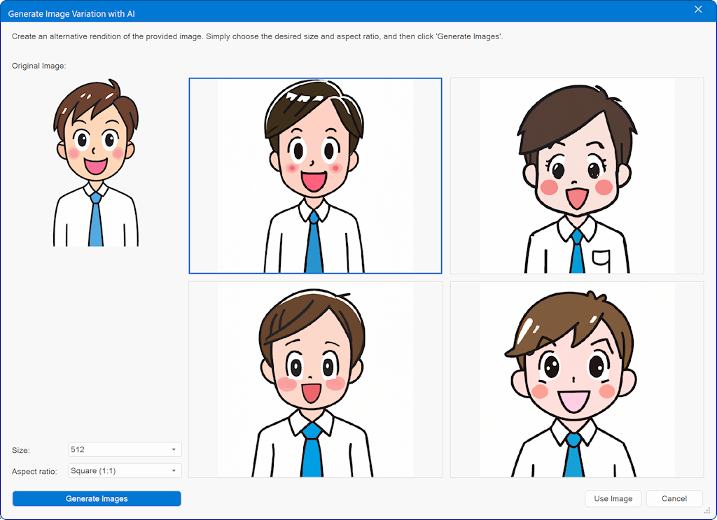
Create a variation of an existing image
Note: You will need an OpenAI API key in order to use this functionality.
Create an alternative rendition of the provided image. Simply choose the desired size and aspect ratio, and then click 'Generate Images'.
This will generate 4 variations of the input image. Select the one you like and click the 'Use Image' button to save it.
Image Enhancement
Image Enhancement
Note: You will need an OpenAI API key in order to use this functionality.
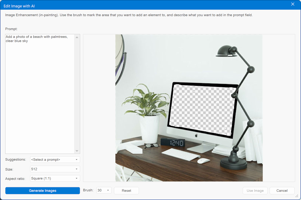
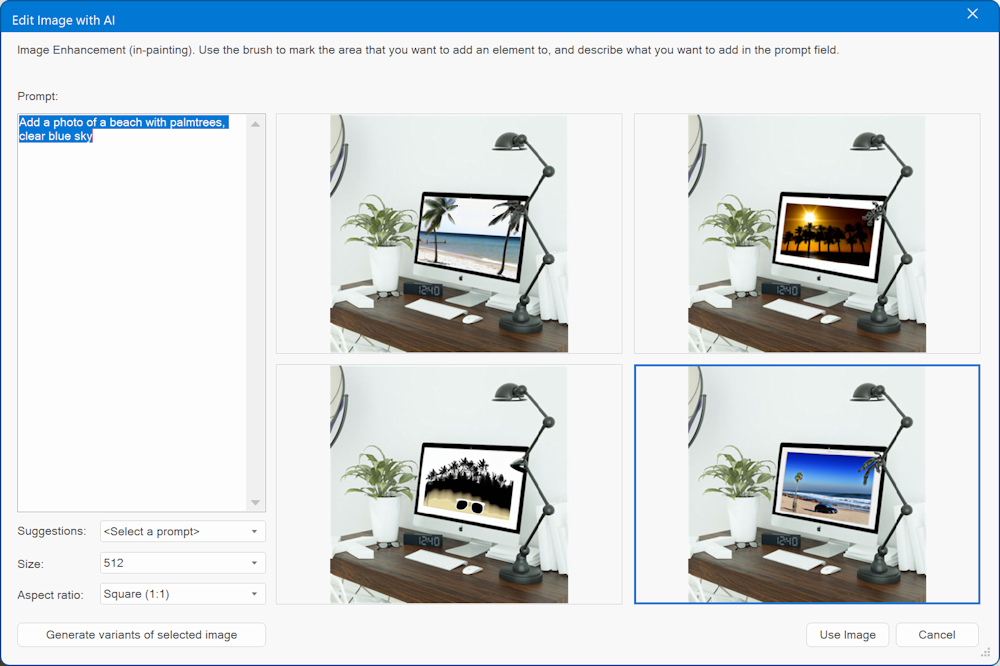
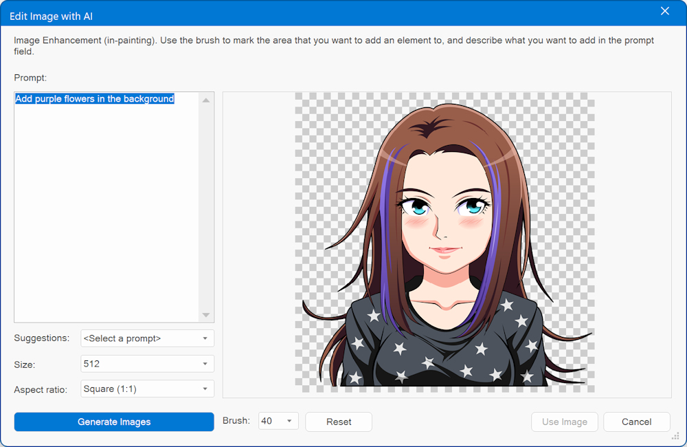
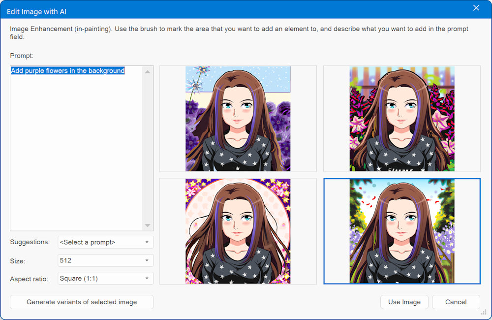
Image Enhancement is also known as 'in-painting'. Use the brush to mark the area that you want to add an element to, and describe what you want to add in the prompt field.
For example, place an object in the background, replace the content of a computer or mobile screen, billboard, t-shirt, apply a different hairstyle to a person ect.
Example 1:
Example 2:
Image Expand
Image Expand
Note: You will need an OpenAI API key in order to use this functionality.
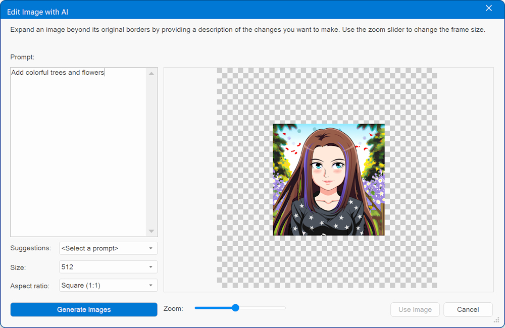
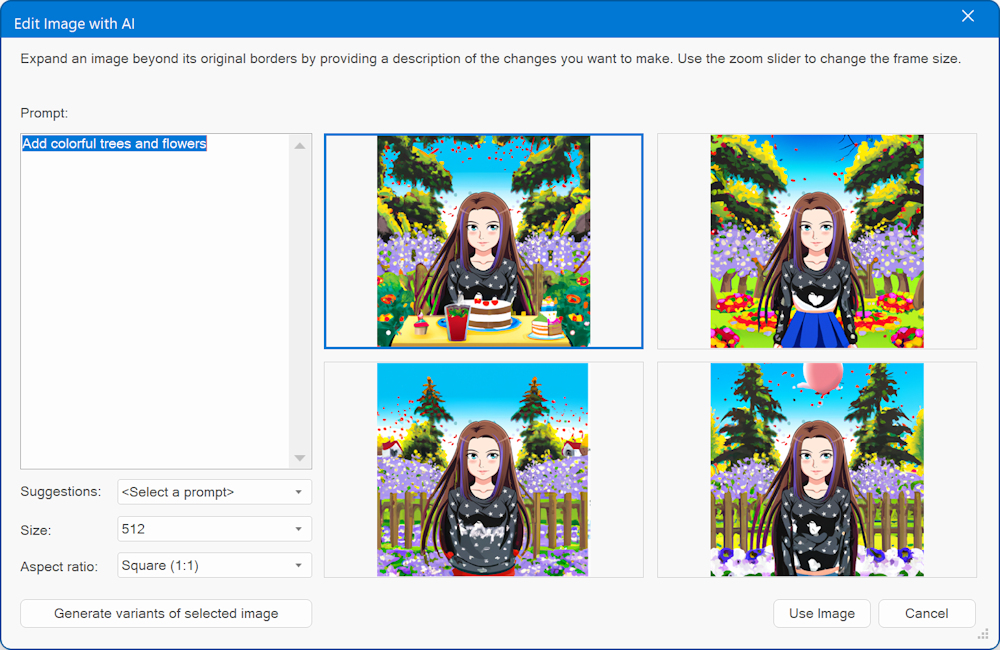
Image Expand is also known as 'out-painting'. This tool expands an image beyond its original borders by providing a description of the changes you want to make. Use the zoom slider to change the frame size.
In this example, we have used one of the previously generated images and wrote a simple prompt to add tree and flowers.
Generate custom code with AI
Note: You will need an OpenAI API key in order to use this functionality.
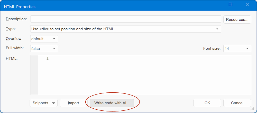
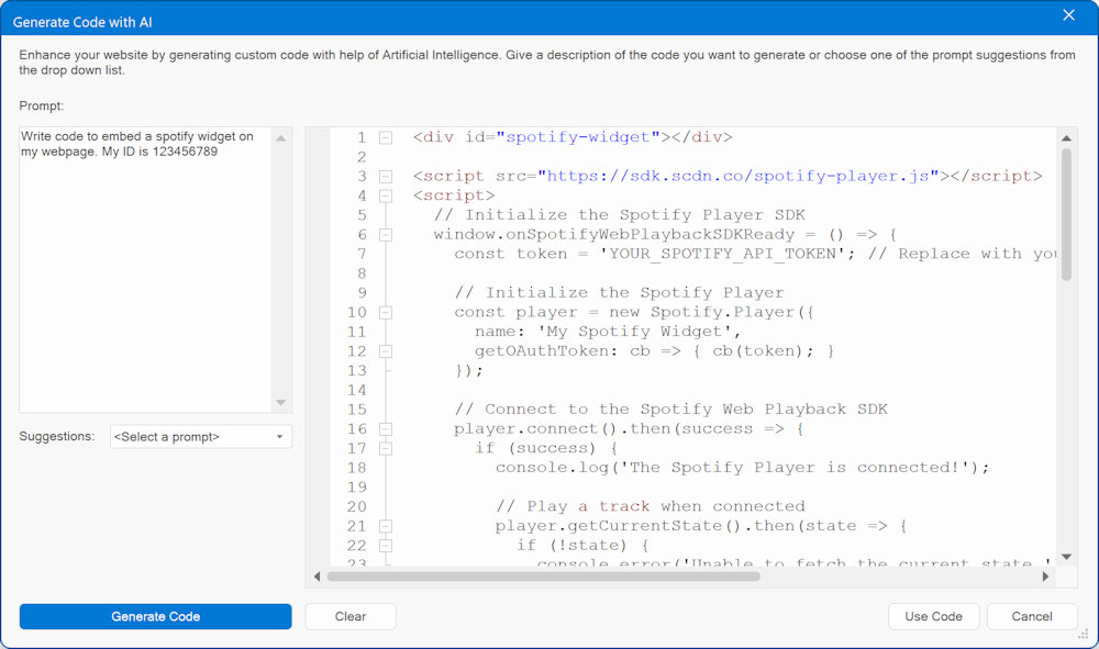
Write custom code with help to AI! AI functionality is available in the HTML object, Object HTML and Page HTML.
Add scripts, HTML, CSS, PHP etc.
Give a description of the code you want to generate or choose one of the prompt suggestions from the drop down list
Translate Text
Translate Text
Note: You will need an OpenAI API key in order to use this functionality.
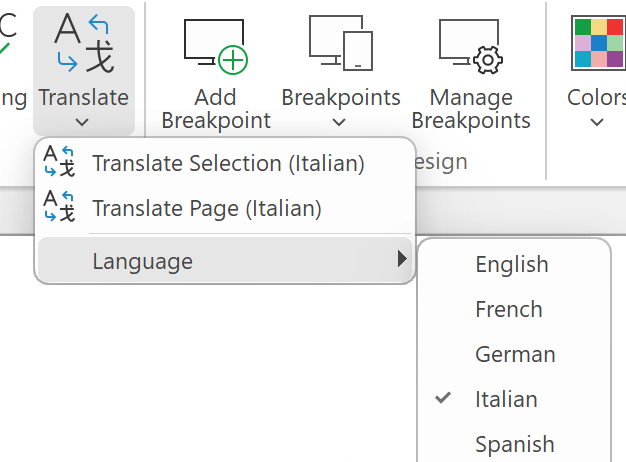
This feature is part of the new AI tools in WYSIWYG Web Builder, but translation is also available as separate tool.
You can use it to translate selected objects or create a translated copy of the whole page.
The translation language can be selected from the 'Language' dropdown menu.
‘Translate Page’ allows you to generate a translated replica of an entire webpage. In contrast to the 'Translate Selection' function, it won't modify the content on the current page. Instead, it generates a new page that maintains the original layout while translating all the text. The new page's name will incorporate the language code corresponding to your selected language. For instance, if you translate 'index' into Spanish, it will become 'index-es'.
Remove background with AI
This feature automatically detects a person or object in an image and replaces the background with a transparent one.
Unlike traditional background removal methods, this tool is works 100% automatically. You don't have to manually select the background/foreground layers to separate them - just click 'Remove Background' and it instantly generate a new image with the background removed!
Note: this uses a third party service: Remove.bg. You will need to request an API key, to use this service.
dali-e-3 support
WYSIWYG Web Builder 19 supports the latest OpenAI models: gpt4, gpt4-turbo, dali-e-2 and dali-e-3 (which was released yesterday!)
dali-e-3 is currently one of the best image generation models.
Not only can it generate beautiful images, but is also one of the first AI models that can generate meaningful text, which makes it very useful for creating unique logos.
As you may note, sometimes it still struggles to accurately capture the desired text. But nonetheless, the outcomes are pretty remarkable. It's highly promising, and it's likely that it won't be long before AI can seamlessly craft flawless logos.
Re: Something 'magical' is coming soon! (teaser)
Here's is another example of using the 'dali-e-3' model in WWB19:
More examples can be found here:
https://openai.com/dall-e-3
More examples can be found here:
https://openai.com/dall-e-3
Website Wizard
Website Wizard
There are moments when seeking fresh inspiration for a new website design can be quite challenging. When you're faced with such moments, look no further than the WYSIWYG Web Builder's website wizard for a helpful boost!
With the assistance of the 'Website Wizard,' you can initiate a new project. You have the flexibility to begin with a template as the foundation for your new project or customize its content and style through a step-by-step process. Moreover, there are options available to harness AI-driven content generation, tailored to your specified description, and incorporate stock images relevant to your selected category. These features empower you to create a distinct and unique website every time you utilize the wizard. The generated website will exhibit fresh variations with each run of the wizard!
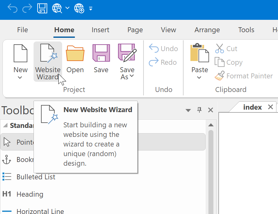
The Website Wizard has 3 options to help you get started building a new website:
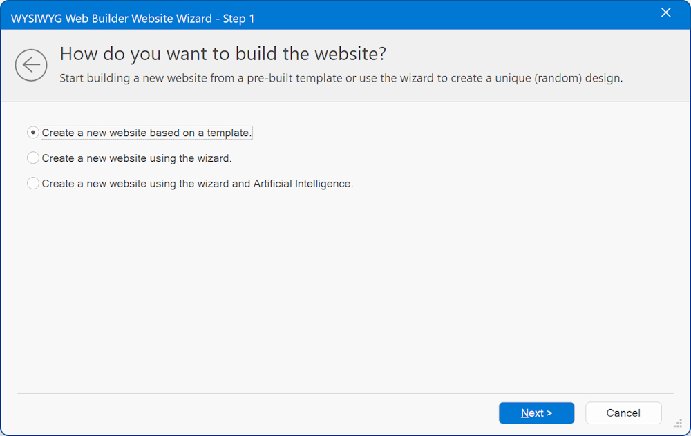
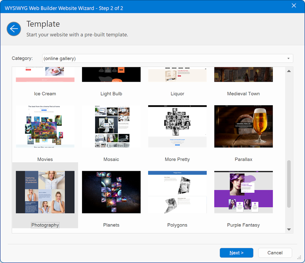
1. Create a new website based on a template
With this option you can quickly start a new project based on an existing template. The generated project will be exactly the same as the original template, so there are no choices to make other then which template you want to use. Of course, you can fully customize the website after you are finished with the wizard.
2. Create a new website using a wizard
When choosing the "Create a new website using a wizard" option, the wizard will prompt you with a series of questions to determine the desired look and feel of your new website. The resulting website will feature a distinct design, generated based on your selections. Consequently, each time you utilize the wizard, you'll receive a one-of-a-kind website.
In the first step you can enter the Name of the website. For example: Pablo's Flowers
This name will generally be used in the header or introduction of the site.
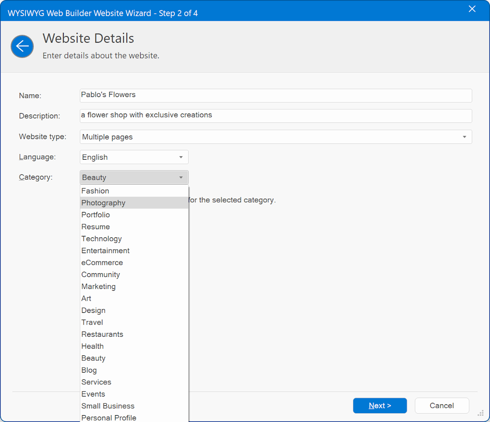
Website type, specifies the type of website:
• Single Page, creates a website with one page only. All sections (about, portfolio, contact form etc) will be on a single page. The navigation will have bookmarks to each section.
• Multiple Pages, create a website where each section has it own page.
• Multiple Pages with master page, create a website where each section has it own page. For the common sections of the layout (header and footer) the project will make use of a master page, so these can be easily updated from one place.
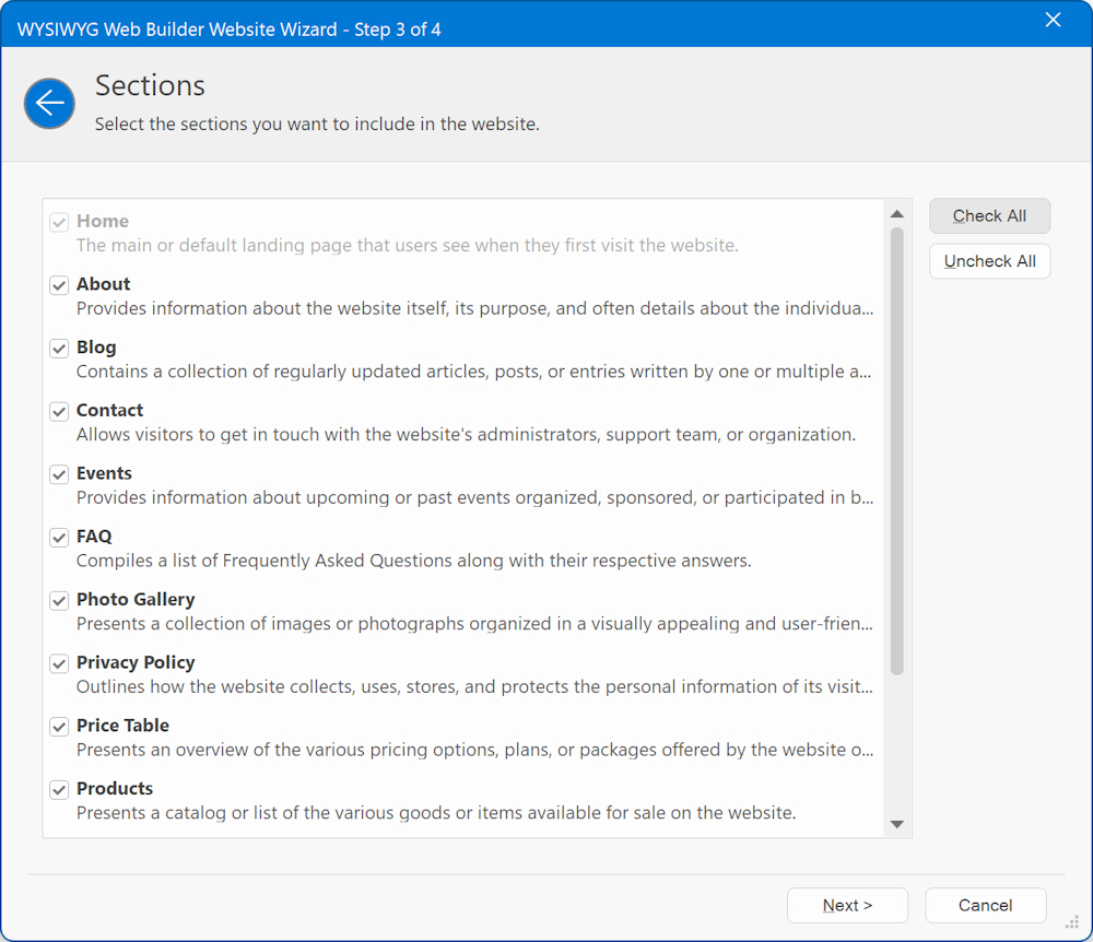
In the next step you can specify which sections you like to add the to website. For example, whether you want add an about section, contact form, photo gallery etc. Each section will also get an entry in the generated navigation. Of course, you can always add new pages later via the Site Manager.
In most cases, the main navigation of the generated website will use WYSWYG Web Builder's 'Synchronize with Site Manager' feature. This means that if you later add a new page to the project, then it will automatically be added to the menu!
For single page websites, the links in the navigation will be bookmarks to the sections on the same page.
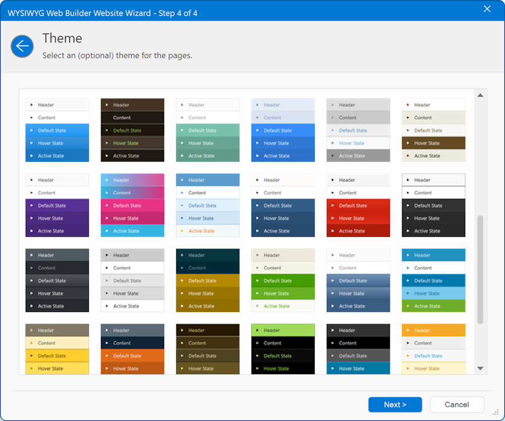
In the last step you can optionally select a theme for the website. The theme controls the main colors of elements on the pages.
For example, the text or background color. . You can always change the selected theme later via the page properties.
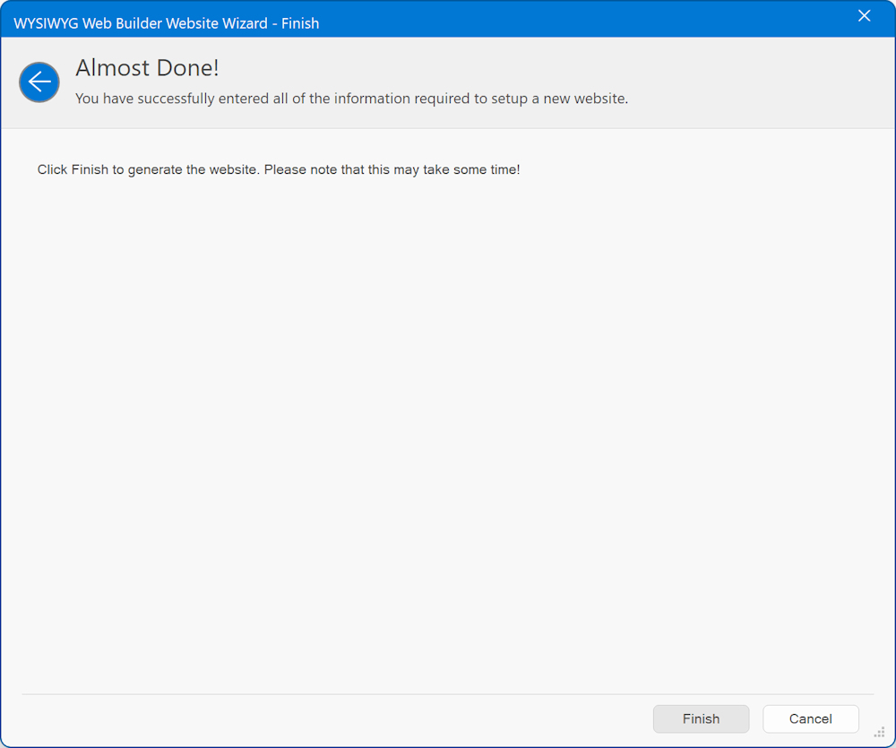
3. Create a new website using a wizard and Artificial Intelligence
This option is largely the same as "Create a new website using a wizard". However, it has one major difference in that it uses AI to generate the content (text) of the website based on the specified description. Also, the selected language will be used for the content!
In future versions of the wizard, we are considering the possibility of AI-generated images for websites. However, as of now, this feature is relatively slow and could consume a significant number of credits. Therefore, at present, we utilize stock images. Nevertheless, please note that this may change in the future. This is just the beginning of what we have in store!


Templates
Templates
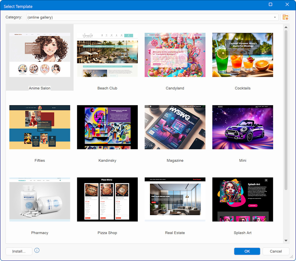
Added 'Online Gallery' to the 'Select template' dialog. This allows you to select a template from the online gallery without the need to manually download and install it first!
You can also preview the template online directly via the context menu.
Added 'Online Gallery' to the 'Select template' dialog. This allows you to select a template from the online gallery without the need to manually download and install it first!
You can also preview the template online directly via the context menu.
SEO
SEO
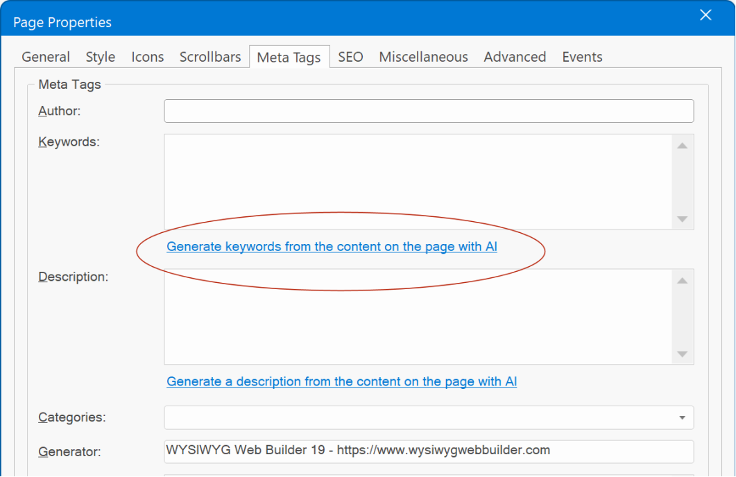
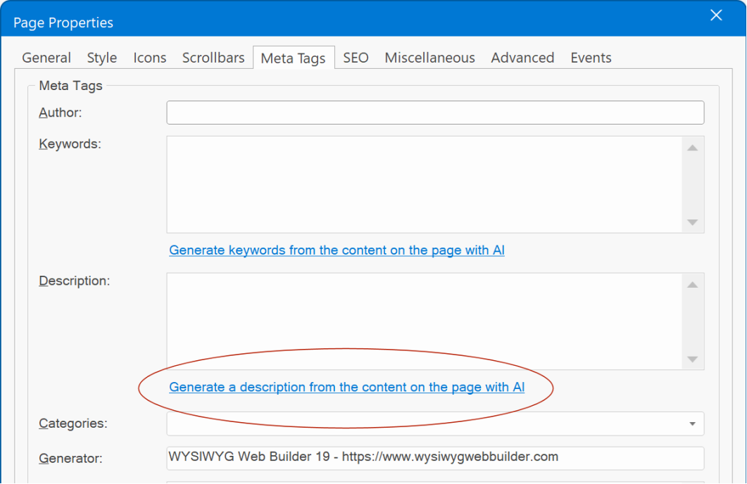
Added 'Get keywords from page content with AI' in the page properties meta tags section. This uses OpenAI to determine the best keywords for the page based on the page content (text and headings).
Added 'Get description from page content with AI' in the page properties meta tags section. This uses OpenAI to write a description about the page content (text and headings).
Theme Manager
Theme Manager
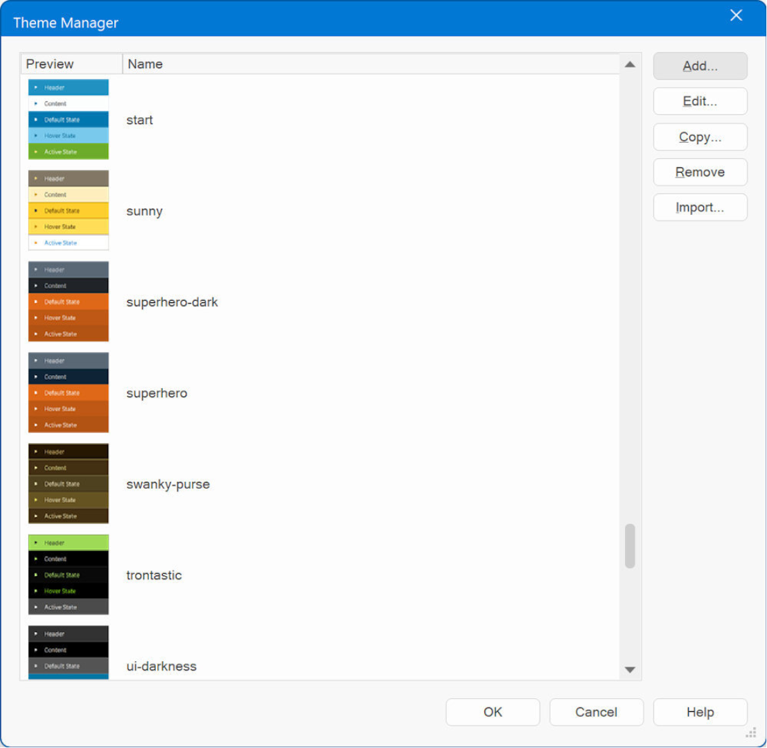
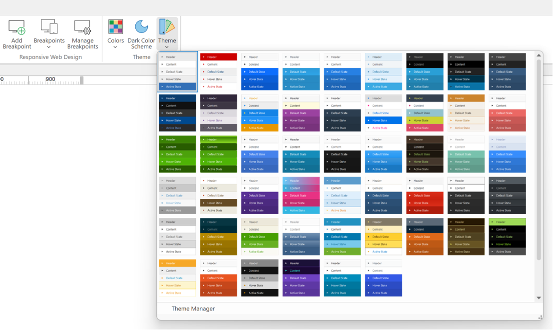
The Theme Manager has been revived. WWB has supported themes for a long time, however previously they were only useful for jQuery UI widgets.
Themes have been updated to support almost all objects. Unlike jQuery UI widgets which require a pretty large CSS set. The new themes only have a small footprint.
Demo:
https://wysiwygwebbuilder.com/support/wb19tryouts/wb19_themes.html
- Added 25 new themes inspired by BootSwatch. Each of the new themes also has a dark theme variation, which allows the visitors of the website to choose between a light and dark theme. Just like you can with styles.
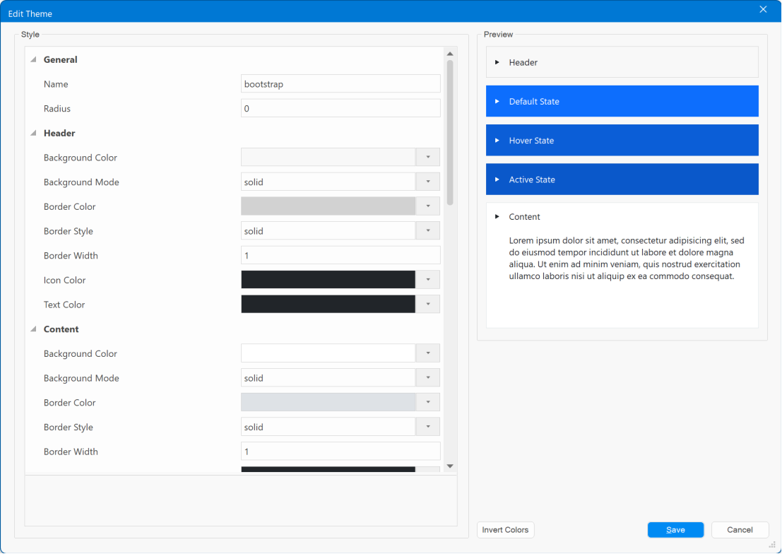
- Added 'Invert colors' button to invert all colors of the current theme. This may be useful if you want to quickly create a dark variant of the theme.
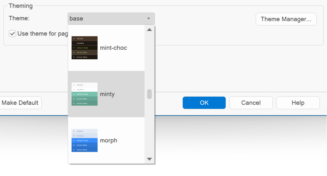
- Added Theme gallery to page menu to easily select a different theme for the page.
- Property list now also uses 'Office look' (when enabled in UI options).
- The theme selector control in the Page Properties now also includes the name (in addition to the preview image) and the themes are sorted by name.
- Added dark variants of the following themes: blitzer, cupertino, eggplant, excite-bike, flick, hot-sneaks, humanity, overcast, pepper-grinder, redmond, smoothness, south-street, start, sunny, ui-lightness, vader.
- Theme Manager dialogs are now resizable.
Theme Manager
Here is another demo of using themes.
This is an updated version of last year's 'Fun!' template.
In this update, we've enabled the 'Use Theme' property for most objects. This makes it possible to easily modify the appearance of the whole page via Page -> Theme
https://www.wysiwygwebbuilder.com/support/wb19tryouts/wb19_themedfun.html
And here's the same template, but now with a different theme:
https://www.wysiwygwebbuilder.com/support/wb19tryouts/wb19_themedfun_alt.html
- You can toggle between dark/light mode via the button in the bottom-left corner.
- The background of the images was removed with the 'Remove background with AI' tool.
- The color of the logo in the footer also adapts to the theme!
Google Fonts
Google Fonts
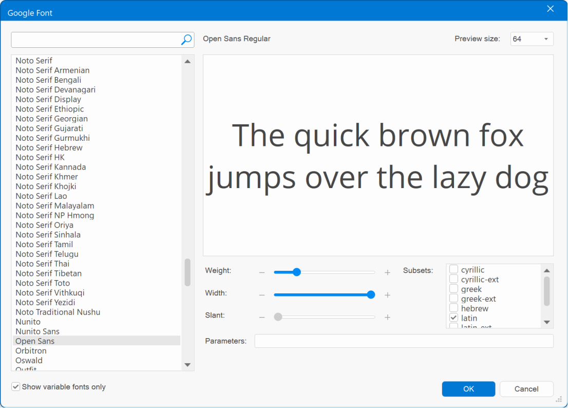
Added support for Variable fonts.
A variable font contains multiple variations of a typeface (such as weight, width, and slant)
within a single file. This enables you to create a wide range of typographic styles and effects using just one font file, resulting in improved performance and more creative possibilities.
The Font Manager has a new option ‘Show variable fonts only’. This will hide all classic fonts and only show variable fonts.
In the Font Manager, you'll find new sliders for adjusting weight, width, and slant, allowing you to preview how a font might appear.
Note that not all fonts do support all properties!
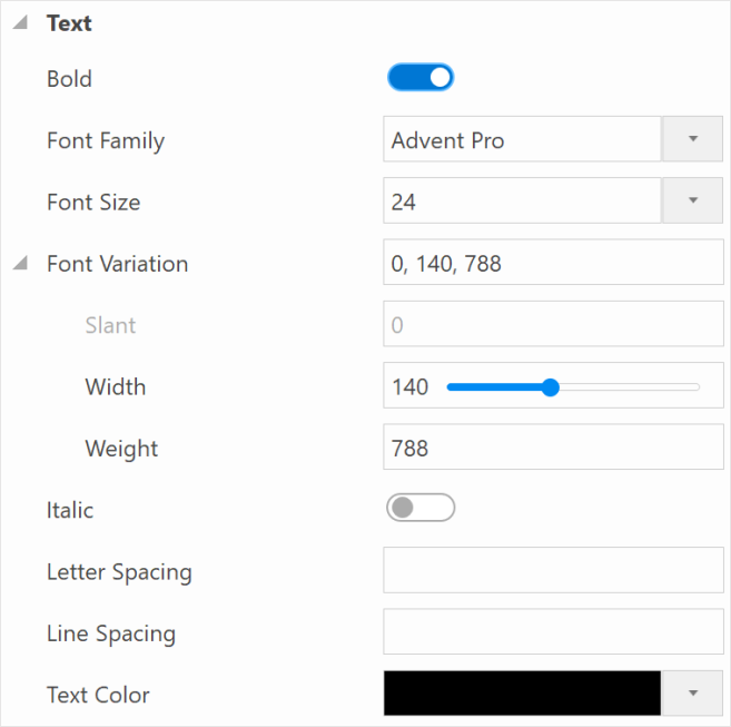
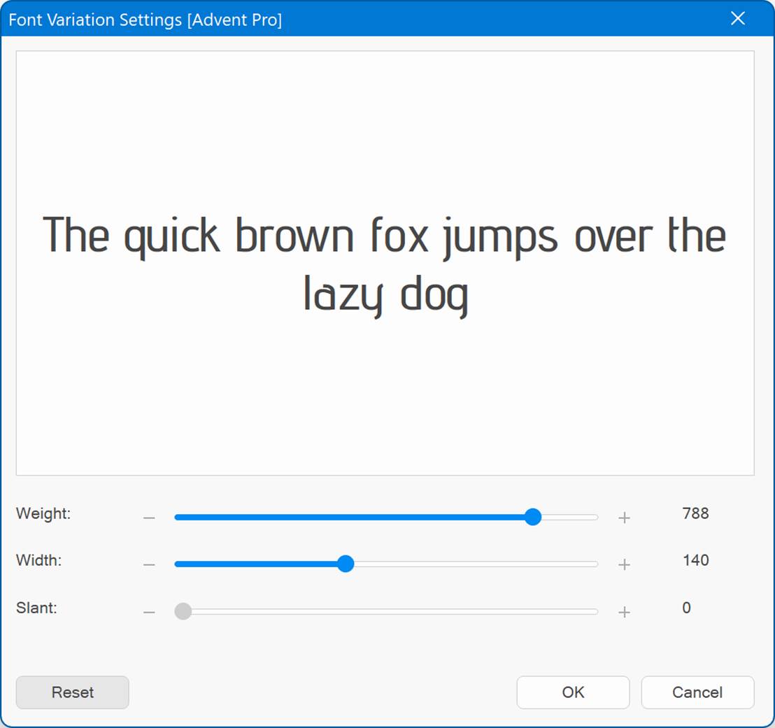
Optionally, if you select a variable font in the style properties, then the ‘Variations’ button can be enabled, to fine-tune the font’s properties for advanced users.
Spellings Checker
Spellings Checker
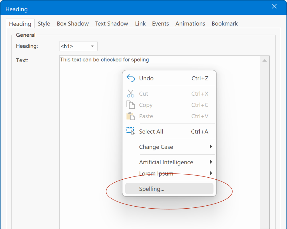
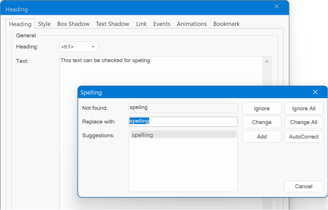
All input fields for text now can check the spelling via the context menu. This feature uses the standard Windows spell checker (Tools -> Options -> Spell Checker)
Heading
Heading
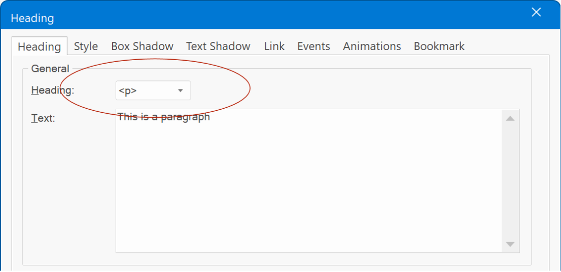
Added the ability to output the heading as paragraph <p>. This can be useful if you want to use specific heading features that are not available for standard text like 'text shadow', 'text stroke' or variable font fine-tuning.
Icons
Icons
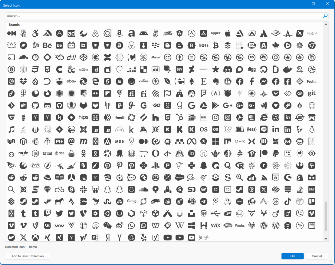
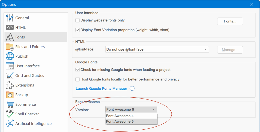
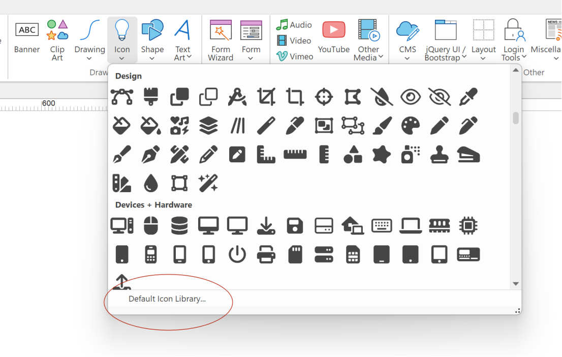
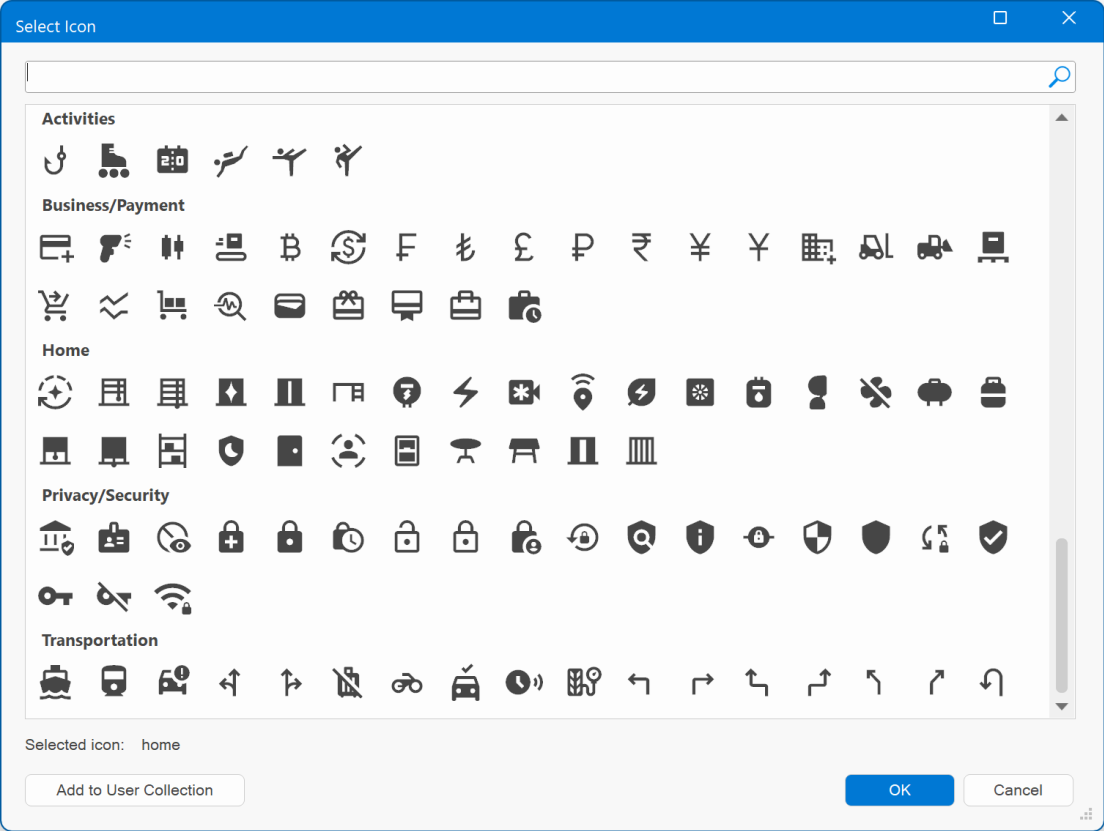
- Added built-in support for Font Awesome 6 (free). Font Awesome 6 has a modern look and includes 600 new icons!
- New projects will automatically use the new version. For older projects, you can select the new version in the Tools -> Options -> Fonts
- It is no longer necessary to restart the application after changing the default icon library. The Ribbon icon gallery will now be updated instantly.
- WWB19 now also includes the latest version of the ‘Material Icons’ library with 390 new icons.
Badges
Badges
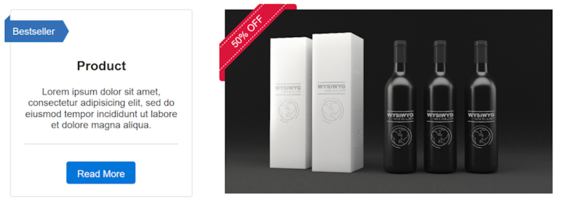
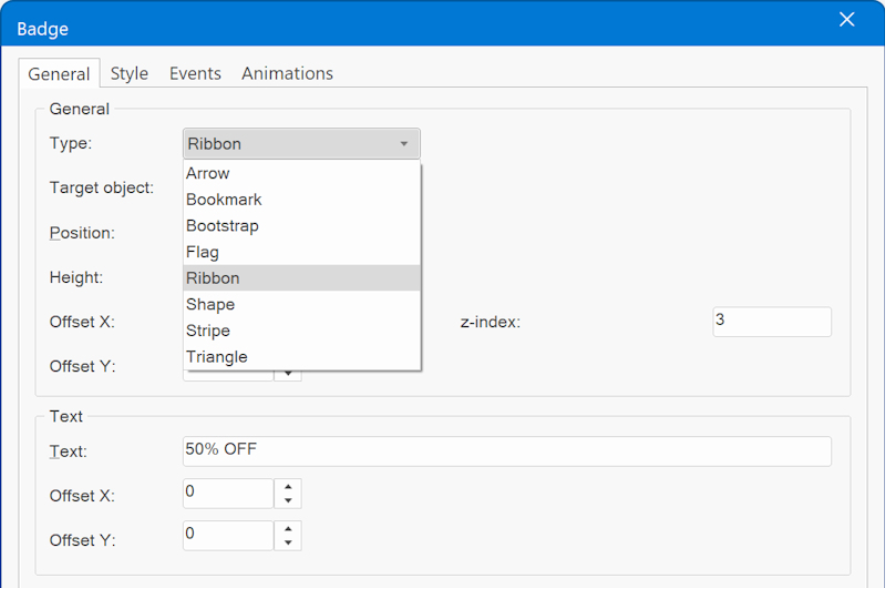
- Added new 'Badge' object. A "badge" is a small graphic, text or symbol that can be used to add additional information to the web site elements. For example, showing if a product is available, promoting a discount, displaying a user's achievements, or indicating how popular a product is. A Badge can be applied to almost any WWB object.
Demo:
https://wysiwygwebbuilder.com/support/wb19tryouts/wb19_badges.html
The Badge object has 8 different types: Arrow, Bookmark, Bootstrap-like badge, Flag, Stripe, Triangle, Ribbon and Shape (with more than 200 shape types!). Badges can include both text and icons, and they can also incorporate animations to capture the visitor's attention.
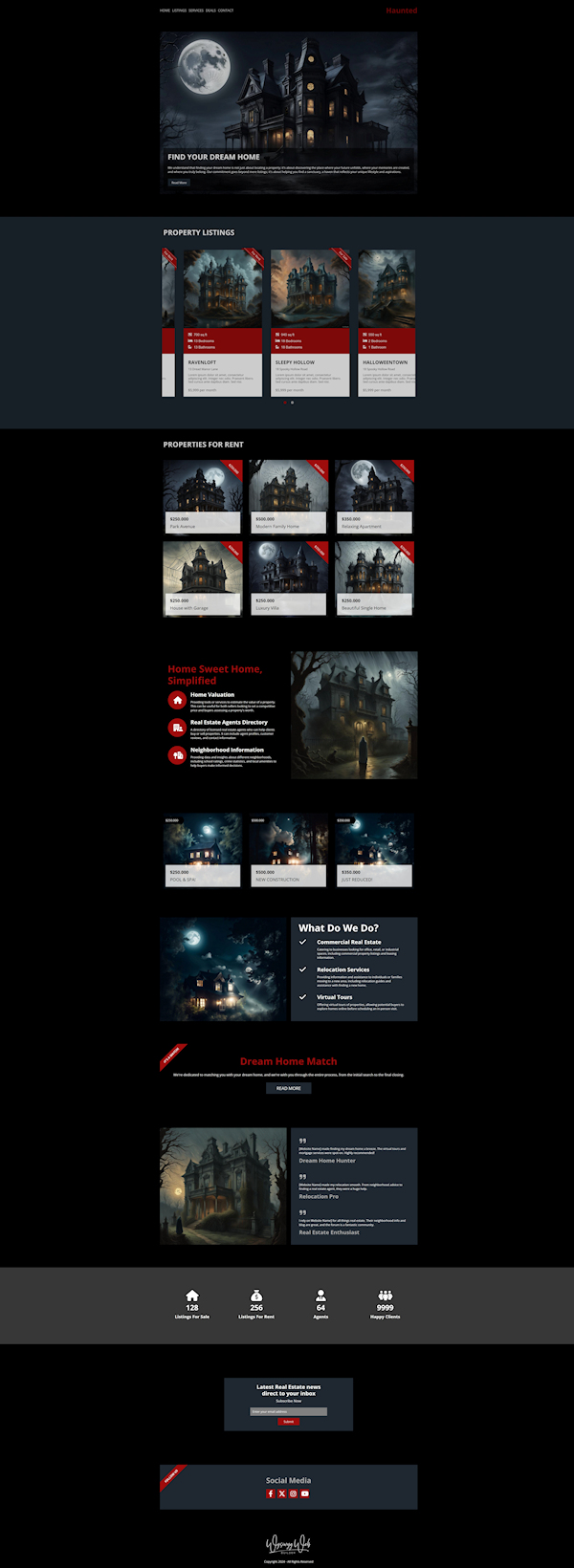
Real Estate template
Here is a preview of the 'real estate' template that uses Badges.
All text and images in this template were generated using AI.
Preview:
https://www.wysiwygwebbuilder.com/support/wb19tryouts/wb19_haunted.html
All text and images in this template were generated using AI.
Preview:
https://www.wysiwygwebbuilder.com/support/wb19tryouts/wb19_haunted.html
Cards - Ecommerce
Cards - Ecommerce
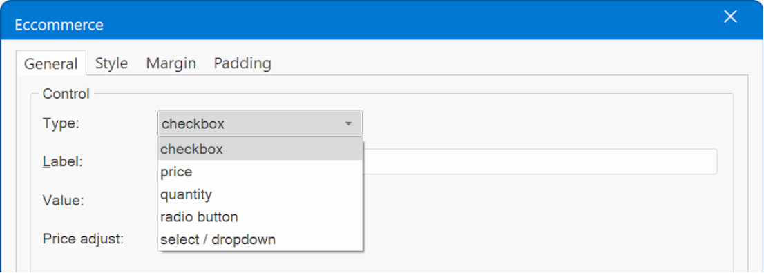
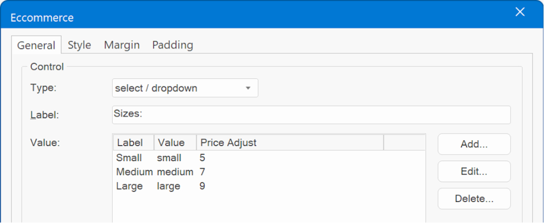
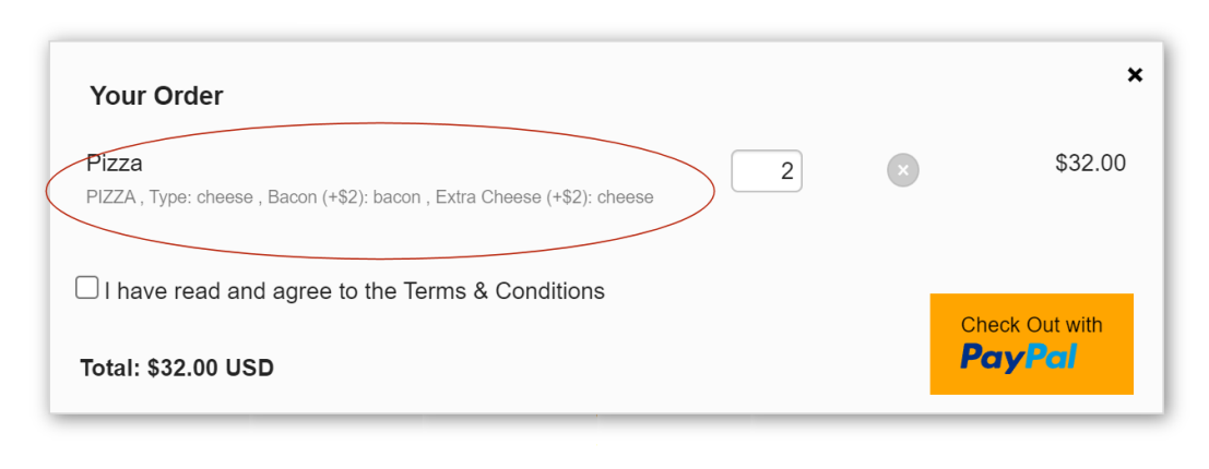
Added eCommerce functionality to cards. Via the new 'ecommerce' item you can add checkboxes, radio buttons, select /dropdown lists, price and quantity fields to the card. These items can then be used to adjust the price. For example, the size of a t-shirt, gift wrapping, glossy printing paper etc. Extra options can increase or decrease the final price. Calculations are done automatically so there is no need to implement events or conditions!
Demo:
https://wysiwygwebbuilder.com/support/wb19tryouts/wb19_ecommerce_card.html
Available options:
• Checkbox
A checkbox adds a simple toggle button to enable a specific option.
• Radio button
A radio button presents multiple choices, allowing the selection of only one option at a time.
• Select / dropdown
A select dropdown serves the same purpose as a radio button but offers a distinct visual presentation. It showcases a list of options from which users can make a selection.
• Price
The 'Price' item can be used to display the calculated price. The value is dynamically updated based on the selections made by the user.
• Quantity
This option enables users to modify the quantity of items in their order.
Re: Something 'magical' is coming soon! (teaser)
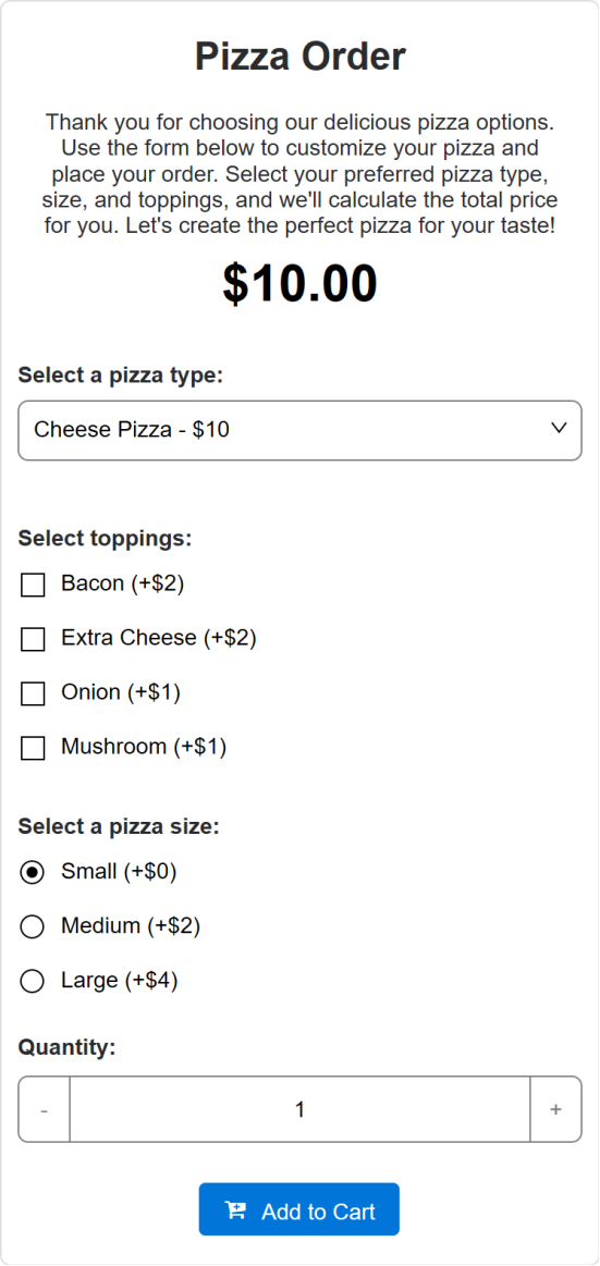
Here is a preview of a new 'pizza shop' template which uses the eCommerce card functionality of WWB19.
All text and images in this template were generated using AI.
Preview:
https://www.wysiwygwebbuilder.com/support/wb19tryouts/wb19_pizzashop.html
All text and images in this template were generated using AI.
Preview:
https://www.wysiwygwebbuilder.com/support/wb19tryouts/wb19_pizzashop.html
Cards
Cards
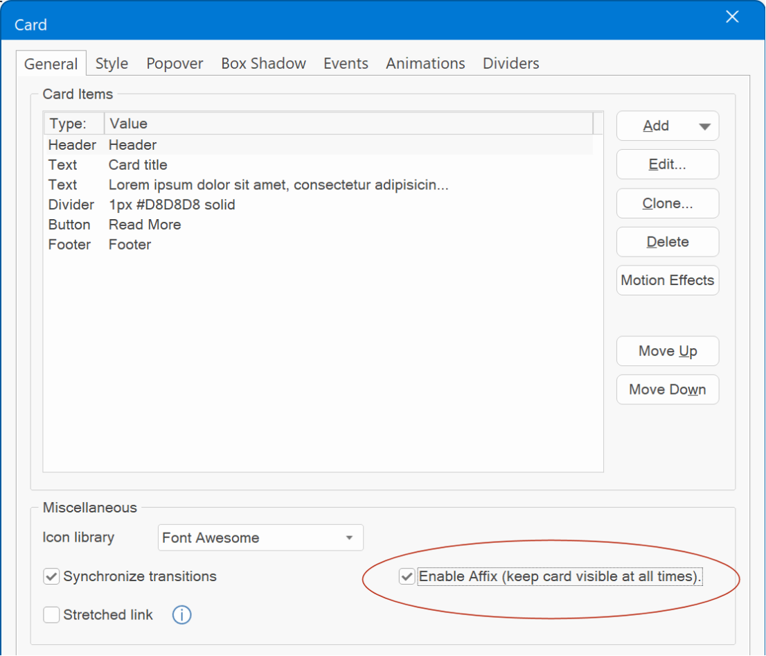
- Added support for Affix to keep the card visible while scrolling.
Demo:
https://wysiwygwebbuilder.com/support/wb19tryouts/wb19_cardaffix.html
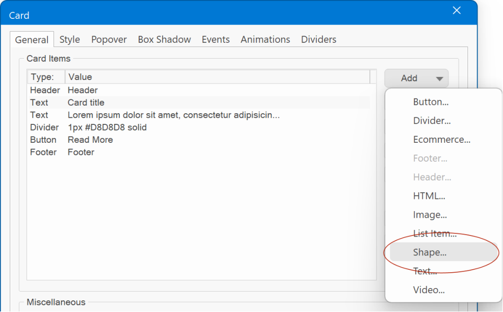
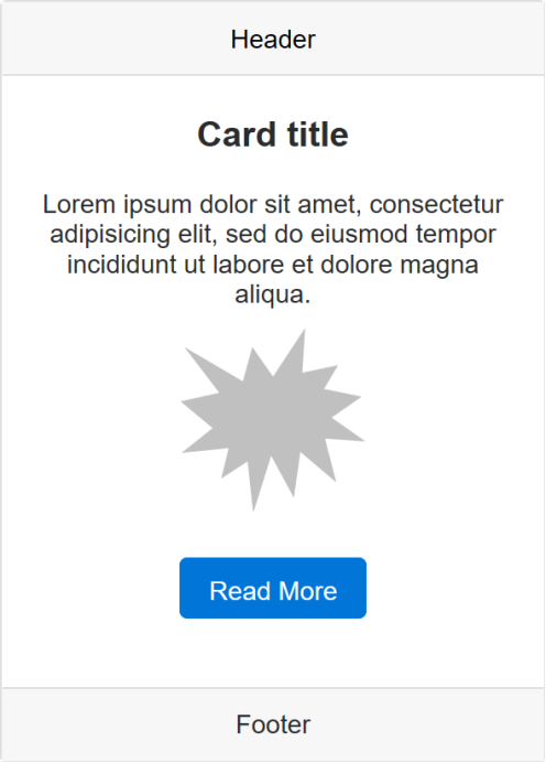
- Added support for shapes in Cards. This feature is identical to the shapes available in Sections.
- Added the ability assign a link to Card text items.
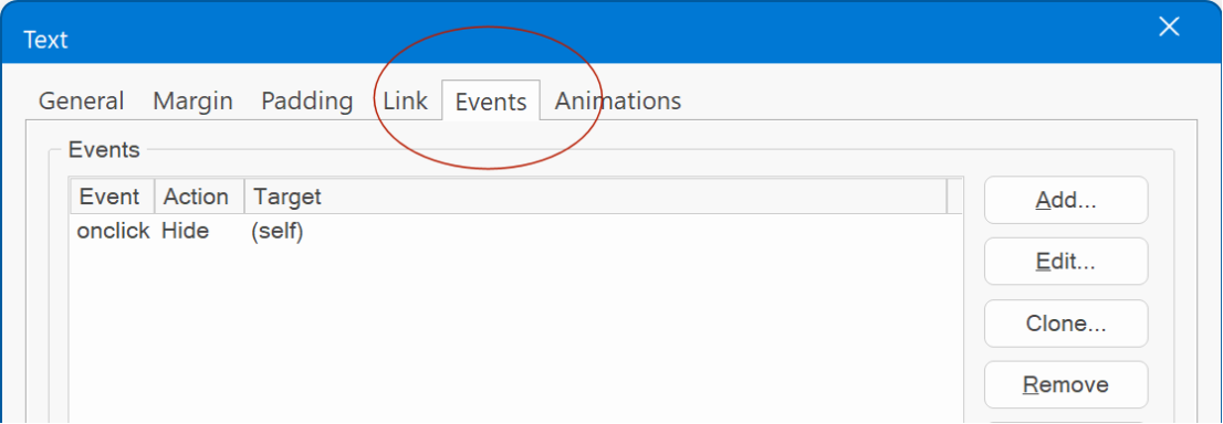
- Added support for events to Card text items.
- Define the 'minimum height' directly within the card's properties, eliminating the need to configure it through the flex properties as was required before.
This specifies the minimum height for the card when it is utilized within layout grids. This feature may be useful to ensure consistent card heights across multiple cards with varying content.
Note that this feature is specifically beneficial when using the card within layout grids. Within a card container, cards will automatically have uniform heights without requiring this setting.
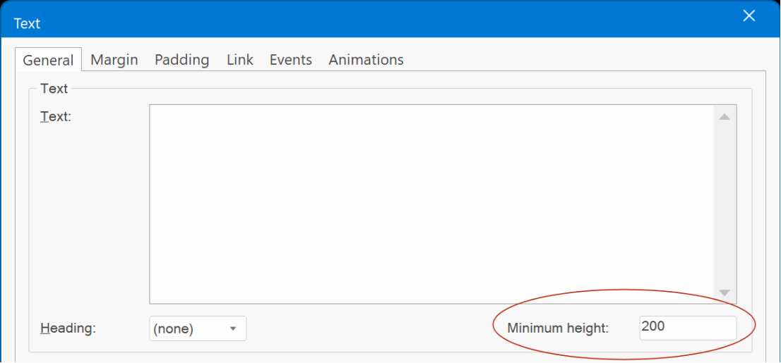
- Added ‘Minimum height’ property for Text items.
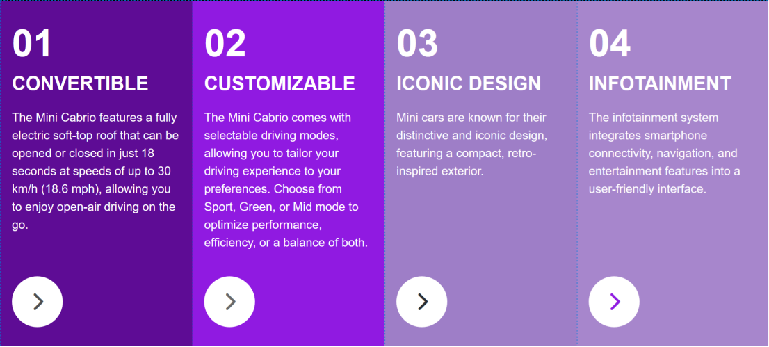
When working with text in cards, variations in text length often result in varying text heights, creating challenges when aligning other elements within the card, such as buttons placed at the bottom. To address this, you can now set a minimum height, ensuring consistent and predictable text heights for improved alignment.
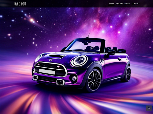
Here is a preview of a new template about my favorite car 'Mini Cabrio' which uses the minimum height in Card text (on the About page).
All text and images in this template were generated using AI.
Preview:
https://www.wysiwygwebbuilder.com/support/wb19tryouts/wb19_mini.html
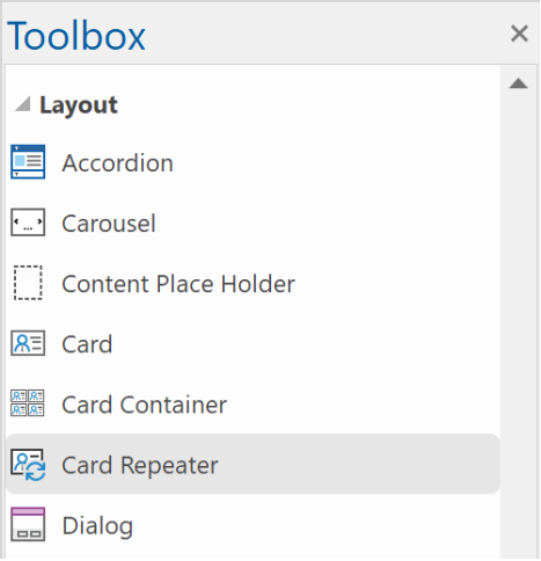
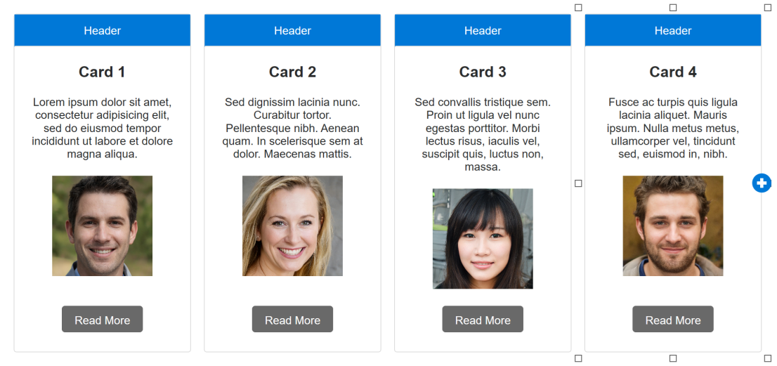
Card Repeater
Card Repeater
- Added 'Card Repeater' object
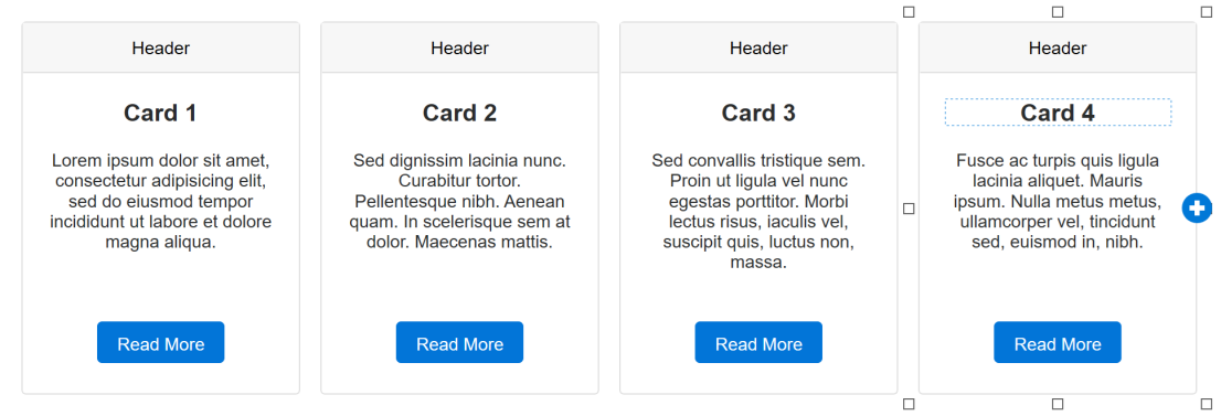
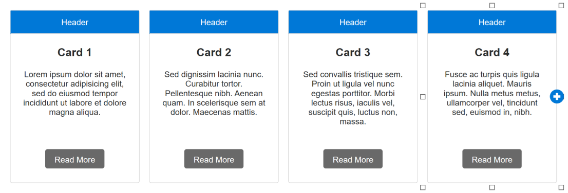
A Card Repeater operates similarly to a Card Container, with a key distinction: all cards within it share the same layout and style. This means that any modification made to one card will automatically propagate to all other cards within the same container. Of course, the text can be different for each card!
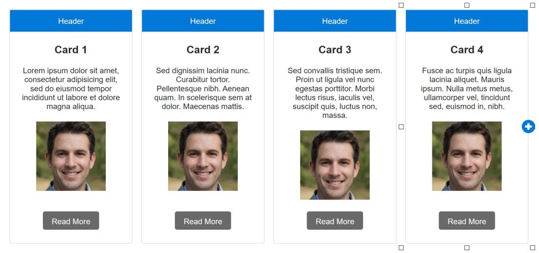
For instance, if you add a button to one card, it will simultaneously appear in all the other cards. Removing an item will have the same effect, as it will be removed from every card within the repeater. Similarly, adjustments to the style attributes, such as font size, background color, or borders, will be uniformly applied to all cards.
Furthermore, duplicating a selected card is a breeze – simply click the clone button to create an identical copy.
Example 1 – Changing the colors of one card will affect all cards.
Example 2 – Add a new item to one card, will add the item to all cards!
Initially, the images will be the same for all card, but you can set a different image for each card, if you want.
Card Container
Card Container
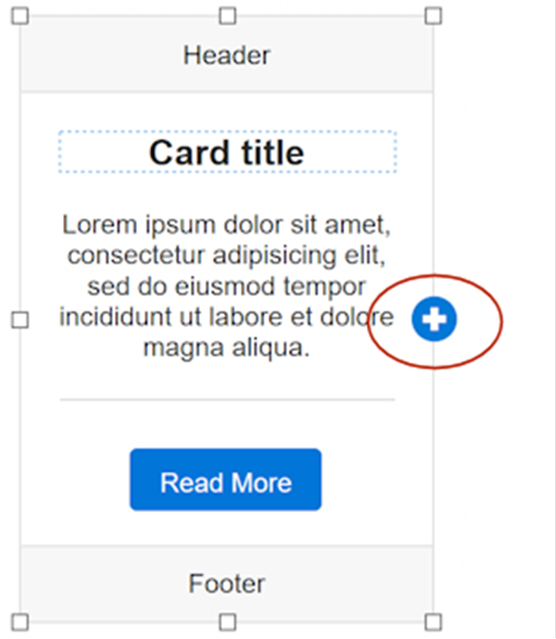
- Cards that are inside a Card container now have a 'clone' button. So, you can easily duplicate the selected card.
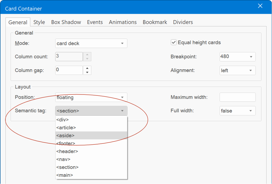
- Added support for HTML5 semantic tags.
- Cards that are inside a Card container now have a 'clone' button. So, you can easily duplicate the selected card.
- Added support for HTML5 semantic tags.
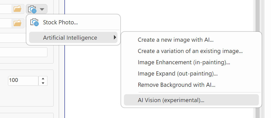
AI Vision
AI Vision
This is an experimental feature and currently only available for users who have an OpenAI account with access to gtp4.
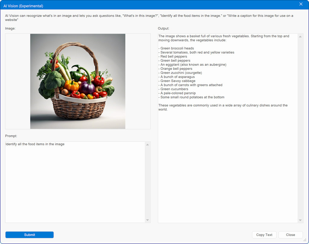
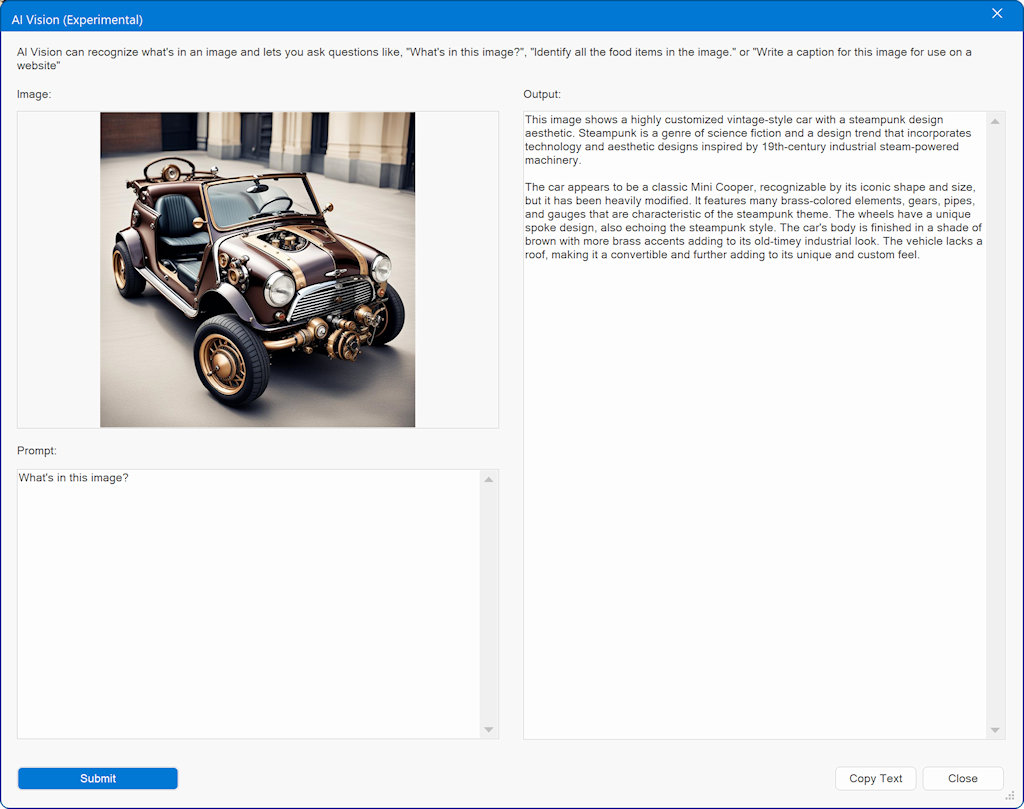
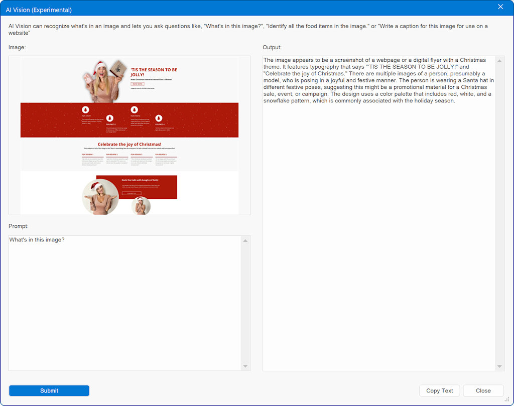
AI Vision can recognize what's in an image and lets you ask questions like, "What's in this image?", "Identify all the food items in the image." or "Write a caption for this image for use on a website".
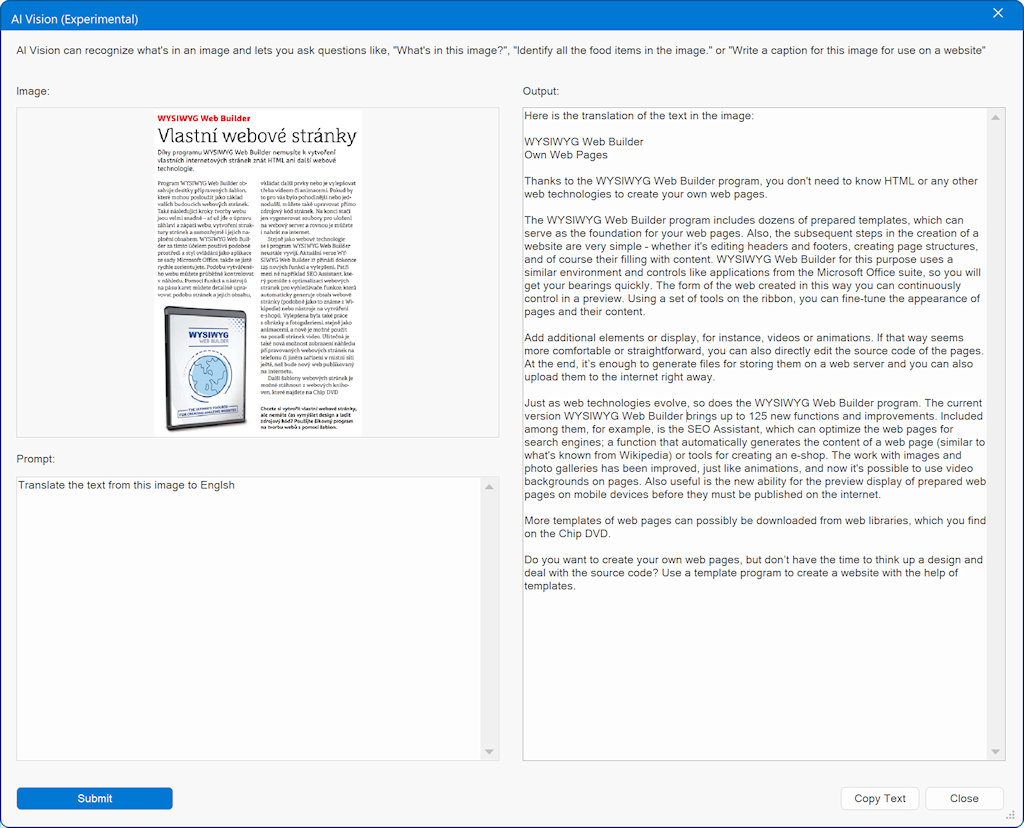
You can also use it to extract text or translate the text from the image to a different language.
This feature can be useful for web design to create titles or detailed descriptions for SEO purposes.
But you can also use it to create a text prompt from an image and use that to create a new image. The results of this tool are already very impressive, and we can’t wait to come up with more features that use this functionality...
Example 1
Identify all the food items in the image.
Example 2
An image that was generated with AI of a 'steam-punked' car.
Example 3
Describe the content of a screenshot of a website.
Example 4
Translate the text from an Czech magazine to English.
Example 5
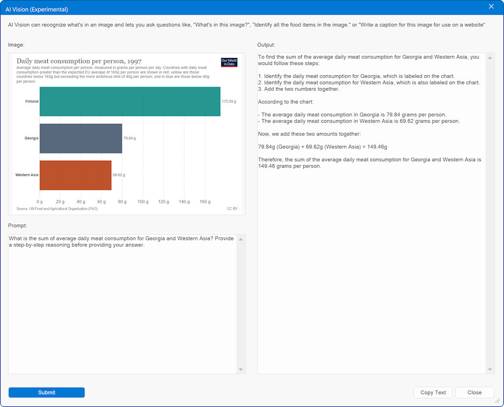
What is the sum of average daily meat consumption for Georgia and Western Asia? Provide a step-by-step reasoning before providing your answer.
Example 6
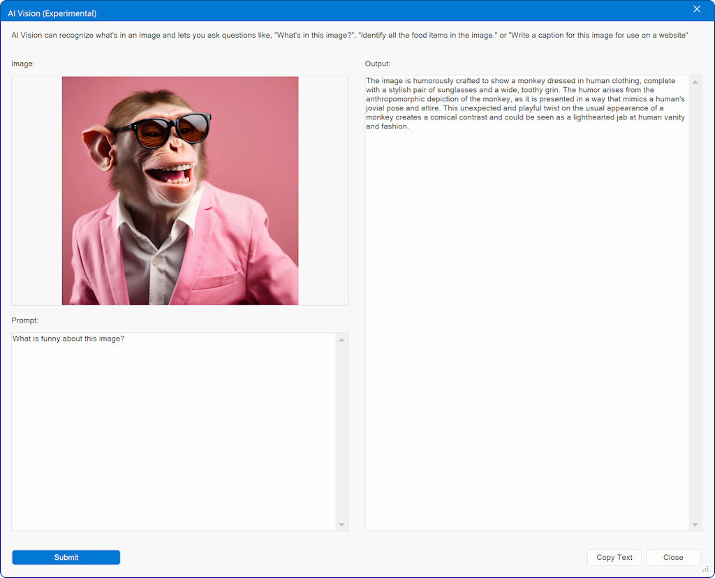
What is funny about this image?
Images
Images
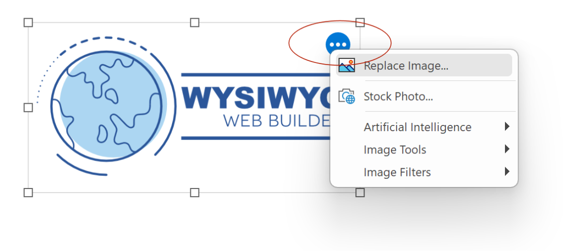
- Added 'Replace image' command to replace an existing image with a new one without losing the current settings.
- Added 'Stock Photo' command to image tools to quickly replace the current image with a stock photo.
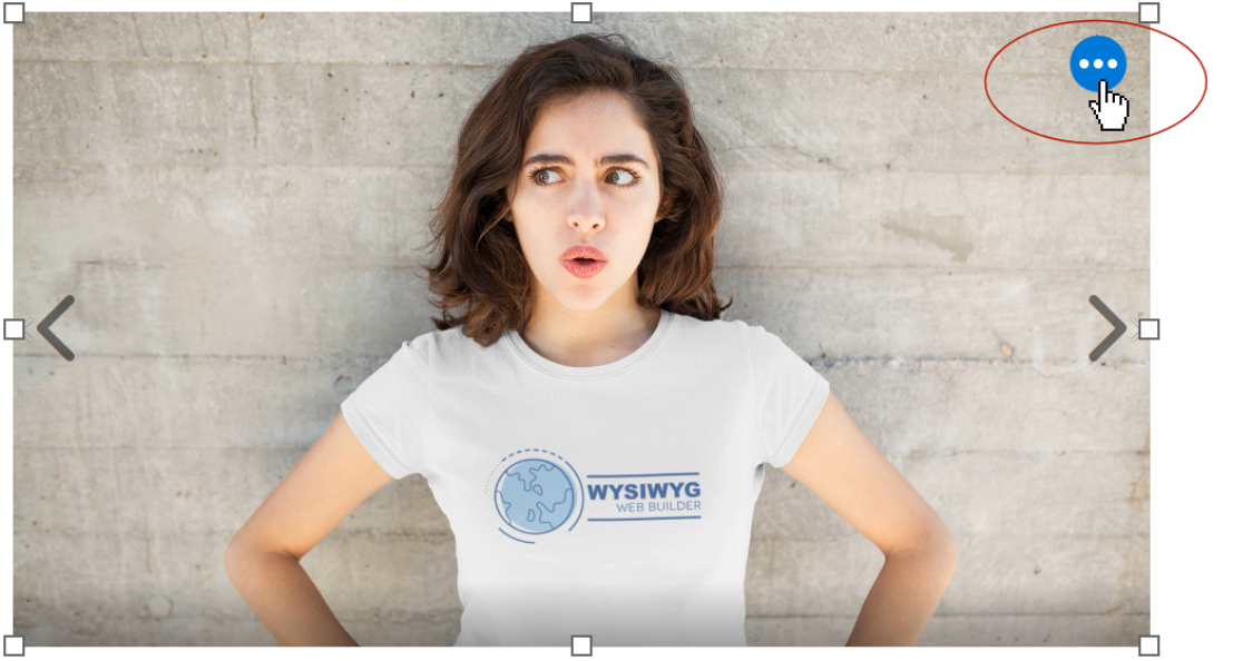
- Added quick menu icon to the selected image. This can be used to open a quick menu with image tools, so you do not have to open the properties dialog.
Slideshow
Slideshow
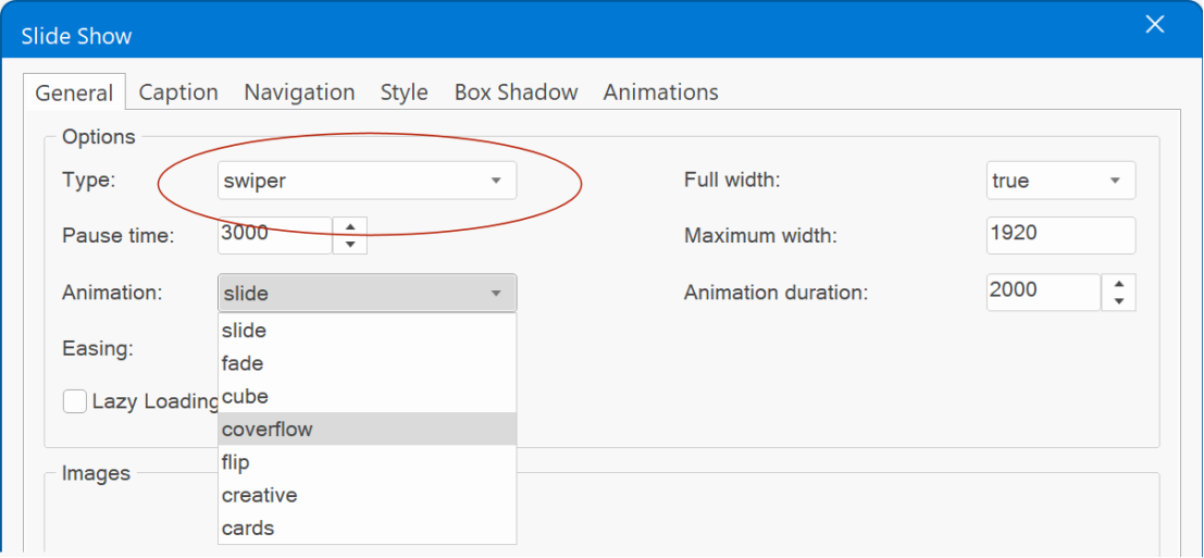
- Added support for 'Swiper'. Swiper is a modern mobile friendly (slider) slider with hardware accelerated transitions (no jQuery): fade, slide, cube, coverflow, flip, cards and creative.
Demo:
https://wysiwygwebbuilder.com/support/wb19tryouts/wb19_swiper.html
- Added quick menu icon to quickly replace the images in the slideshow.
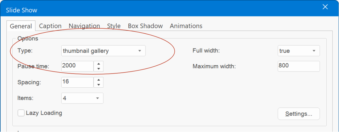
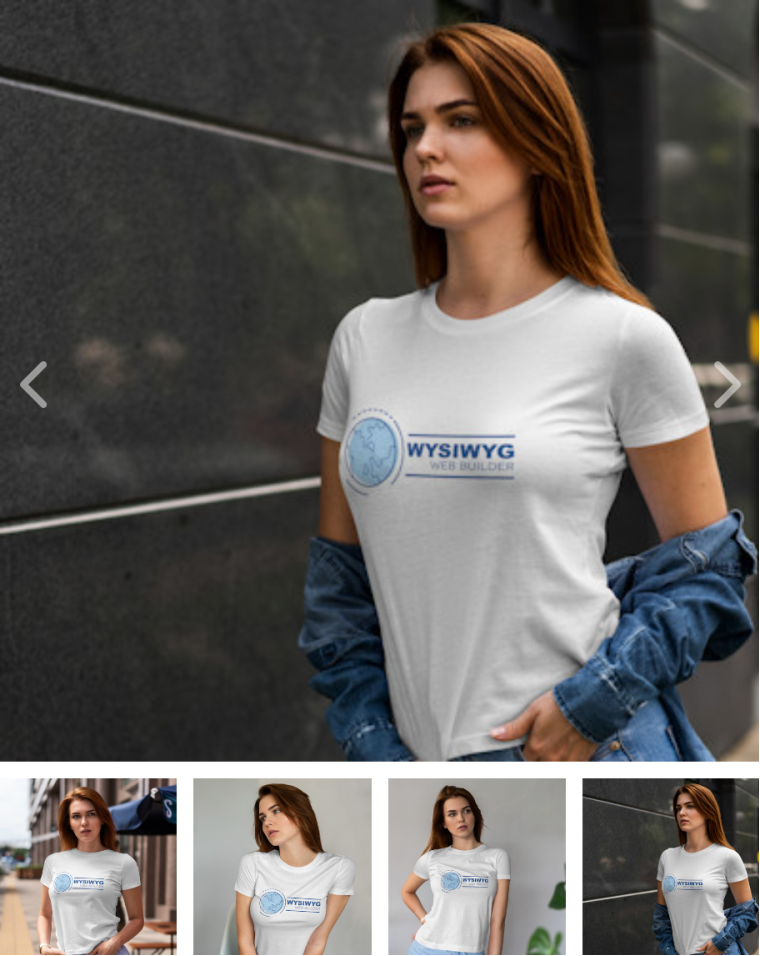
- Added 'Thumbnail Gallery' option: A lightweight, responsive image slider accompanied by carousel-style thumbnail navigation. This feature is particularly useful as an 'eCommerce gallery,' enabling you to elegantly display various product images for showcasing your merchandise. But of course, it can also be used to display any images you like.
Demo:
https://wysiwygwebbuilder.com/support/wb19tryouts/wb19_thumbnailgallery.html
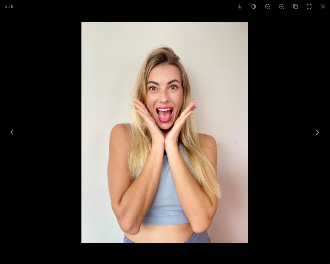
- Added support for ‘Spotlight’ lightbox. Spotlight is modern, lightweight image gallery with great performance and no dependencies (no jQuery or other libraries).
Demo:
https://wysiwygwebbuilder.com/support/wb19tryouts/wb19_spotlight.html
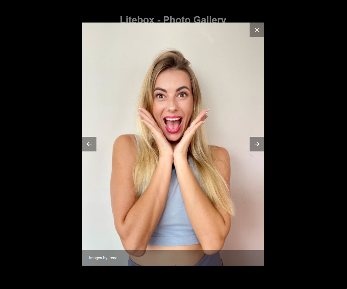
- Added support for ‘Litebox’ lightbox. Litebox is a simple lightweight lightbox to showcase your images with no dependencies (no jQuery or other libraries).
Demo:
https://wysiwygwebbuilder.com/support/wb19tryouts/wb19_litebox.html
Forms
Forms
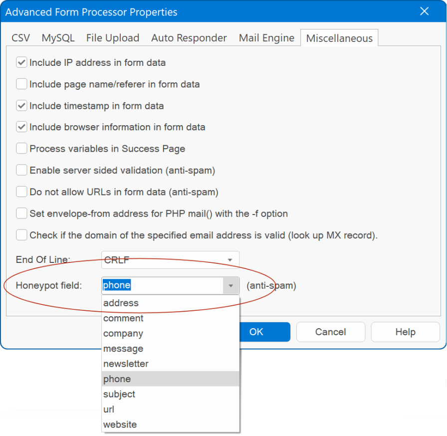
- Added Honeypot Anti-Spam option.
The anti-spam honeypot is a hidden form field that bots can’t avoid filling, but it’s invisible to human users. If the hidden field is filled in, it’s a sign of spambot activity and can be blocked. If the field is not filled in, it indicates that the form was filled in by a human user as intended. The name of the Honeypot Anti-Spam field name can be set in Form Properties -> Advanced -> Miscellaneous.
- Added "Include timestamp in form data" option. This specifies whether to include the time stamp in the form data. Previously this was always included and could not be turned off.
- Added "Include browser information in form data" option. This specifies whether to include the browser information in the form data. Previously this was always included and could not be turned off.
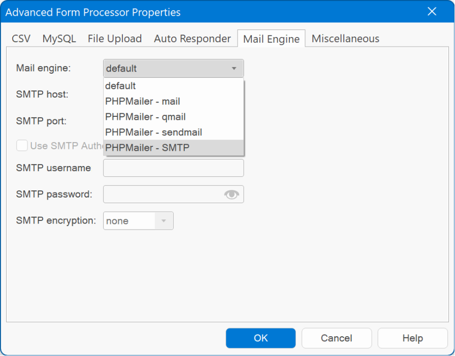
- The Mail Engine settings have been streamlined. The previously existing 'use PHP Mailer instead of standard PHP mail' option has been eliminated. Instead, you'll find a single dropdown menu. When you select 'default,' it will utilize PHP's built-in mail() function. Alternatively, you can choose the PHP Mailer option for other settings.
Form Wizard
Form Wizard
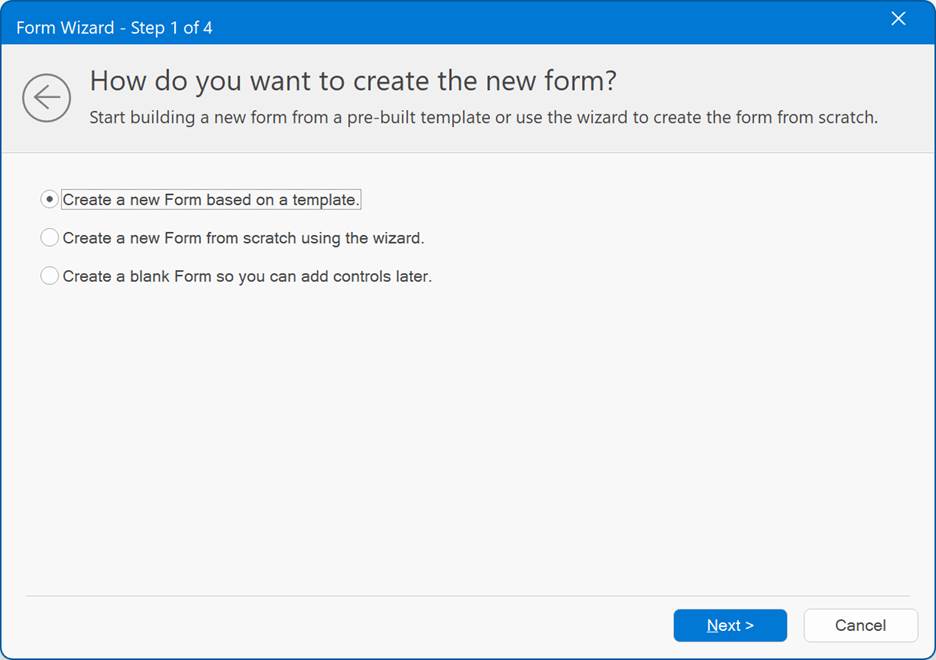
- Form Wizard has undergone a makeover with the 'Aero' style. This not only gives the wizard a contemporary appearance but also allows for resizable windows, enhancing user experience.
File Upload
File Upload
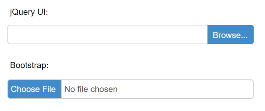
- Added 'Bootstrap' type. This will style the file input with Bootstrap aesthetics using pure CSS. Unlike the jQuery UI version that requires JavaScript, this offers a lightweight alternative for streamlined functionality.
Demo:
https://wysiwygwebbuilder.com/support/wb19tryouts/wb19_fileupload.html
- Added 'Bootstrap' type. This will style the file input with Bootstrap aesthetics using pure CSS. Unlike the jQuery UI version that requires JavaScript, this offers a lightweight alternative for streamlined functionality.
Demo:
https://wysiwygwebbuilder.com/support/wb19tryouts/wb19_fileupload.html
Spinner
Spinner
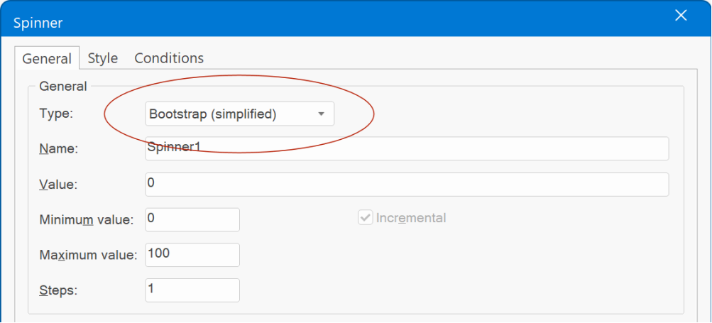
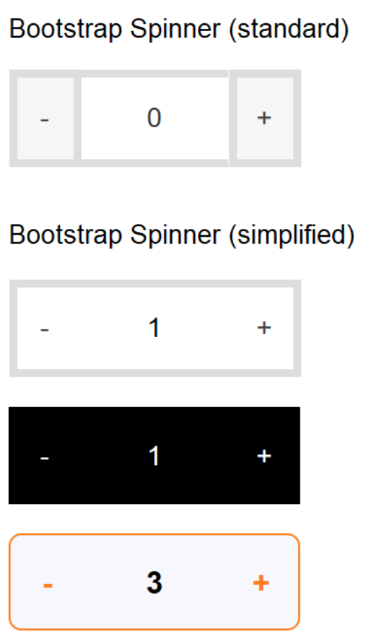
- Added 'Bootstrap Simplified' mode. This will render a simplified spinner without visible button borders, frequently used in eCommerce websites.
Demo:
https://wysiwygwebbuilder.com/support/wb19tryouts/wb19_spinner.html
- Added 'Border width’ property. To control the size of the spinner’s border. Previously this was fixed to 1.
Something 'magical' is coming soon! (teaser)
Tomorrow (Monday), I'll unveil additional features from the list. For today, I want to share a glimpse of the new templates I've created for WWB19.
These are just some random ideas that I came up while testing WWB19.
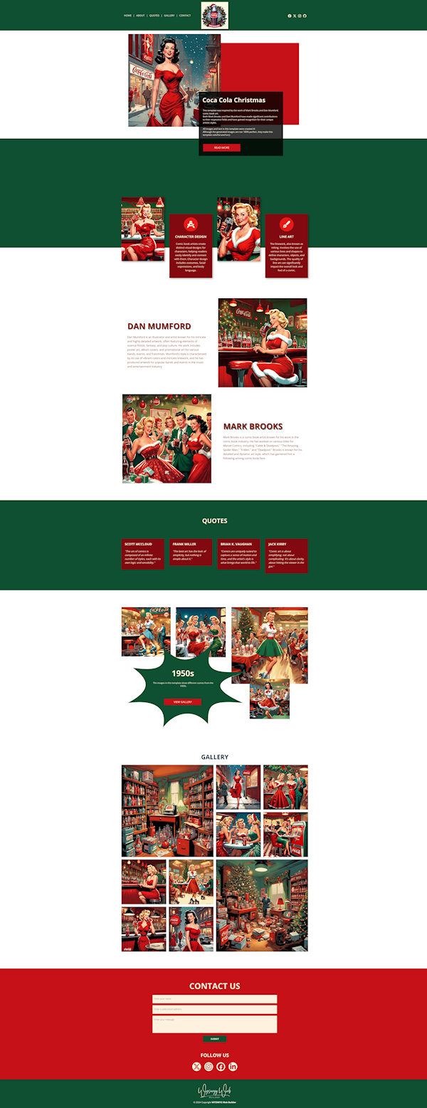
"Fifties Christmas"
Inspired by Dan Mumford and Mark Brook art work. Combined with a Coca Cola Christmas theme...
Preview:
https://www.wysiwygwebbuilder.com/support/wb19tryouts/wb19_fifties_xmas.html
Special features:
- The header scales while scrolling, using scroll transitions.
- The gallery uses the new 'spotlight' lightbox
- All images and text were generated with AI.
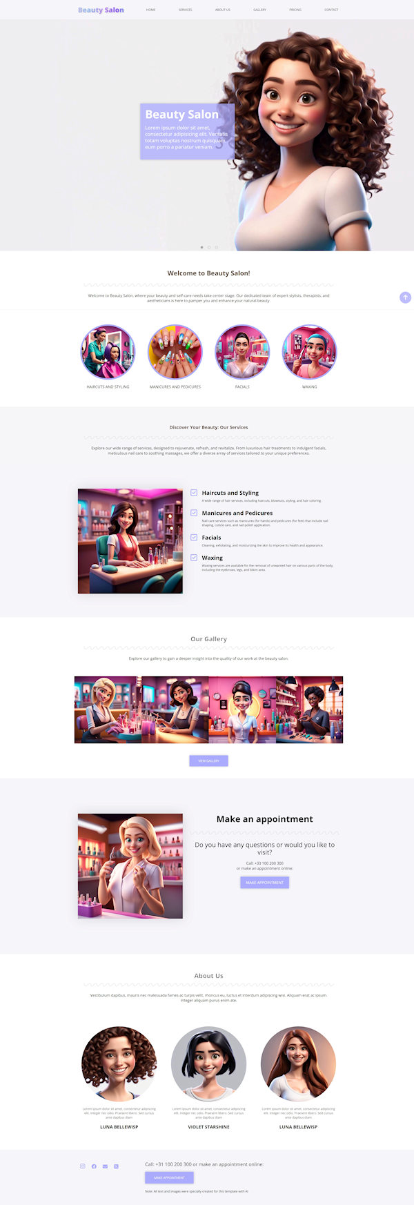
"Beauty Salon"
This is a colorful multi-page template, inspired by Disney Pixar art work.
Preview:
https://www.wysiwygwebbuilder.com/support/wb19tryouts/wb19_beauty.html
Special features:
- A Carousel is used to create a slideshow with fade effect. Each slide has the same text (card), which makes it look like the text is fixed on top of the slideshow.
- When you hover the mouse over the gallery images they will scale, but object itself will not get larger. This was done with the new 'overflow' property of the image.
- All images and text were generated with AI.
"Anime Salon"
This is the same template as the "Beauty Salon" template. However, in this case I have used AI to generate images in Anime style.
Just to give you an idea what you can do with the AI image tools.
Preview:
https://www.wysiwygwebbuilder.com/support/wb19tryouts/wb19_animesalon.html
"Wizzy Wizard"
And finally for today, a template inspired by WYSIWYG Web Builder's new Website Wizard.
I attempted to design a logo using AI to promote the Website Wizard. However, there were so many impressive images that I decided to make a dedicated template for it!
Preview:
https://www.wysiwygwebbuilder.com/support/wb19tryouts/wb19_wizzywizard.html
Timer
Timer
- Added 'Visits' option.
This feature enables you to trigger a timer after a specified number of visits, making it perfect for showcasing introductory dialogs or special offers to new visitors. By default, the timer activates only once, but you also have the option to use a negative number. In this scenario, the count resets after every 'X' visits, allowing for repeated activation as needed.
- Added 'Days' option.
You can now set up timers to activate after a specified number of days following the user's initial visit. By default, the timer activates only once, but you also have the option to use a negative number, which will restart the timer at regular intervals of 'x' days.
- Added 'Date Range' option.
This feature allows you to activate a timer within a specific date range, making it perfect for showcasing special offers or managing your store's operations during holidays and other designated periods.
- Added 'Time Range' option.
This feature enables you to set up timers for specific time ranges, making it perfect for delivering personalized welcome messages such as "Good morning" or "Good afternoon" at the right times of day.
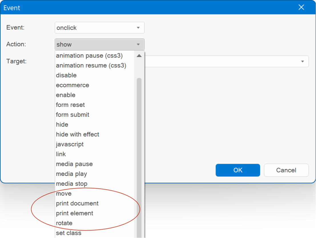
Events
Events
- Added "Print Document' and 'Print Element' actions.
Print Document prints the contents of the current window.
Print Element prints the contents of the specified object.
- Added the ability to select a target (ID) for the JavaScript action. This makes it possible to use the selected ID in the code. For example: alert('$ID$') will result in alert('wb_Heading1'). This means that you no longer have to use a hardcoded ID. If you change the ID of the object in the project, then the code will automatically be updated.
- Added ‘ondocumentready’ to object events.
$(document).ready() is a function used in jQuery, to specify a piece of code that should be executed when the HTML document is fully loaded and the DOM (Document Object Model) is ready for manipulation.
Previously, the 'ondocumentready' event was only accessible through Page events. But there may be situations where you prefer to associate the event directly with an object. This approach can facilitate actions such as seamless copying and pasting of objects with associated events across different pages, or preserving the object as an integral part of a block, which does not include page events.
The new functionality is demonstrated is this example:
https://wysiwygwebbuilder.com/support/wb19tryouts/wb19_events.html
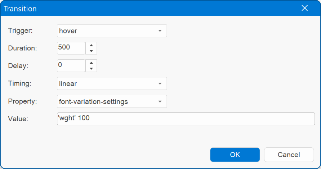
Transitions / Animations
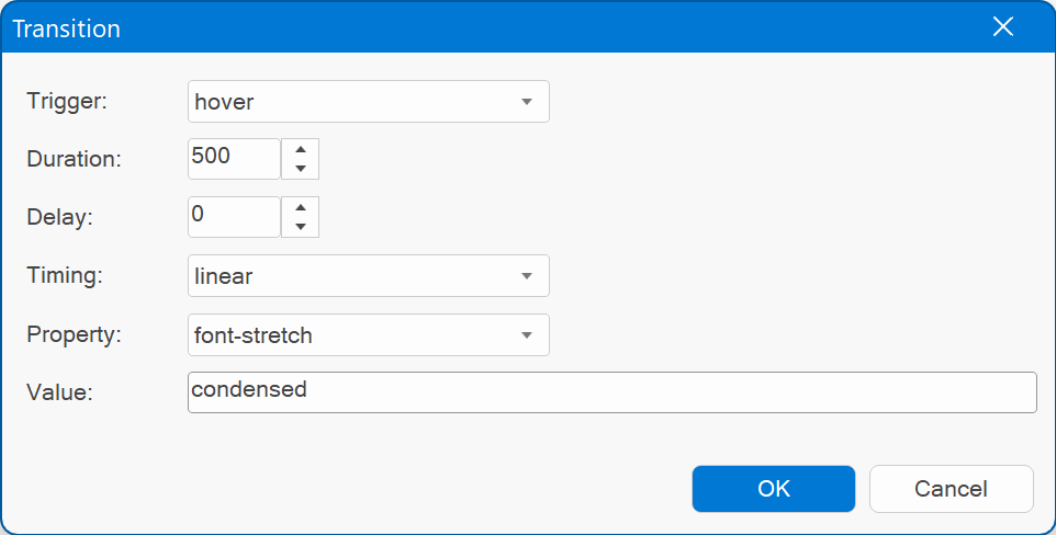
- Added 'font-variation-settings' property. This adds the ability to animate properties of variable fonts, like weight, width, slant etc. Example: 'wght' 100
- Added 'font-stretch' property to animate the compactness of the characters in a font. This property may be specified as a single keyword value (semi-condensed, condensed, extra-condensed, ultra-condensed, semi-expanded, expanded, extra-expanded, ultra-expanded) or a percentage value.
Note: these new options only work with variable fonts!
Demo:
https://wysiwygwebbuilder.com/support/wb19tryouts/wb19_variablefonts_animation.html
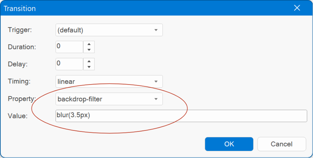
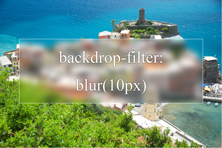
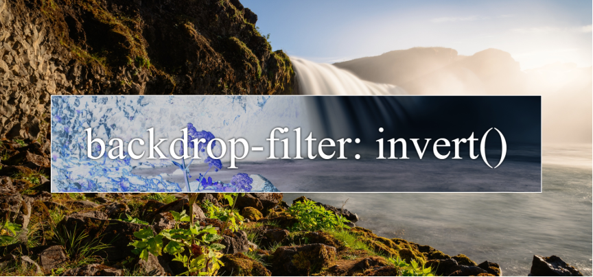
- Added 'backdrop-filter’ property. This lets you apply graphical effects such as blurring or color shifting to the area behind an element.
"Candyland' Template
Here is a preview of the new "Candyland" template that uses the backdrop filter option.
Preview
https://www.wysiwygwebbuilder.com/support/wb19tryouts/wb19_candyland.html
Special features:
- "glass look" by using backdrop filter.
- all images and text generated with AI
- the gallery was implemented with the new "Thumbnail gallery" option.
Just for the fun of it, I've also created a Christmas version of the "Candyland" template:
Preview:
https://www.wysiwygwebbuilder.com/support/wb19tryouts/wb19_candywonderland.html
Ecommerce
PayPal
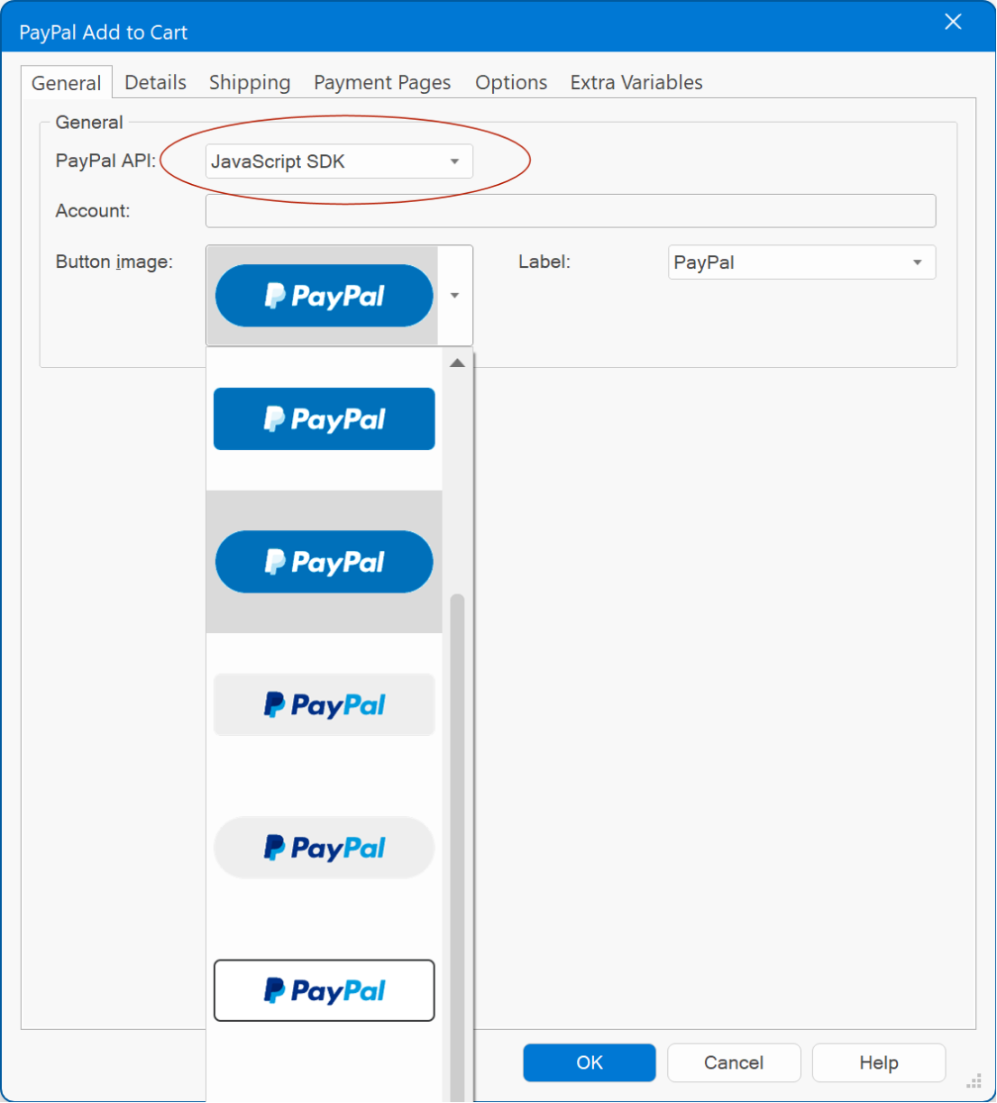
- Added 'JavaScript SDK' option as alternative for the Legacy Payment Button (https://developer.paypal.com/sdk/js/reference/).
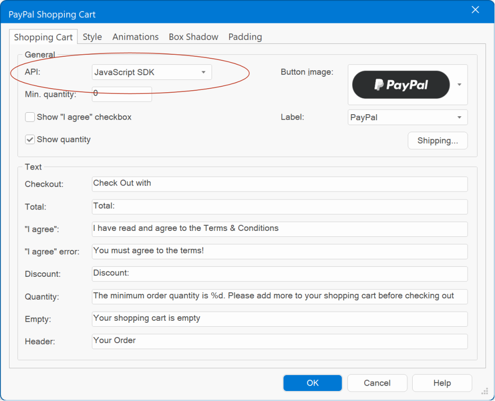
PayPal Shopping Cart
- Added 'Checkout API' property. This specifies whether to use the Legacy Payment Button or JavaScript SDK for checkout.
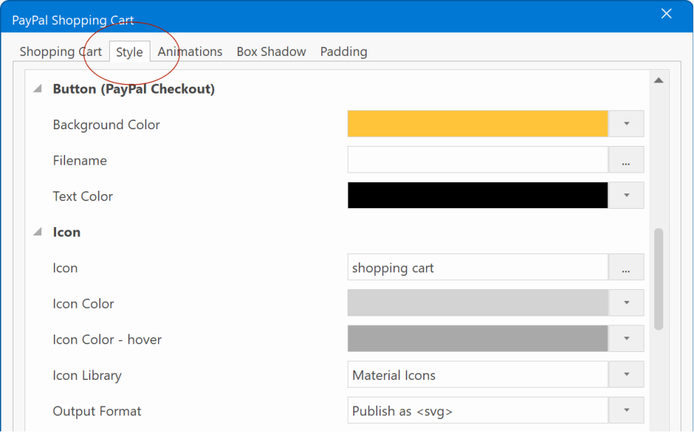
- All style properties are now in a separate ‘Style’ tab.
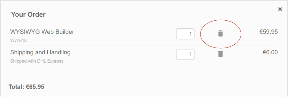
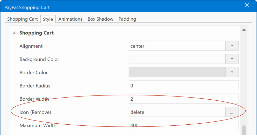
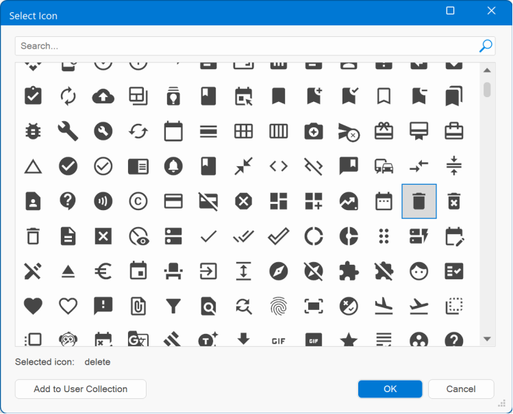
- Added the ability to set a custom icon for the ‘Remove’ button. This can be any icon from the selected Icon Library.
- Also, added the ability to set the border width and color of the shopping cart popup.
'Pharmacy" template
Here's a preview of a new template 'Pharmacy" which uses the updated PayPal Shopping Cart.
Preview:
https://www.wysiwygwebbuilder.com/support/wb19tryouts/wb19_pharmacy.html
Preview:
https://www.wysiwygwebbuilder.com/support/wb19tryouts/wb19_pharmacy.html
Flex Grid
Flex Grid
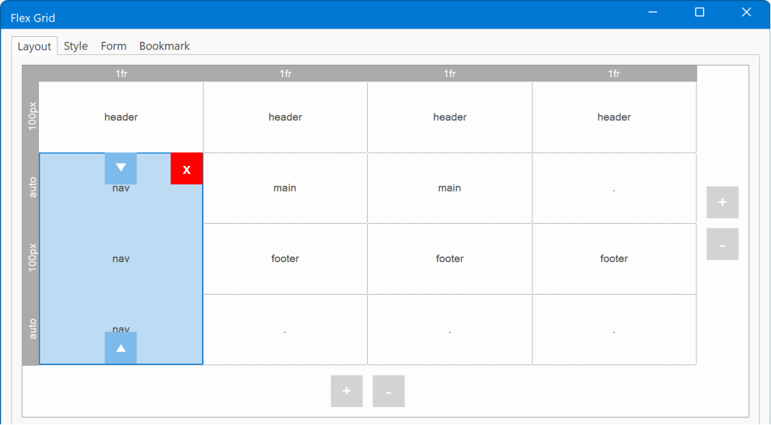
- Added 'Visual grid editor'.
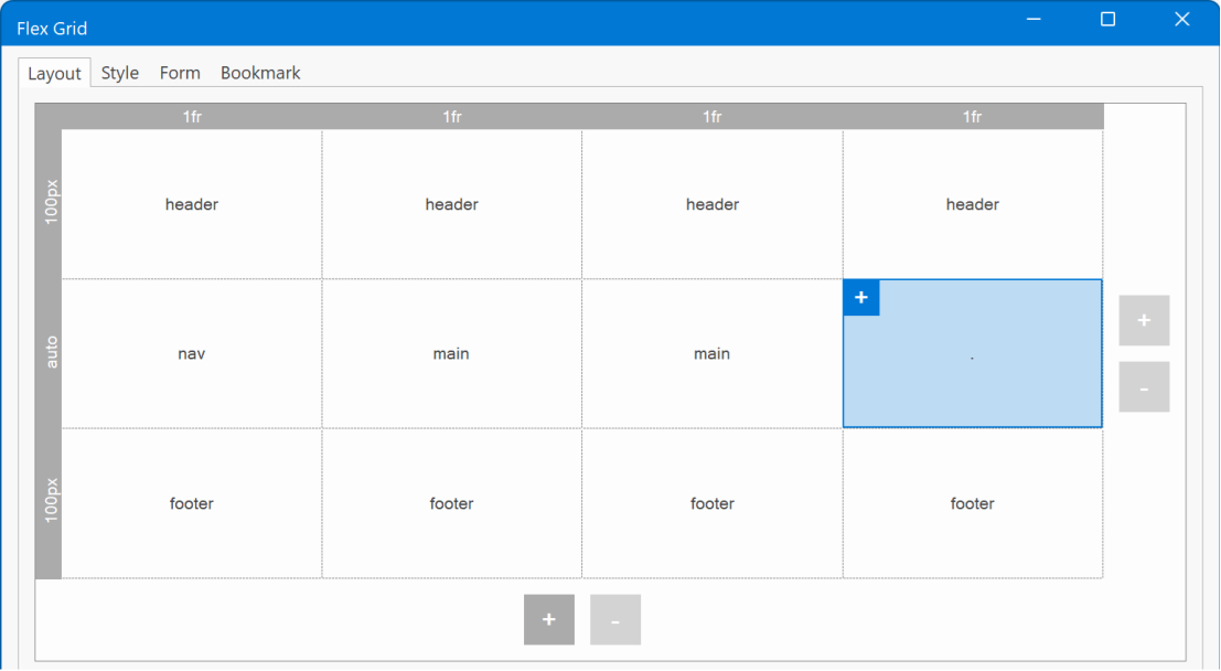
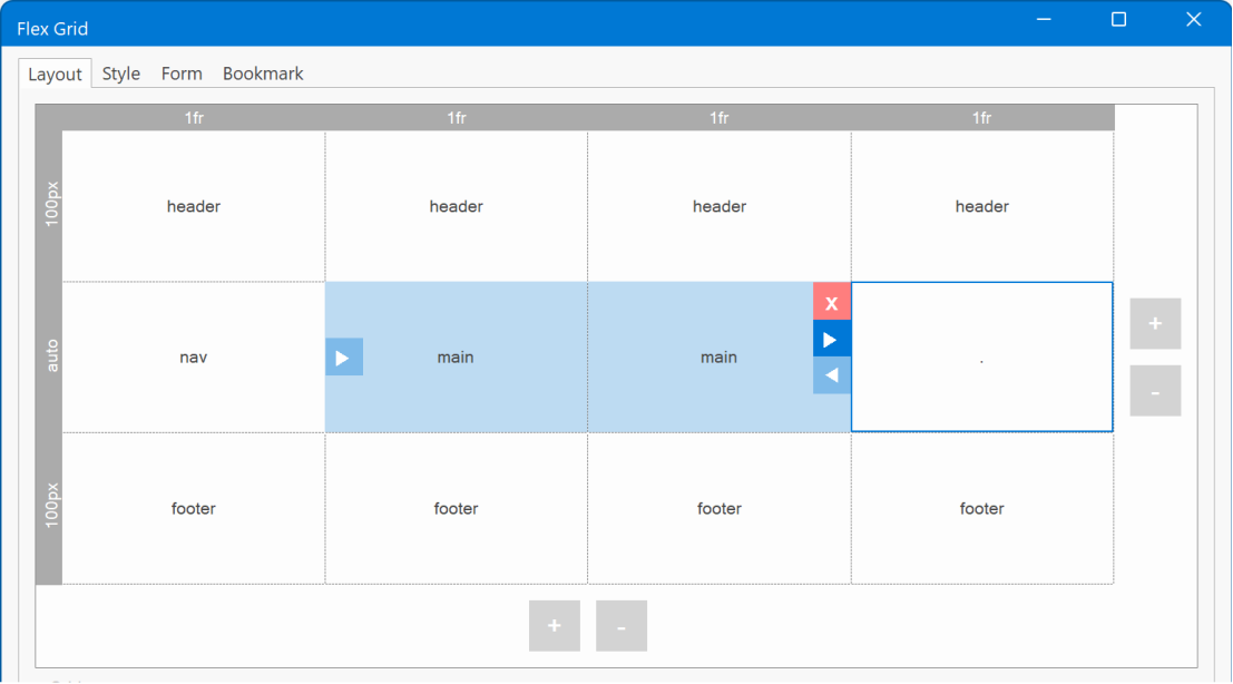
The visual flex grid editor provides a user-friendly interface for arranging grid items in specific row or column structures. You can easily add rows and columns using the '+' and '-' buttons located at the right and bottom of the grid, respectively. When you hover over an item, controls appear, allowing you to manage its appearance within the grid. Adding new grid items is as simple as clicking the '+' button, while existing items can be resized using arrow buttons. Furthermore, removing an item is quick and convenient with the 'Delete' button. The displayed arrows indicate to which sides the grid items can be expanded.
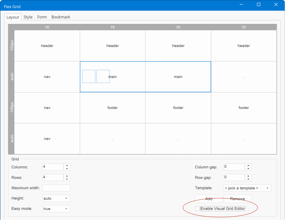
If you rather use the old way of editing the grid, then you can easily switch back to the classic editor by unchecking the ‘Enable Visual Grid editor’ option.
Layers
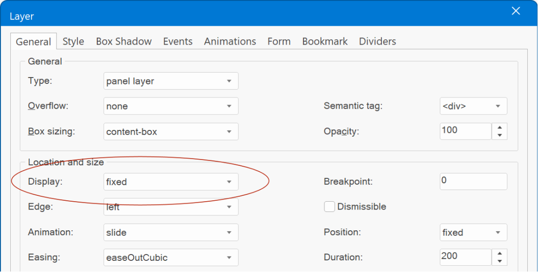
Panel Layer
- Added 'fixed' display mode to Panel Layer. In fixed mode, the panel layer will always be visible.
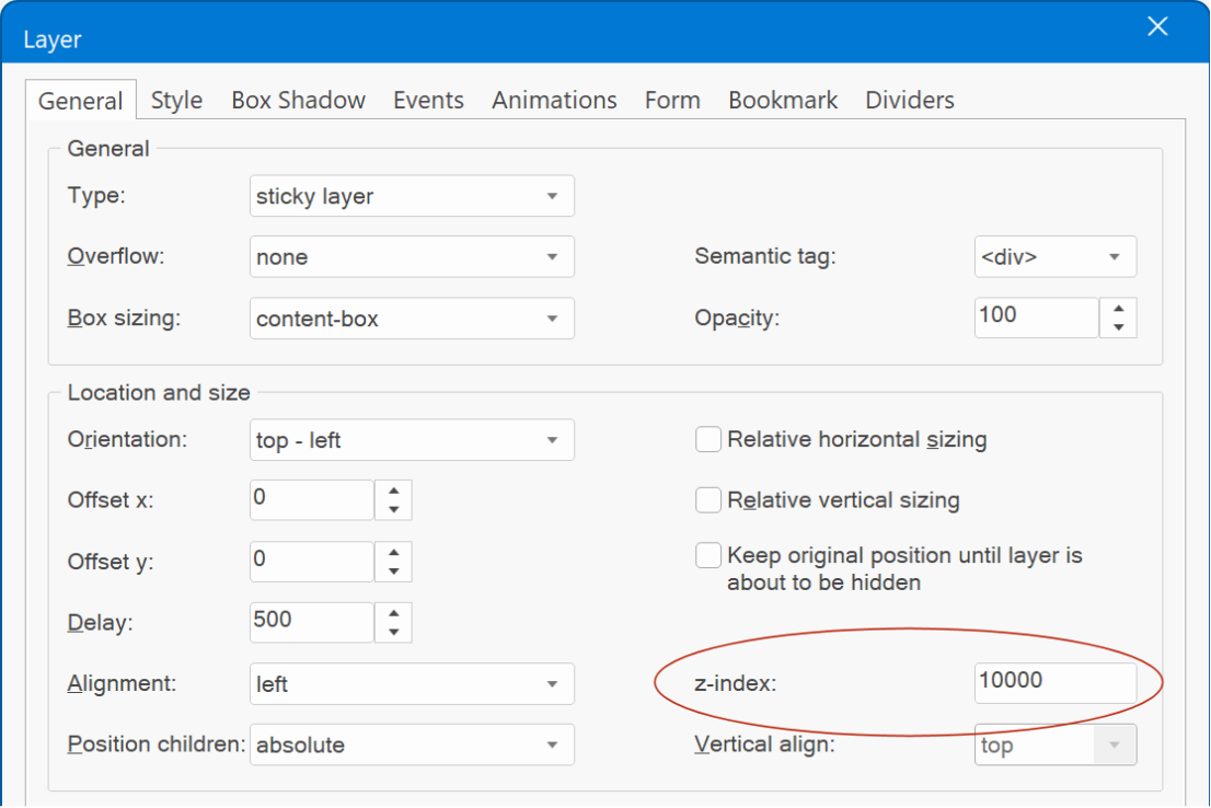
Sticky Layer
- Added 'z-index' property to Sticky Layer. This makes it possible to overwrite the automatically generated z-index. For example, if you want to show the sticky layer to be on top of everything else. Leave the field empty for the default behavior.
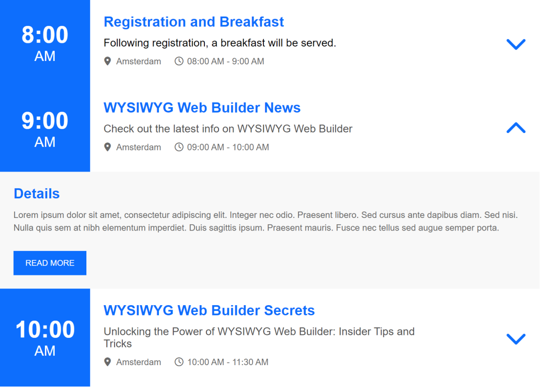
Accordion
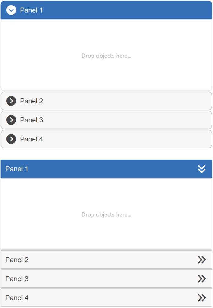
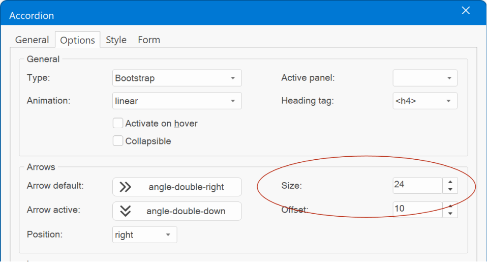
- Added the ability to configure the arrow size. Previously this was fixed to 16 pixels.
Demo:
https://wysiwygwebbuilder.com/support/wb19tryouts/wb19_accordion.html
Tab
- Added ‘Bulma Tabs’ type. This renders a minimalistic version of the tab control featuring simple text and subtle underlines, drawing inspiration from the tabs found in the Bulma CSS framework.
Demo:
https://wysiwygwebbuilder.com/support/wb19tryouts/wb19_tabs.html
Borders Gradient
Borders
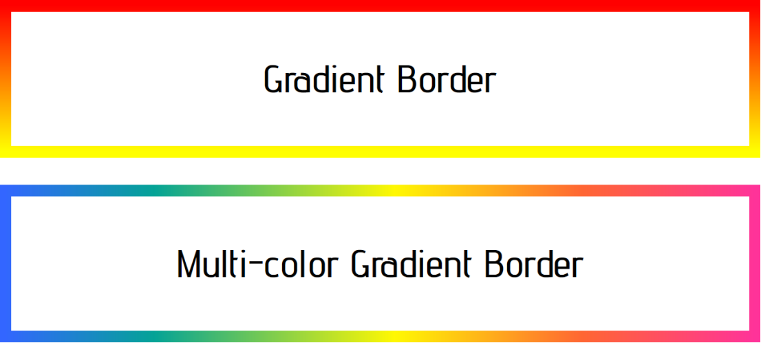
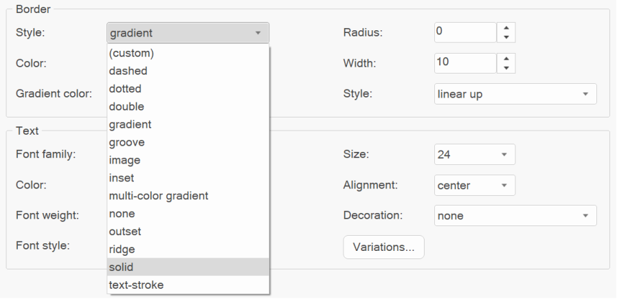
- Added 'Gradient' and 'Multi-color gradient' border styles. This makes it possible to apply a gradient to an object’s border.
Demo:
https://wysiwygwebbuilder.com/support/wb19tryouts/wb19_bordergradient.html
- Added support 'Image' and 'Custom' border styles to Slide Show, Blog, Article, News Feed Ticker, Bullets, Carousel, Auto Complete, Site Search
- Improved: Border style names are now sorted.
Gradients
Gradients
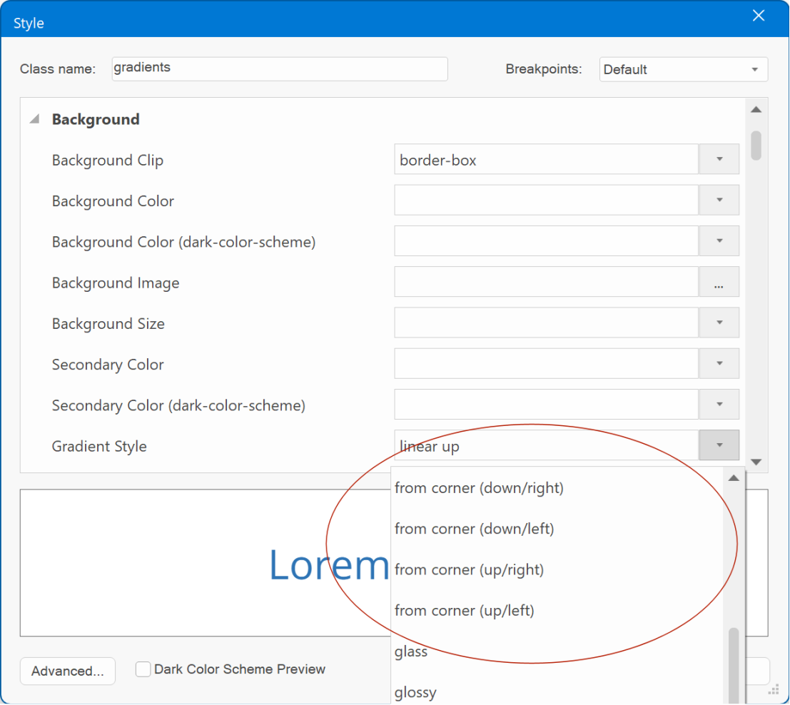
- CSS output is now supported for all built-in gradients, eliminating the need for image fallbacks in the following styles: Linear from Center, Linear to Center, From Corner (down/right), From Corner (down/left), From Corner (up/right), From Corner (up/left). This results in cleaner and more efficient HTML output, enhancing performance.
The gradient styles were also added to all objects that previously did not support these styles: CSS menu, Layer menu, Mega menu, Overlay menu, Panel menu, Slide menu, Tab menu and styles in the Style Manager.
Text Art
Text Art
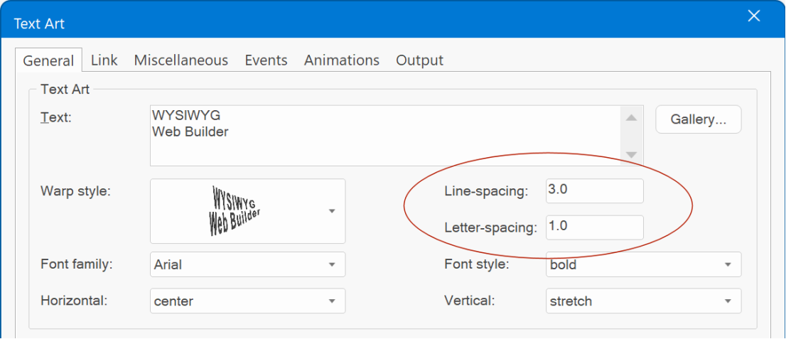
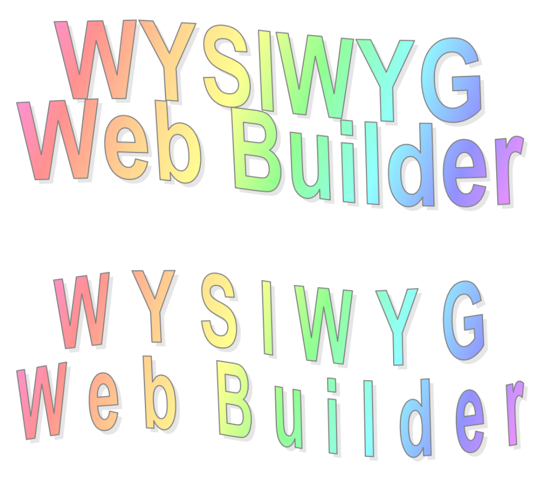
- Added 'Line spacing' property. This feature allows you to precisely control the vertical spacing between lines.
- Added 'Letter spacing' property. This feature allows you to precisely control the horizontal spacing between characters.
- Added 'Line spacing' property. This feature allows you to precisely control the vertical spacing between lines.
- Added 'Letter spacing' property. This feature allows you to precisely control the horizontal spacing between characters.
Ready to use JavaScripts
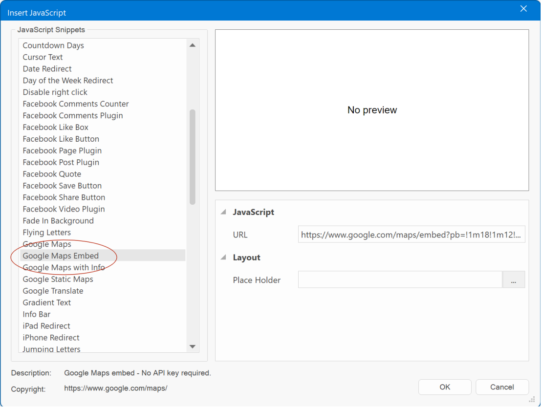
- Added ‘Google Maps Embed’ script. This makes it possible to embed Google Maps without the need for an API key.
This feature in demonstrated here:
https://www.wysiwygwebbuilder.com/support/wb19tryouts/wb19_animesalon_contact.html
- Added the ability to add a preview image to scripts. This will be displayed in the workspace as a place holder, instead of the text-based place holder.
Without preview image:
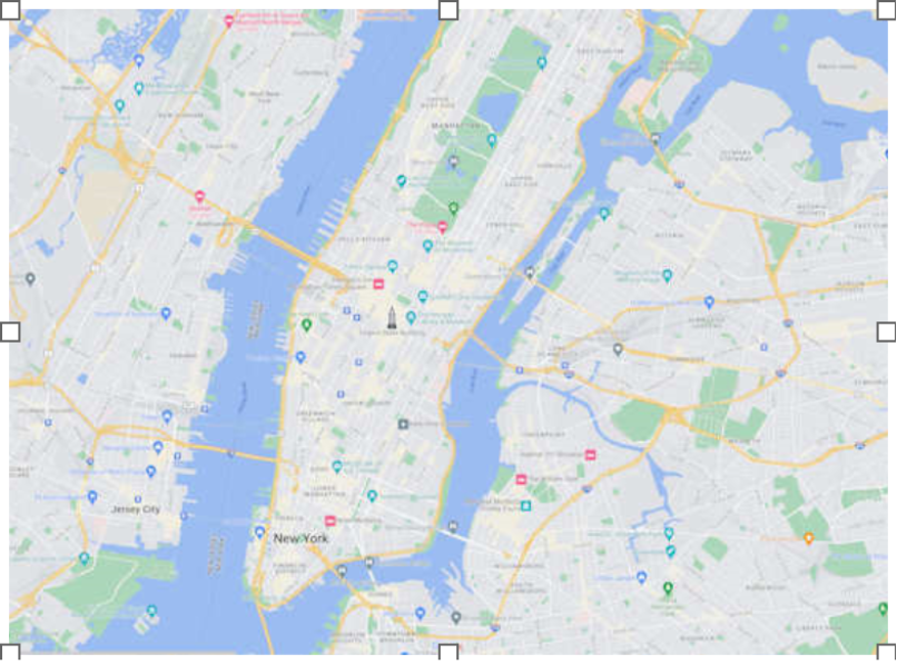
With preview image:
Note that the image will not be published. It is only used during design time.
Navigation
Navigation
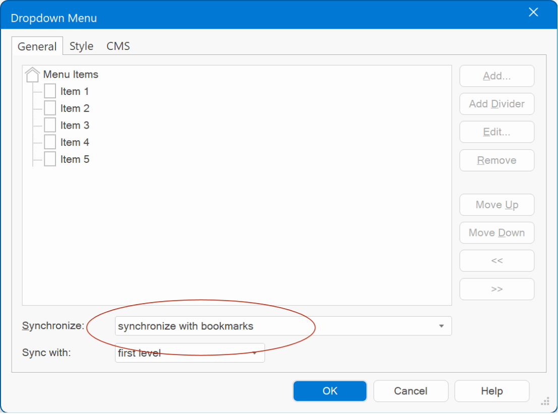
- Added 'synchronize with bookmarks'. This feature can dynamically update the menu based on bookmarks on the same page. This can be useful to automate the menu items of navigation objects on 'single page' websites.
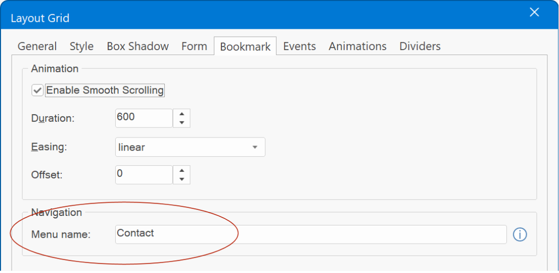
The text that will be used for the automatically generated menu items can be set via the new 'menu name' property available for all objects that support bookmarks: Bookmark, Layer, Layout Grid, Flex Grid, Flex Container and Heading.
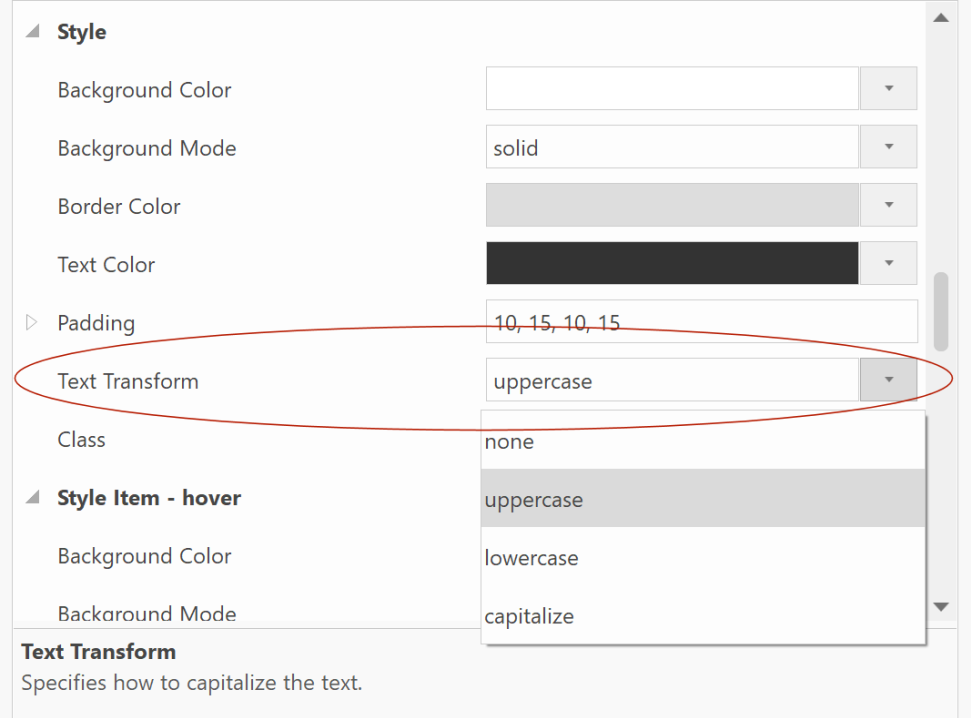
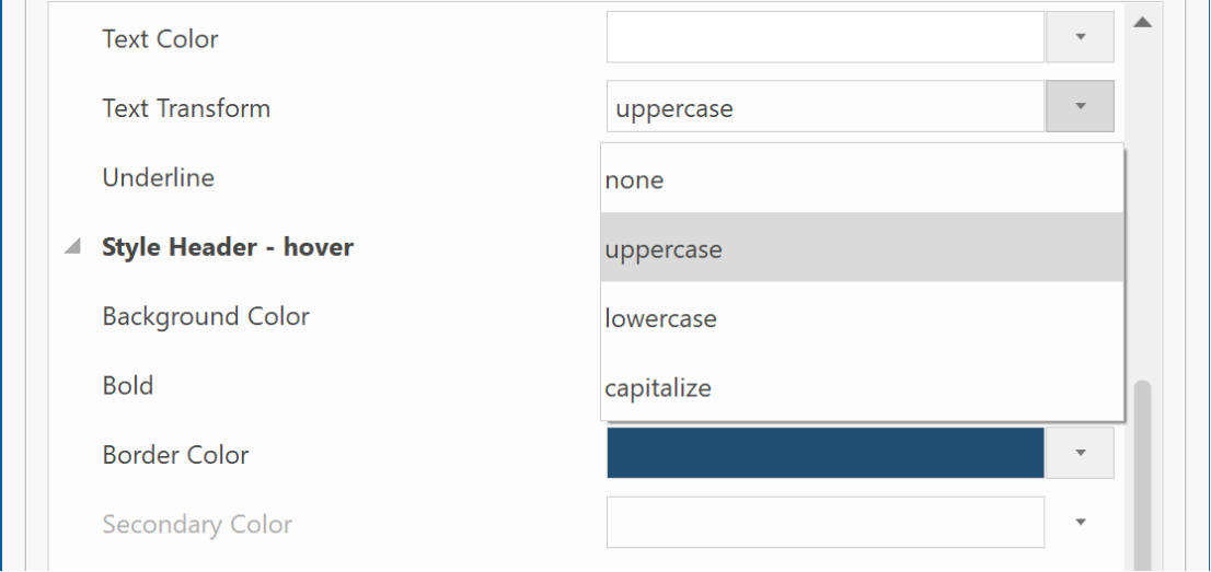
- Added 'text-transform' properties (uppercase, lowercase, capitalize). This feature allows you to easily control the capitalization of text. This can be useful when managing menu items, as it enables swift changes in casing without the need to manually update each item. Moreover, when employing synchronization with the Site Manager, the text can automatically be made uppercase, lowercase or capitalize, streamlining the process further.
This option is available in Breadcrumb, CSS Menu, Dropdown Menu, Go Menu, Layer Menu, Mega Menu, Menu bar, Navigation Bar, Overlay Menu, Panel Menu, Pagination, Responsive Menu, Tab Menu, Text Menu
Drop Down Menu
Drop Down Menu
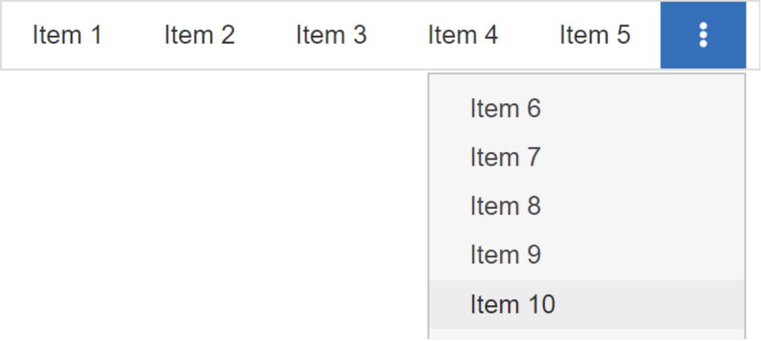
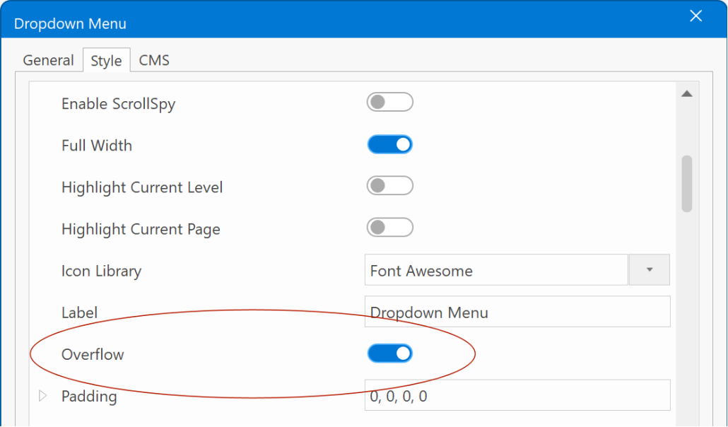
- Added 'overflow' mode. There are times when the drop down has many menu items, and they begin to wrap (undesirable) as the page width decreases. Using overflow mode, you can automatically collapse the extra menu items into a dropdown menu on the right. When the viewport is wide enough, the menu items return to the horizontal menu. When there are no overflowing items, the dropdown menu is hidden.
Demo:
https://wysiwygwebbuilder.com/support/wb19tryouts/wb19_menuoverflow.html
Overflow menus are represented by a 'kebab' button, as the user clicks on the kebab, a horizontal list will appear with additional options to click.
Slide Menu
Slide Menu
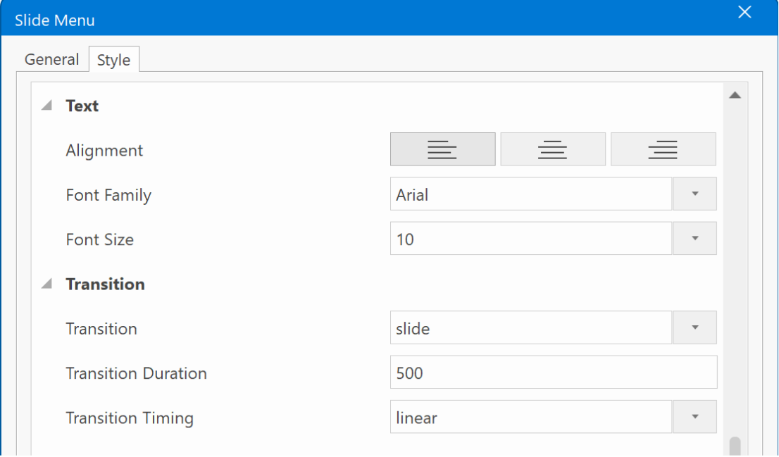
- Added transition duration and easing properties.
- Improved: 'Enable uppercase folder names' has been replaced with 'text-transform'. It now also supports lowercase and capitalize.
- Improved: Script has been converted to vanilla JavaScript (no longer uses jQuery) and moved to wb.slidemenu.min.js, to minimize duplicated code.
Note: the feature list continues on the next page of this topic...