*** SOLVED *** Responsive menu: The indentation of the items is not always correct.
Posted: Wed Sep 18, 2019 8:26 pm
WB 15.0.7 x74 / Windows 7 x64 SP1 / Google Chromium Browser Version 72.0.3750.0 x64 ("Iron" Browser from SRWare)
Hello,
I currently have the problem on my own page that the responsive menu does not display all subentries indented in the "breakpoint" state.
I can open and close a submenu and the items are displayed or hidden correctly, but the indentation of the items is not always correct.
Here is an example with the identical page in two browser windows of different widths.
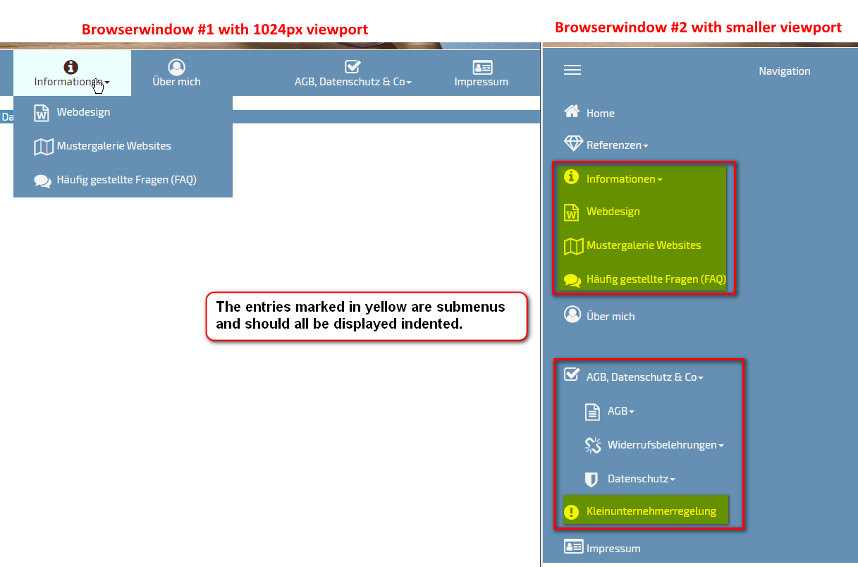
[Correction: The entry "Informationen" should not be marked yellow, because this is the parent node. Sorry for the wrong drawing.]
What could be the reason for this?
Thank you very much for your hints.
Markus
Hello,
I currently have the problem on my own page that the responsive menu does not display all subentries indented in the "breakpoint" state.
I can open and close a submenu and the items are displayed or hidden correctly, but the indentation of the items is not always correct.
Here is an example with the identical page in two browser windows of different widths.
[Correction: The entry "Informationen" should not be marked yellow, because this is the parent node. Sorry for the wrong drawing.]
What could be the reason for this?
Thank you very much for your hints.
Markus