Page 1 of 1
Google mobile usability
Posted: Sat Aug 15, 2020 6:04 am
by levitmic
Greetings all,
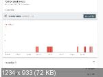
I have a problem with one page:
https://drevelina.co.il/article2
1. Text too small to read
2. Clickable elements too close together (i don't have on this page)
And at the same time google-mobile friendly test - PASS (sometimes - FAILL, but run once again - PASS)
using last version, 15.4.0 (today updated to 15.4.5)
Thanks,
Re: Google mobile usability
Posted: Sat Aug 15, 2020 6:28 am
by Pablo
1. You can set the font-size to anything you like. You can also have difference font-size for different device sizes.
https://www.wysiwygwebbuilder.com/responsive_text.html
2. To add spacing between elements you can use 'margin'.
Re: Google mobile usability
Posted: Sat Aug 15, 2020 8:05 am
by levitmic
Pablo,
In all breakpoints correspond style (different font size). Once google sees that right(PASS), another time not.
I can't find the problem.
attached project:
https://we.tl/t-ZsjK4fvI16
Re: Google mobile usability
Posted: Sat Aug 15, 2020 10:28 am
by Pablo
Where in your project do I need to look to see the problem?
Can you please be more specific?
Notes:
It's not common to add a 1280 breakpoint to your page. 1280 is usually the default view and all breakpoints should be lower.
If you share your project to get help then please remove all non-relevant content from the project.
Related FAQ:
https://www.wysiwygwebbuilder.com/forum ... 10&t=82134
Re: Google mobile usability
Posted: Sat Aug 15, 2020 11:48 am
by levitmic

article2.php in Site Manager
font style: article_txt
Thanks,
Re: Google mobile usability
Posted: Sat Aug 15, 2020 12:42 pm
by Pablo
What do I need to do to see the problem?
What did you expect to happen?
Can you please be more specific?
Re: Google mobile usability
Posted: Sat Aug 15, 2020 1:23 pm
by levitmic
Google Mobile Usability in quite frequently says that i have a problem with Text too small to read and Clickable elements too close together.
I don't have any clickable elements in article2(I think so). Also text size is 13px. Where are these problems located i don't know.
I also have no idea where to look.


Re: Google mobile usability
Posted: Sat Aug 15, 2020 2:52 pm
by Pablo
My advise:
- remove the 1280 breakpoint
- use response fonts, and make the font larger on smaller screens.


