Responsive Menu
Posted: Wed Nov 27, 2019 7:53 am
I am using "responsive menu" in grid layout however, the menu breaks into mobile mode at 975px.
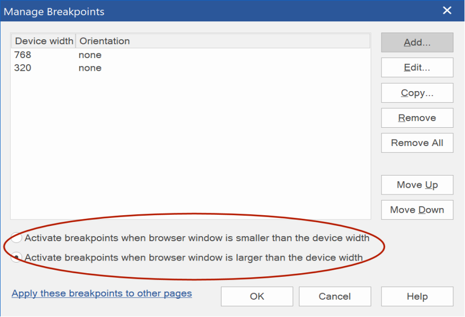
I have breakpoints set to 480px in both the menu settings and the grid layer setting. Nothing I am doing will cause the menu to remain as a desktop menu below 975px. Both desktop and ipads are viewing menu in mobile mode.
I have tried starting a completely new project with only the menu and a grid layout an no difference. The menu default is 768px break but that setting doesn't seem to do anything.
Windows 10 pro 64bit up to date.
wysiwyg 15.2.1
firefox 70.0.1
Chrome 78.0.3904.108
Microsoft Edge