WYSIWYG Web Builder 12 (teaser)
- Pablo
- Posts: 24166
- Joined: Sun Mar 28, 2004 12:00 pm
- Location: Europe
- Contact:
WYSIWYG Web Builder 12 (teaser)
The next major version of WYSIWYG Web Builder (WWB12) is planned for later this year, this will be a major upgrade with more than 125 new features and improvements!
This post will give you a sneak peak at some of these new features, it will be regularly updated with new information, so make sure you don't miss anything...
The release date is unknown at this time. But we tell you more as soon as we know it!
This post will give you a sneak peak at some of these new features, it will be regularly updated with new information, so make sure you don't miss anything...
The release date is unknown at this time. But we tell you more as soon as we know it!
- Pablo
- Posts: 24166
- Joined: Sun Mar 28, 2004 12:00 pm
- Location: Europe
- Contact:
Blocks
Blocks
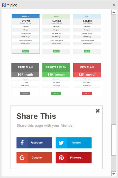
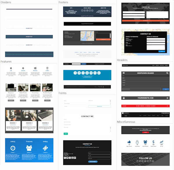
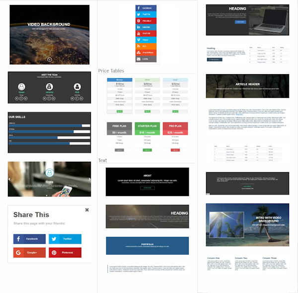
Version 12 introduces the "Blocks' toolbox. Blocks are ‘building blocks’ that make it possible to quickly create a website by dragging predefined blocks to the work-space.
Blocks are basically just a group of standard WWB objects, so once dragged to the page you can fully customize the behavior and appearance of the content.
Using Blocks greatly simplifies the way you can build websites with WYSIWYG Web Builder. Also it helps new users get started more easily, in case they are overwhelmed by the many features of the software...
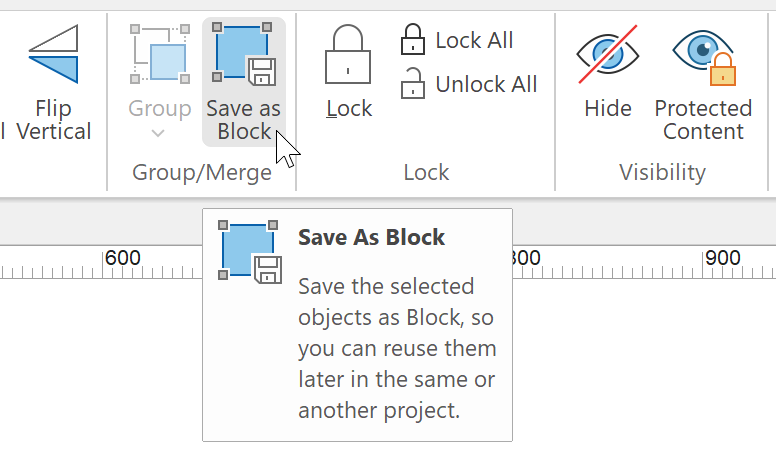
WWB12 includes a whole bunch of standard blocks to help you get started, but you can also create your own blocks (by saving a group of objects as 'Block'), so you can reuse them in other pages or projects. Also, additional ‘Block packs’ will be available in the download section of the website.
The 'Blocks' feature alone already adds dozens of new features and ideas to WWB! Example of included Blocks are: Headers, Footers, Dividers, Forms, Video Background, Counters, Features, Social Sticky, Read More, Price Tables, Share This, Fullscreen Intros and much more…


- Pablo
- Posts: 24166
- Joined: Sun Mar 28, 2004 12:00 pm
- Location: Europe
- Contact:
Scroll Transitions
Scroll Transitions
WWB12 adds support for scroll transitions. This allows you to animate CSS properties of objects depending on the position of the scrollbar.
For example, you can set the opacity (fading) of an object based on the scroll position, or move/rotate/scale objects into place when it scrolls into view.
Examples:
https://www.wysiwygwebbuilder.com/suppor ... ions1.html
https://www.wysiwygwebbuilder.com/suppor ... ions2.html
https://www.wysiwygwebbuilder.com/suppor ... ions3.html
https://www.wysiwygwebbuilder.com/suppor ... color.html
https://www.wysiwygwebbuilder.com/suppor ... dient.html
https://www.wysiwygwebbuilder.com/suppor ... flyin.html
This feature is also demonstrated in this template:
https://www.wysiwygwebbuilder.com/suppor ... ibiza.html
- Pablo
- Posts: 24166
- Joined: Sun Mar 28, 2004 12:00 pm
- Location: Europe
- Contact:
Open Graph Meta Tags
Open Graph Meta Tags
Added support for Open Graph Meta Tags in Page Properties->Meta tags. These settings make it easy to add Open Graph meta tags to a page to enable it to become a "rich" social object. For instance, Facebook uses this information to work out how to preview shared content in a user's Facebook profile.
The following properties are supported: og:url, og:title, og::description, og::image and og::type
https://developers.facebook.com/docs/sh ... ers#markup

- Pablo
- Posts: 24166
- Joined: Sun Mar 28, 2004 12:00 pm
- Location: Europe
- Contact:
Flexbox
Flexbox
WB12 adds support for CSS3 flexbox.
Flexbox is a new CSS layout mode that introduces a powerful way to lay out, align and distribute objects. Flexbox consists of flex containers and flex items.
Flex items (the objects inside a flex container) can be laid out horizontally or vertically, aligned and distributed in various ways. It is also possible to stretch or shrink objects to fill the available empty space.
Here's a live demo:
https://www.wysiwygwebbuilder.com/support/flexbox.html


- Pablo
- Posts: 24166
- Joined: Sun Mar 28, 2004 12:00 pm
- Location: Europe
- Contact:
Layout Grid
Layout Grid
- Improved: gutter, padding and margin are now responsive, so they can have different values in breakpoints.
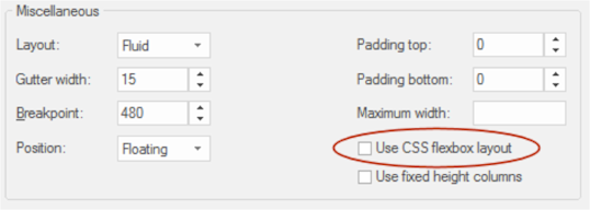
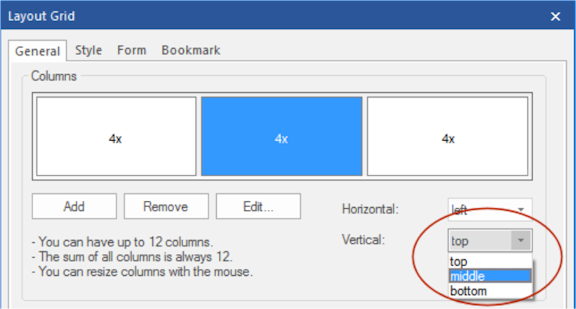
- New feature: Added 'Use Flexbox' option. When this option is enabled, the grid will use CSS flexbox layout. This results in cleaner code and also enables some extra features like vertical alignment and entire column will be filled with the background.
Note that this is a relative new CSS feature, it is not supported by older browsers (< IE11). http://caniuse.com/#feat=flexbox
- New feature: Use different column widths in breakpoints.
- New feature: Use different column counts in breakpoint.
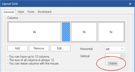
- New feature: Added the ability to hide columns in breakpoints.
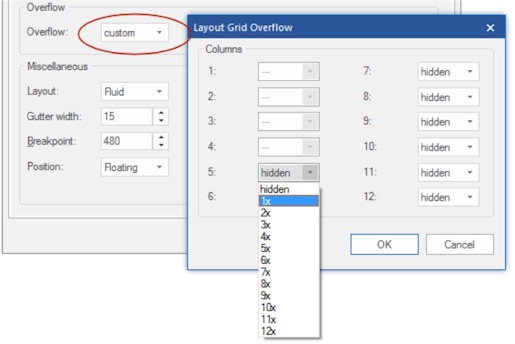
- New feature: Added 'overflow' option. This determines what happens when columns do not fit in the current row. Overflow columns can be hidden, 100% or have custom value.
- New feature: Added vertical alignment option to columns. Note this only works when CSS flexbox is used!
- New feature: Added the ability to set the layout grid fixed to the top of the page (as page header).
- New feature: Added background overlay option. This uses the specified background color (and alpha value) to add an overlay to the background image.
Demo:
https://www.wysiwygwebbuilder.com/suppor ... anced.html


- Pablo
- Posts: 24166
- Joined: Sun Mar 28, 2004 12:00 pm
- Location: Europe
- Contact:
Layers
Layers
- Improved: margins of floating layers are now responsive, so they can have different values in breakpoints.
- New feature: Added option to select semantic HTML5 tag instead of generic <div>. Available options: <article>, <aside>, <footer>, <header>, <nav>, <section>

- New feature: Added background overlay option. This uses the specified background color (and alpha value) to add and an overlay to the background image (see also Layout Grid for more details).

- New feature: Added the ability to use a video as background. Supported are Youtube and Vimeo URLs. This is especially useful for full width/full screen layers.
Note: this feature is also available for Layout grids and Page headers/footers!

- New feature: Added ‘Position children’ option. By default, child elements of the layer use absolute positions so you can place them anywhere you want. By using 'floating' mode the objects inside the layer will float instead of having a fixed position. This can be useful when using floating layers which are set to 'Relative horizontal sizing' to create fluid layouts.

- New feature: Added ‘100vh’ to floating mode options. This will set the height of the layer to 100% of the viewport. This can be useful to create floating layers with a relative horizontal size. For example, to create full height columns.

Demo (100vh and floating layout):
https://www.wysiwygwebbuilder.com/support/wb ... eight.html
- Improved: margins of floating layers are now responsive, so they can have different values in breakpoints.
- New feature: Added option to select semantic HTML5 tag instead of generic <div>. Available options: <article>, <aside>, <footer>, <header>, <nav>, <section>

- New feature: Added background overlay option. This uses the specified background color (and alpha value) to add and an overlay to the background image (see also Layout Grid for more details).

- New feature: Added the ability to use a video as background. Supported are Youtube and Vimeo URLs. This is especially useful for full width/full screen layers.
Note: this feature is also available for Layout grids and Page headers/footers!

- New feature: Added ‘Position children’ option. By default, child elements of the layer use absolute positions so you can place them anywhere you want. By using 'floating' mode the objects inside the layer will float instead of having a fixed position. This can be useful when using floating layers which are set to 'Relative horizontal sizing' to create fluid layouts.

- New feature: Added ‘100vh’ to floating mode options. This will set the height of the layer to 100% of the viewport. This can be useful to create floating layers with a relative horizontal size. For example, to create full height columns.

Demo (100vh and floating layout):
https://www.wysiwygwebbuilder.com/support/wb ... eight.html
- Pablo
- Posts: 24166
- Joined: Sun Mar 28, 2004 12:00 pm
- Location: Europe
- Contact:
Checkbox/Radio Button
Checkbox/Radio Button
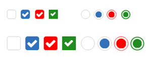
- New feature: It is now possible to customize the style (and size) of the Checkbox/Radio Button object to override the default browser appearance. This also make the Checkbox/Radio Button responsive so it can have a different size (and color) in breakpoints.
This new behavior can be disabled with the 'use default browser styling' (This is enabled for older projects for backwards compatibility).

- Pablo
- Posts: 24166
- Joined: Sun Mar 28, 2004 12:00 pm
- Location: Europe
- Contact:
Form Conditions and Calculations
Form Conditions
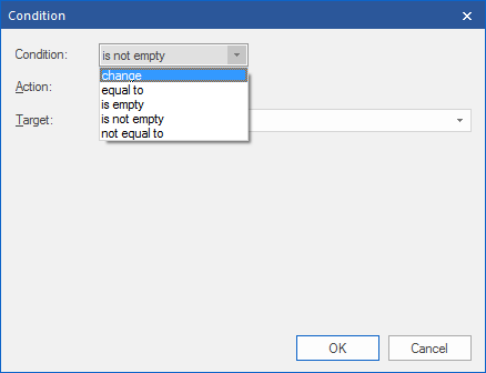
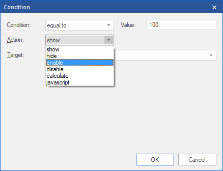
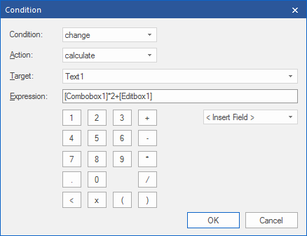
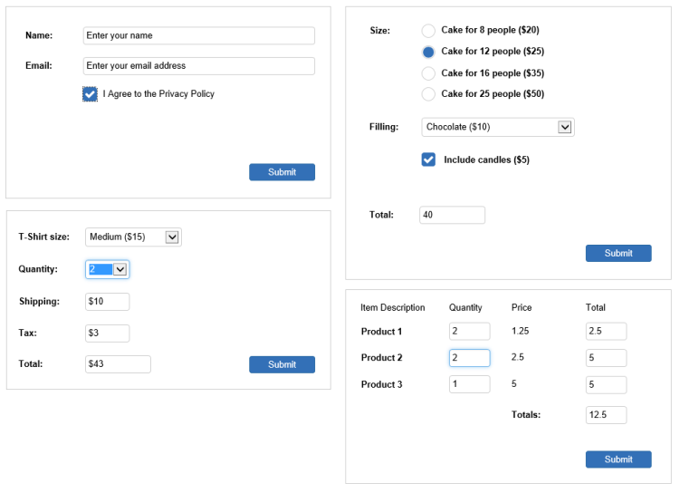
- New feature: Added 'Conditions'. This makes it possible to show/hide/enable/disable other objects based on the value or selection of a form input field. For example, you can disable the form's submit button until the user checks a box.
Form Calculations
- New feature: Added the possibility to do basic calculations in form fields. Calculations are available in the 'Conditions' section of input fields. They can be used to calculate a value based on the values or selections of other input fields. For example, to calculate the total price of an item in a web shop based on the selected options.
Conditions/calculations options are available for Editbox, TextArea, Combobox, Checkbox and Radio Button.
Demos:
https://www.wysiwygwebbuilder.com/suppor ... ions1.html
https://www.wysiwygwebbuilder.com/suppor ... ions2.html
https://www.wysiwygwebbuilder.com/suppor ... ions3.html
https://www.wysiwygwebbuilder.com/suppor ... ions4.html


- Pablo
- Posts: 24166
- Joined: Sun Mar 28, 2004 12:00 pm
- Location: Europe
- Contact:
Forms
Forms
- New feature: Added support for variables in the subject of the email message (PHP Mailer or rich text must be enabled).
- New feature: Added the ability to set ID property for hidden fields.
- New feature: Added option to include page name/referrer in form data.
- New feature: Added option to configure the auto responder email input field.
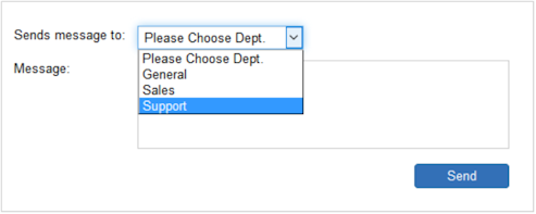
- New feature: Added the ability to send form data to an email address based on the selection in a combobox. Users can select a 'department' from a dropdown menu, and have the email sent to just that department's email address.

- Pablo
- Posts: 24166
- Joined: Sun Mar 28, 2004 12:00 pm
- Location: Europe
- Contact:
File Upload
File Upload
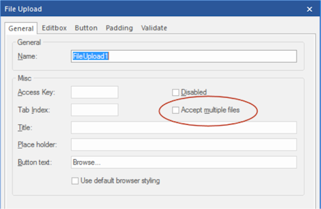
- New feature: Added 'Accept multiple files' option. To select multiple files, hold down the CTRL or SHIFT key while selecting.
- New feature: It is now possible to customize the style of the File Upload object. The button and editbox each can have their own styling. This new behavior can be disabled with the 'use default browser styling' (This is enabled for older projects for backwards compatibility).
- New feature: Added 'Padding' option. Note: left padding will be used for the editbox and the right padding for the button.
- New feature: Added 'Place Holder' option. Specifies a short hint to help the user to fill out the input field.
- New feature: Added "Button text' option. This makes it possible to customize the text of the button.


- Pablo
- Posts: 24166
- Joined: Sun Mar 28, 2004 12:00 pm
- Location: Europe
- Contact:
Rollover Layer
Rollover Layer
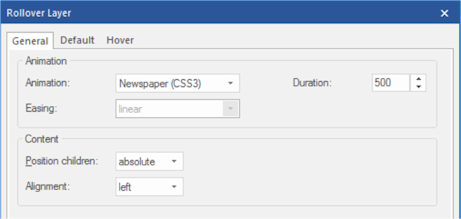
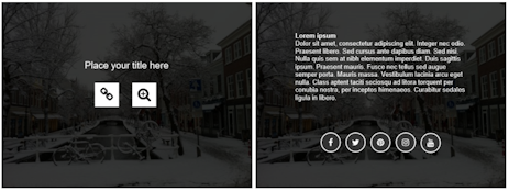
- New feature: Added 'RollOver Layer' object. A RollOver Layer works just like the RollOver image, but instead of just images you can now use any type of objects. Both the ‘Default’ and ‘Hover’ layer can be fully customized for endless possibilities.
In additional to fixed mode (where you can place objects anywhere you want), the RollOver Layer also supports floating mode so it can be used in Layout grids.
Examples:
https://www.wysiwygwebbuilder.com/support/wb ... layer.html


- Pablo
- Posts: 24166
- Joined: Sun Mar 28, 2004 12:00 pm
- Location: Europe
- Contact:
Carousel
Carousel
- New feature: Added 'Full Page' support. An easy way to create fullscreen scrolling websites (also known as single page websites or onepage sites).
Demo:
https://www.wysiwygwebbuilder.com/suppor ... lpage.html
Example template:
https://www.wysiwygwebbuilder.com/suppor ... phone.html
- New feature: Added 'CSS3 animation' option. Select animations created with the Animation Manager. A different animation can be selected for 'show' and 'hide' to create sophisticated animation effects.

- New feature: Added 'News Paper' and 'Flip Horizontal/Vertical' animations.

- New feature: Added 'Full Page' support. An easy way to create fullscreen scrolling websites (also known as single page websites or onepage sites).
Demo:
https://www.wysiwygwebbuilder.com/suppor ... lpage.html
Example template:
https://www.wysiwygwebbuilder.com/suppor ... phone.html
- New feature: Added 'CSS3 animation' option. Select animations created with the Animation Manager. A different animation can be selected for 'show' and 'hide' to create sophisticated animation effects.

- New feature: Added 'News Paper' and 'Flip Horizontal/Vertical' animations.

- Pablo
- Posts: 24166
- Joined: Sun Mar 28, 2004 12:00 pm
- Location: Europe
- Contact:
jQuery / jQuery UI
jQuery
- New feature: Added support for jQuery 3. This version is slimmer and faster than previous versions.

jQuery UI
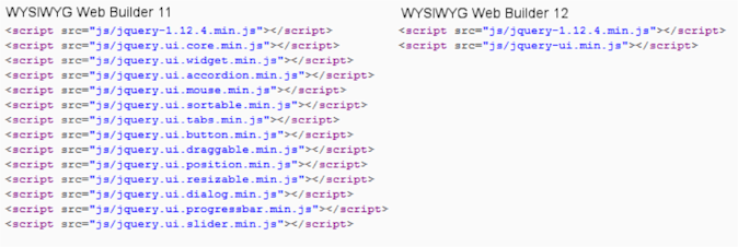
- Improved: Upgraded to the latest version of jQuery UI. All jQuery UI scripts are combined in one file (jquery-ui.min.js instead of jquery.ui.widget.min.js, jquery.ui.accordion.min.js, jquery.ui.effect.min.js etc.). This reduces the number of generated files which may help speed up loading of your pages.
All internal scripts have been updated.
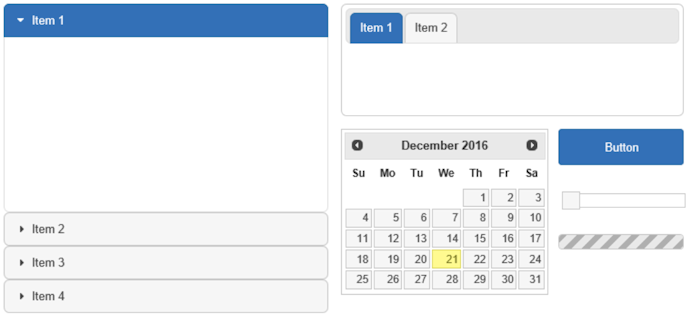
- New feature: A new jQuery UI theme ‘base’ has been added:
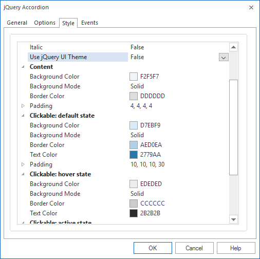
- New feature: Added the ability to customize the colors of the jQuery UI widgets (Tabs, Accordion, Dialog, Slider, Date Picker etc.) independently of the jQuery UI theme. Set ‘Use jQuery UI Theme’ to false to control the colors of each widget individually.
Tabs
- New feature: Tabs can now be part of a layout grid!
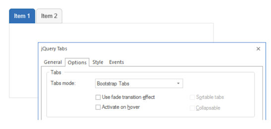
- New feature: Added support for Bootstrap tabs. This will use Bootstrap’s tab script instead of jQuery UI Tabs. This will result in a smaller footprint because it does not depend on the jQuery UI framework.
- New feature: Added floating mode to Tabs. When this option is enabled objects inside the tabs float instead of having a fixed position. This is recommended for flexible layouts with layout grids.

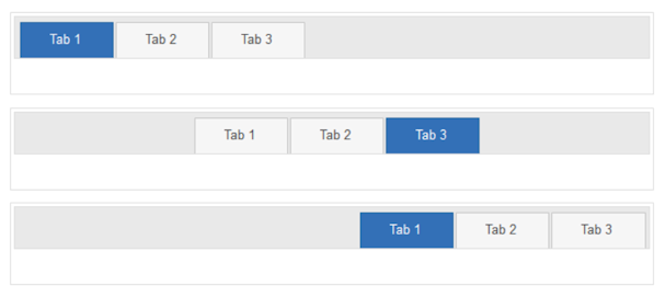
- New feature: Added the ability to align the navigation tabs in the header.
Accordion
- New feature: Accordions can now be part of a layout grid!
- New feature: Added support for the Bootstrap Accordion. This will use Bootstrap’s collapse script instead of jQuery Accordion. This will result in a smaller footprint because the jQuery UI framework does not need to be included.
- New feature: Added floating mode to Accordion. When this option is enabled objects inside the panels float instead of having a fixed position. This is recommended for flexible layouts with layout grids.
jQuery Dialog
- Improved: The jQuery Dialog can now have sizes and different layouts in breakpoints.
and more...
- New feature: Added support for jQuery 3. This version is slimmer and faster than previous versions.

jQuery UI
- Improved: Upgraded to the latest version of jQuery UI. All jQuery UI scripts are combined in one file (jquery-ui.min.js instead of jquery.ui.widget.min.js, jquery.ui.accordion.min.js, jquery.ui.effect.min.js etc.). This reduces the number of generated files which may help speed up loading of your pages.
All internal scripts have been updated.

- New feature: A new jQuery UI theme ‘base’ has been added:

- New feature: Added the ability to customize the colors of the jQuery UI widgets (Tabs, Accordion, Dialog, Slider, Date Picker etc.) independently of the jQuery UI theme. Set ‘Use jQuery UI Theme’ to false to control the colors of each widget individually.

Tabs
- New feature: Tabs can now be part of a layout grid!
- New feature: Added support for Bootstrap tabs. This will use Bootstrap’s tab script instead of jQuery UI Tabs. This will result in a smaller footprint because it does not depend on the jQuery UI framework.

- New feature: Added floating mode to Tabs. When this option is enabled objects inside the tabs float instead of having a fixed position. This is recommended for flexible layouts with layout grids.

- New feature: Added the ability to align the navigation tabs in the header.

Accordion
- New feature: Accordions can now be part of a layout grid!
- New feature: Added support for the Bootstrap Accordion. This will use Bootstrap’s collapse script instead of jQuery Accordion. This will result in a smaller footprint because the jQuery UI framework does not need to be included.
- New feature: Added floating mode to Accordion. When this option is enabled objects inside the panels float instead of having a fixed position. This is recommended for flexible layouts with layout grids.
jQuery Dialog
- Improved: The jQuery Dialog can now have sizes and different layouts in breakpoints.
and more...
- Pablo
- Posts: 24166
- Joined: Sun Mar 28, 2004 12:00 pm
- Location: Europe
- Contact:
Master Object/Page
Master Object/Page
- New feature: Master objects can now be used inside a Layout Grid. The object becomes flexible/floating when it's part of a layout grid.
- New feature: Master objects can now be used inside a Layout Grid. The object becomes flexible/floating when it's part of a layout grid.
- Pablo
- Posts: 24166
- Joined: Sun Mar 28, 2004 12:00 pm
- Location: Europe
- Contact:
PNG/JPEG compression
PNG/JPEG compression
- New feature: Added PNG/JPEG compression for dynamically generated images (shapes, drawing tools, images with filters etc.). This makes it possible to optimize images for quality or performance (larger images look better but take more time to download and process). Support 10 levels.

- New feature: Added PNG/JPEG compression for dynamically generated images (shapes, drawing tools, images with filters etc.). This makes it possible to optimize images for quality or performance (larger images look better but take more time to download and process). Support 10 levels.

- Pablo
- Posts: 24166
- Joined: Sun Mar 28, 2004 12:00 pm
- Location: Europe
- Contact:
Merged Object
Merged Object
- New feature: Added support for Events and CSS3 animations/transitions.
An example of this feature is demonstrated in the ‘Social Media Sticky’ block. Here we have merged a fontawesome icon with a text object
Demo:
https://www.wysiwygwebbuilder.com/suppor ... wyork.html


- New feature: Added support for Events and CSS3 animations/transitions.
An example of this feature is demonstrated in the ‘Social Media Sticky’ block. Here we have merged a fontawesome icon with a text object
Demo:
https://www.wysiwygwebbuilder.com/suppor ... wyork.html


- Pablo
- Posts: 24166
- Joined: Sun Mar 28, 2004 12:00 pm
- Location: Europe
- Contact:
Multi-Page Properties
Multi-Page Properties
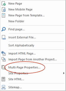
- New feature: Added Multi-Page Properties tool to modify selected properties for multiple (selectable) pages at once. This makes it possible for example to quickly change the master page for a group of pages. But also, background properties, meta tags, page extension etc. Only the modified value(s) will be applied to all selected pages!
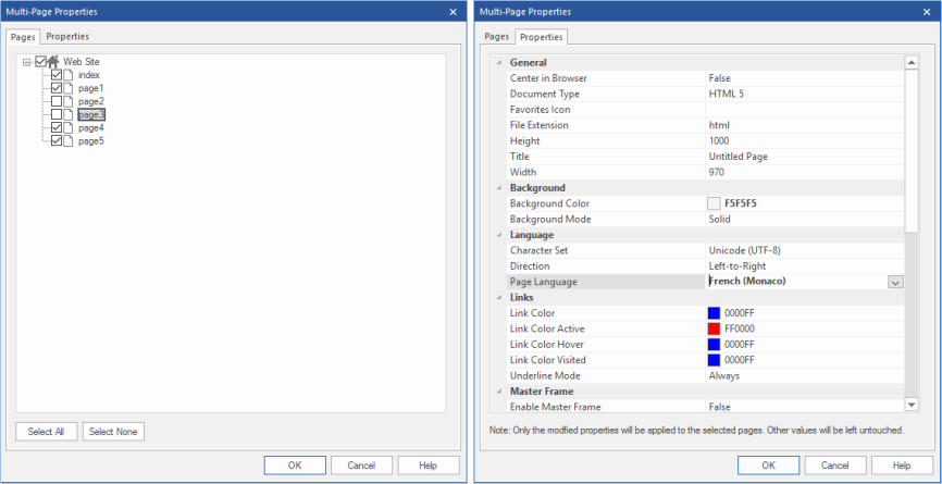
- New feature: Added Multi-Page Properties tool to modify selected properties for multiple (selectable) pages at once. This makes it possible for example to quickly change the master page for a group of pages. But also, background properties, meta tags, page extension etc. Only the modified value(s) will be applied to all selected pages!


- Pablo
- Posts: 24166
- Joined: Sun Mar 28, 2004 12:00 pm
- Location: Europe
- Contact:
HTML/CSS
HTML/CSS
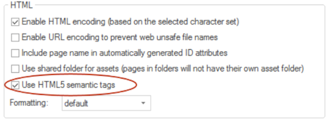
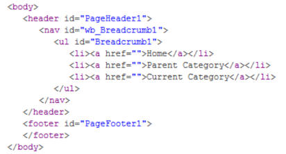
- New feature: Added the ability to use semantic HTML5 tags. Tools->Options->HTML->Use HTML5 Semantic Tags. When this option is enabled WWB will automatically output semantic HTML5 tags instead of divs. For example, page header <header> page footer <footer>, navigation <nav>.
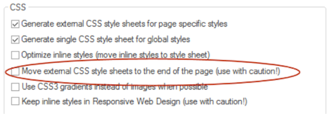
- New feature: Added 'Move external CSS style sheets to the end of the page'. This is often recommended by Google PageSpeed Insights to improve the performance of the page. Note however that this also may affect the way to page is rendered because styles are loaded after the content has been load, resulting in flicker. Also some scripts may not support this because they expect the style to be between the head tags. Please read the help for more details!
- New feature: Added 'CSS visibility property' (visibility vs display) HTML/CSS options. This option controls the way objects are hidden. When using 'visibility:hidden' hidden objects will not be visible but they still affect the layout (just like in previous versions of WWB). On the other hand 'display:none' removes the object from the layout so it no longer affects the size of the page. This can be useful when hiding objects that are not inside the page boundaries in breakpoints.

- New feature: Added the ability to use semantic HTML5 tags. Tools->Options->HTML->Use HTML5 Semantic Tags. When this option is enabled WWB will automatically output semantic HTML5 tags instead of divs. For example, page header <header> page footer <footer>, navigation <nav>.


- New feature: Added 'Move external CSS style sheets to the end of the page'. This is often recommended by Google PageSpeed Insights to improve the performance of the page. Note however that this also may affect the way to page is rendered because styles are loaded after the content has been load, resulting in flicker. Also some scripts may not support this because they expect the style to be between the head tags. Please read the help for more details!

- New feature: Added 'CSS visibility property' (visibility vs display) HTML/CSS options. This option controls the way objects are hidden. When using 'visibility:hidden' hidden objects will not be visible but they still affect the layout (just like in previous versions of WWB). On the other hand 'display:none' removes the object from the layout so it no longer affects the size of the page. This can be useful when hiding objects that are not inside the page boundaries in breakpoints.

- Pablo
- Posts: 24166
- Joined: Sun Mar 28, 2004 12:00 pm
- Location: Europe
- Contact:
Text
Text
- Improved: When using "enable responsive fonts" the text alignment is now also responsive, so you can have different alignments in breakpoints.
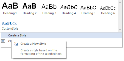
- New feature: Text styles now display a style gallery with preview. To quickly modify a style, right and select ‘Modify’.

- New feature: Add 'Create a style' option. Create a style based on the formatting of the selected text.
Spell Checker
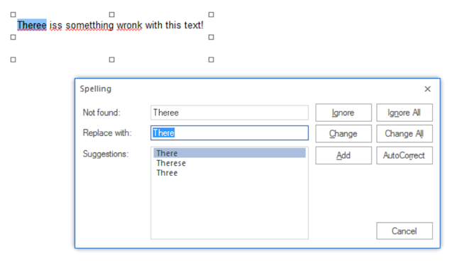
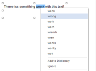
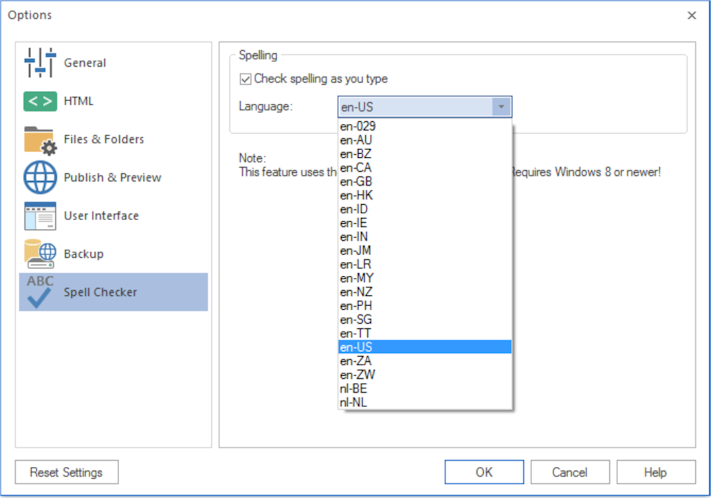
- New feature: Added support for native Windows spell checker. With 'spell as you type', 'Checking spelling' dialog (F7) and context menu suggestions. Supports all language dictionaries you have installed in Windows. Requires Windows 8, 8.1 or 10!
- Improved: When using "enable responsive fonts" the text alignment is now also responsive, so you can have different alignments in breakpoints.
- New feature: Text styles now display a style gallery with preview. To quickly modify a style, right and select ‘Modify’.

- New feature: Add 'Create a style' option. Create a style based on the formatting of the selected text.

Spell Checker
- New feature: Added support for native Windows spell checker. With 'spell as you type', 'Checking spelling' dialog (F7) and context menu suggestions. Supports all language dictionaries you have installed in Windows. Requires Windows 8, 8.1 or 10!


- Pablo
- Posts: 24166
- Joined: Sun Mar 28, 2004 12:00 pm
- Location: Europe
- Contact:
Table
Table
- Improved: The sort tool now includes all data in the table. So, for example if you sort a column then the other columns will be moved too. Also, the style of the cells will be included, not only the text, so cells keep their own styling.
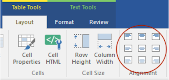
- New feature: Added cell alignment options to the Ribbon and context menu of the table to quickly set the alignment of one or multiple table cells.
- New feature: Added border-collapse option. The border-collapse property sets whether the table borders are collapsed into a single border or detached as in standard HTML.


- New feature: Added the possibility to set the border-width of table cells. This replaces 'enable cell borders'.
- New feature: Added 'Striped row color' option to add zebra-striping to the table rows.


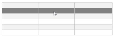
- New feature: Added 'Hover rows color' option to enable a hover state on table rows.

- New feature: Added 'Header row' option. This will output the first row as header cells (<th> instead or <td>).

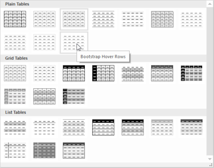
- New feature: Added 'Table Styles' gallery. This allows you to quickly update the style of your tables. You may know this feature from MS Office. 30 predefined styles are currently available.
- New feature: Added size mode 'Automatic' (in addition to 'pixels' and 'percentages'). When using this mode, the table cells will be automatically sized based on their content. This makes it possible to use a table in layout grid layouts.

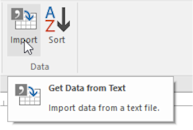
- New feature: Added 'Import data from text file'. A quick way to get data from a comma separated text file into the table.
- New feature: Added the possibility to add objects inside table cells. When you drag an object inside a cell then it will automatically become an object container. Any text that was in the table cell will no longer be visible (until you remove the object again). Multiple objects can be inside a single cell and they will be floating, just like in a layout grid. Note however that tables are not meant to be used for layout purposes. The main reason why this functionality was added is to make it possible to add images to the table. For example, as part of a list.

- Improved: The sort tool now includes all data in the table. So, for example if you sort a column then the other columns will be moved too. Also, the style of the cells will be included, not only the text, so cells keep their own styling.
- New feature: Added cell alignment options to the Ribbon and context menu of the table to quickly set the alignment of one or multiple table cells.

- New feature: Added border-collapse option. The border-collapse property sets whether the table borders are collapsed into a single border or detached as in standard HTML.


- New feature: Added the possibility to set the border-width of table cells. This replaces 'enable cell borders'.
- New feature: Added 'Striped row color' option to add zebra-striping to the table rows.


- New feature: Added 'Hover rows color' option to enable a hover state on table rows.


- New feature: Added 'Header row' option. This will output the first row as header cells (<th> instead or <td>).

- New feature: Added 'Table Styles' gallery. This allows you to quickly update the style of your tables. You may know this feature from MS Office. 30 predefined styles are currently available.

- New feature: Added size mode 'Automatic' (in addition to 'pixels' and 'percentages'). When using this mode, the table cells will be automatically sized based on their content. This makes it possible to use a table in layout grid layouts.

- New feature: Added 'Import data from text file'. A quick way to get data from a comma separated text file into the table.

- New feature: Added the possibility to add objects inside table cells. When you drag an object inside a cell then it will automatically become an object container. Any text that was in the table cell will no longer be visible (until you remove the object again). Multiple objects can be inside a single cell and they will be floating, just like in a layout grid. Note however that tables are not meant to be used for layout purposes. The main reason why this functionality was added is to make it possible to add images to the table. For example, as part of a list.

- Pablo
- Posts: 24166
- Joined: Sun Mar 28, 2004 12:00 pm
- Location: Europe
- Contact:
Picture
Picture
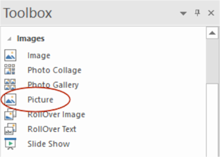
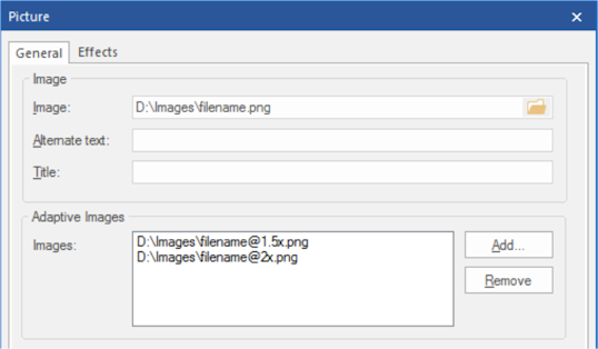
- New feature: Added 'Picture' object. The HTML5 <picture> element is a container used to specify multiple images for different viewport or screen resolutions. The browser will choose the most suitable image according to the current layout of the page and the device it will be displayed on.
You can specify different images for breakpoints. It also supports high resolution displays using pixel density descriptors such as 1x, 1.5x, 2x, and 3x. For example you can include different versions of the image by using names like: filename@1.5x.png, filename@2x.png
The picture object supports rotation using standard CSS3 transforms. Plus experimental support for CSS3 filters (blur, contrast, brightness, hue, saturation, negative, sepia, grayscale)


- Pablo
- Posts: 24166
- Joined: Sun Mar 28, 2004 12:00 pm
- Location: Europe
- Contact:
SlideShow
SlideShow
- New feature: Added 'Flip Horizontal' and 'Flip Vertical' animations (uses CSS3 transforms).
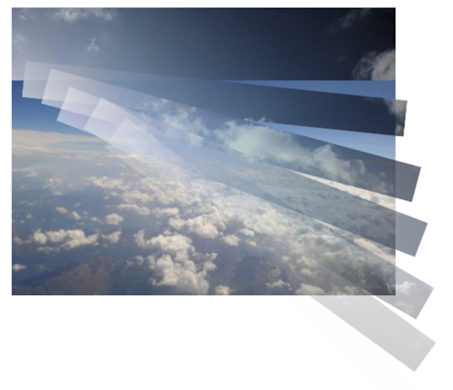
- New feature: Added 'Fan' and 'Block Scale' animations.

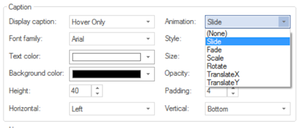
- New feature: Added animations to caption: fade, slide, rotate, scale, translate.
- New feature: Added 'CSS3 animation' option. Select animations created with the Animation Manager. A different animation can be selected for 'show' and 'hide' to create sophisticated slideshows.

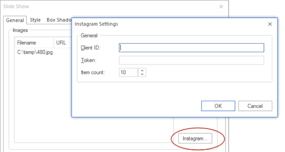
- New feature: Added Instagram integration. This makes it possible to feed the slideshow with images from your Instagram account.
- New feature: Added 'Flip Horizontal' and 'Flip Vertical' animations (uses CSS3 transforms).
- New feature: Added 'Fan' and 'Block Scale' animations.


- New feature: Added animations to caption: fade, slide, rotate, scale, translate.

- New feature: Added 'CSS3 animation' option. Select animations created with the Animation Manager. A different animation can be selected for 'show' and 'hide' to create sophisticated slideshows.

- New feature: Added Instagram integration. This makes it possible to feed the slideshow with images from your Instagram account.

- Pablo
- Posts: 24166
- Joined: Sun Mar 28, 2004 12:00 pm
- Location: Europe
- Contact:
Photo Gallery
Photo Gallery
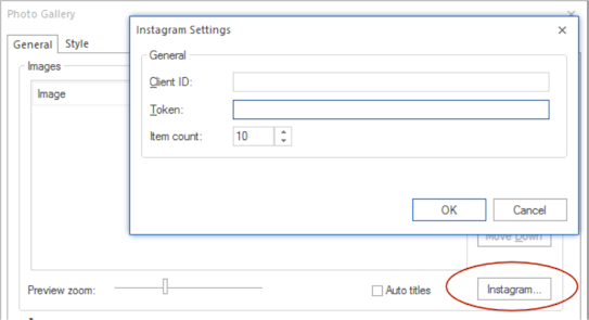
- New feature: Added Instagram integration. This makes it possible to feed the photo gallery with images from your Instagram account.
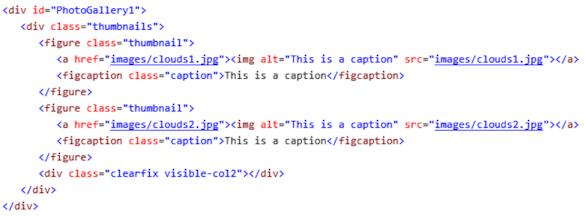
- New feature: The Photo Gallery uses <figure> and <figcaption> tags when ‘Use HTML5 Semantic Tags (in Tools->Options->HTML) is enabled.
- Improved: Now includes galleria 1.5.4, which makes it possible to use the lightbox/galleria in responsive layouts.
- New feature: Added Instagram integration. This makes it possible to feed the photo gallery with images from your Instagram account.

- New feature: The Photo Gallery uses <figure> and <figcaption> tags when ‘Use HTML5 Semantic Tags (in Tools->Options->HTML) is enabled.

- Improved: Now includes galleria 1.5.4, which makes it possible to use the lightbox/galleria in responsive layouts.
- Pablo
- Posts: 24166
- Joined: Sun Mar 28, 2004 12:00 pm
- Location: Europe
- Contact:
YouTube / Vimeo
YouTube / Vimeo
- New feature: Added 'Enable JS API' option. This option enables the player to be controlled via JavaScript Player API calls.
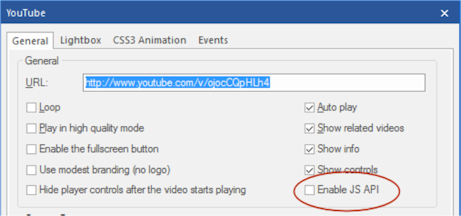
- New feature: Added support for YouTube/Vimeo events (play, pause, ended etc.). Requires 'Enable JS API'.
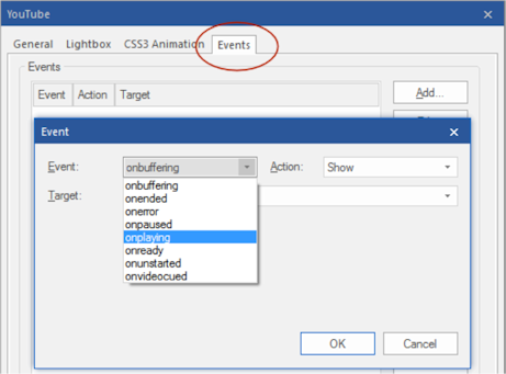
- New feature: play, pause actions in events can now be used to control the YouTube/Vimeo video. Requires 'Enable JS API'.

- New feature: Added 'Enable JS API' option. This option enables the player to be controlled via JavaScript Player API calls.

- New feature: Added support for YouTube/Vimeo events (play, pause, ended etc.). Requires 'Enable JS API'.

- New feature: play, pause actions in events can now be used to control the YouTube/Vimeo video. Requires 'Enable JS API'.

- Pablo
- Posts: 24166
- Joined: Sun Mar 28, 2004 12:00 pm
- Location: Europe
- Contact:
Events
Events
- New feature: Added 'CSS3 Animate' action. This will trigger a CSS3 animation from the animation manager. So, it's no longer necessary to manually create a separate style for this (WWB will do this automatically).
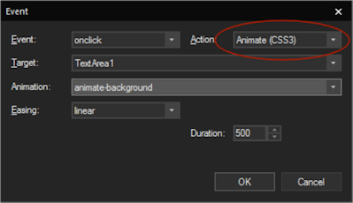
This feature is demonstrated in the following templates:
https://www.wysiwygwebbuilder.com/suppor ... onday.html
https://www.wysiwygwebbuilder.com/suppor ... onuts.html
https://www.wysiwygwebbuilder.com/suppor ... ummer.html
and more...
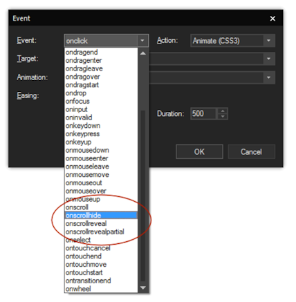
- New feature: Added 'onscrollreveal', 'onscrollhide' and 'onscrollrevealpartial' events to most objects.
These events were previous only available for the bookmark object.
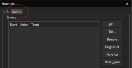
- New feature: Added support for events to links in navigation objects: BreadCrumb, CSS Menu, Mega Menu, Navigation Bar, Pagination, Panel Menu, Responsive Menu, Slide Menu, Tab Menu, Text Menu, jQuery ListView and jQuery Menu.
- New feature: Added 'CSS3 Animate' action. This will trigger a CSS3 animation from the animation manager. So, it's no longer necessary to manually create a separate style for this (WWB will do this automatically).

This feature is demonstrated in the following templates:
https://www.wysiwygwebbuilder.com/suppor ... onday.html
https://www.wysiwygwebbuilder.com/suppor ... onuts.html
https://www.wysiwygwebbuilder.com/suppor ... ummer.html
and more...
- New feature: Added 'onscrollreveal', 'onscrollhide' and 'onscrollrevealpartial' events to most objects.
These events were previous only available for the bookmark object.

- New feature: Added support for events to links in navigation objects: BreadCrumb, CSS Menu, Mega Menu, Navigation Bar, Pagination, Panel Menu, Responsive Menu, Slide Menu, Tab Menu, Text Menu, jQuery ListView and jQuery Menu.

- Pablo
- Posts: 24166
- Joined: Sun Mar 28, 2004 12:00 pm
- Location: Europe
- Contact:
Responsive Menu
Responsive Menu
- New feature: Added the possibility to set the menu alignment.

- New feature: Added the possibility to set the menu alignment.

- Pablo
- Posts: 24166
- Joined: Sun Mar 28, 2004 12:00 pm
- Location: Europe
- Contact:
Breadcrumb Menu
Breadcrumb Menu
- New feature: Added the possibility to set the menu alignment.

- New feature: Added ‘Full Width’ property so the menu can be stretched to the full width of its container (when used inside a layout grid).
- Improved: CSS3 Transitions are now applied to the menu items (instead of to its container). For example, to rotate, scale or modify the style of an item on hover.

- New feature: Added the possibility to set the menu alignment.

- New feature: Added ‘Full Width’ property so the menu can be stretched to the full width of its container (when used inside a layout grid).
- Improved: CSS3 Transitions are now applied to the menu items (instead of to its container). For example, to rotate, scale or modify the style of an item on hover.

- Pablo
- Posts: 24166
- Joined: Sun Mar 28, 2004 12:00 pm
- Location: Europe
- Contact:
Publish
Publish
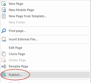
- New feature: Added "Publish' option to context menu in Site Manager, so you can quickly publish the selected page.
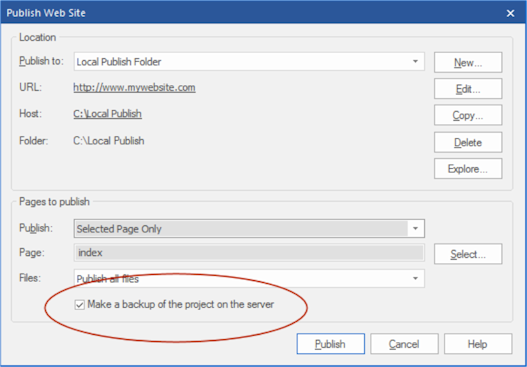
- New feature: Added ‘Make a backup of the project on the server' option to the publish dialog.
This can be used to override the global setting for the current session.
- New feature: Added "Publish' option to context menu in Site Manager, so you can quickly publish the selected page.

- New feature: Added ‘Make a backup of the project on the server' option to the publish dialog.
This can be used to override the global setting for the current session.

- Pablo
- Posts: 24166
- Joined: Sun Mar 28, 2004 12:00 pm
- Location: Europe
- Contact:
Error Reports
Error Reports
- New feature: Error Reports displays a warning when the page name is the same as the project name because this may cause a conflict with style sheets.
- New feature: Error Reports detects missing fonts. If an object uses a font which is not installed, then an error message will be displayed.
- New feature: Error Reports detects missing (third party) extensions. If the page uses an extension which is not installed, then an error message will be displayed.
- New feature: Added the possibility to hide warnings for specific objects via the context menu. Also, an option 'Show hidden warnings' have been added to restore the warnings.

- New feature: The 'Error Reports' window can now be docked, floating or set to autohide so it can be made visible all the time.
When visible, the error list automatically refreshes when you switch between pages. Double click an item in the list to select the object in the workspace.
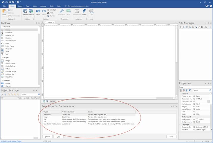
- New feature: Error Reports displays a warning when the page name is the same as the project name because this may cause a conflict with style sheets.
- New feature: Error Reports detects missing fonts. If an object uses a font which is not installed, then an error message will be displayed.
- New feature: Error Reports detects missing (third party) extensions. If the page uses an extension which is not installed, then an error message will be displayed.
- New feature: Added the possibility to hide warnings for specific objects via the context menu. Also, an option 'Show hidden warnings' have been added to restore the warnings.

- New feature: The 'Error Reports' window can now be docked, floating or set to autohide so it can be made visible all the time.
When visible, the error list automatically refreshes when you switch between pages. Double click an item in the list to select the object in the workspace.

- Pablo
- Posts: 24166
- Joined: Sun Mar 28, 2004 12:00 pm
- Location: Europe
- Contact:
Icons
Material Icons
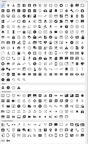
- New feature: Added support for Google's Material Design Icons(https://material.io/icons/). Adds more than 900 new icons. The Material Icon object supports the same features as FontAwesome.
FontAwesome
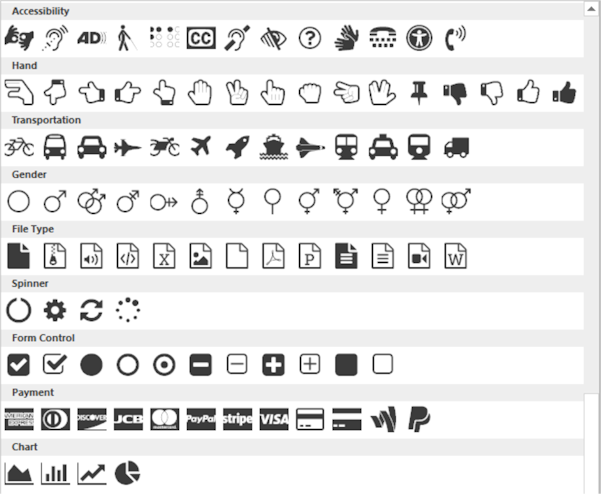
- Improved: The icons in the FontAwesome Gallery of the Ribbon are now categorized to make it easier to find icons (based on the categories on the FontAwesome website: http://fontawesome.io/icons/).
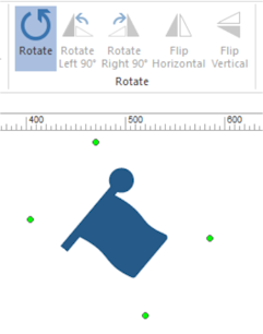
- New feature: Added support for rotation.
- New feature: Added 'Publish as SVG' option. This will output the icon as embedded SVG (scalable vector image) instead as font. This greatly reduces the overall size of the website if you only use a few FontAwesome icons.

- New feature: Added support for Google's Material Design Icons(https://material.io/icons/). Adds more than 900 new icons. The Material Icon object supports the same features as FontAwesome.
FontAwesome
- Improved: The icons in the FontAwesome Gallery of the Ribbon are now categorized to make it easier to find icons (based on the categories on the FontAwesome website: http://fontawesome.io/icons/).
- New feature: Added support for rotation.
- New feature: Added 'Publish as SVG' option. This will output the icon as embedded SVG (scalable vector image) instead as font. This greatly reduces the overall size of the website if you only use a few FontAwesome icons.
- Pablo
- Posts: 24166
- Joined: Sun Mar 28, 2004 12:00 pm
- Location: Europe
- Contact:
Photo Collage
Photo Collage
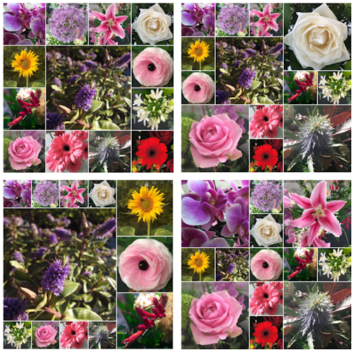
- New feature: Added 'Photo Collage' object. This introduces a cool new way to display your images. More than 30 layout variants are available, each with a different number of images.
The Photo collage object is flexible so it can be used in layout grids and responsive layouts. Also, supports lightboxes, Instagram integration, load animations and more.

- Pablo
- Posts: 24166
- Joined: Sun Mar 28, 2004 12:00 pm
- Location: Europe
- Contact:
User Interface
User Interface
- New feature: Added 'Office 2016 - Black' color scheme.
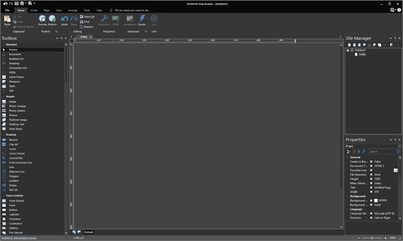
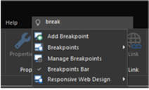
- New feature: Implemented Office 2016-like Ribbon commands search ("Tell Me"). When the user types a part of command text in the box, a list of matching commands is displayed on the Main Panel.

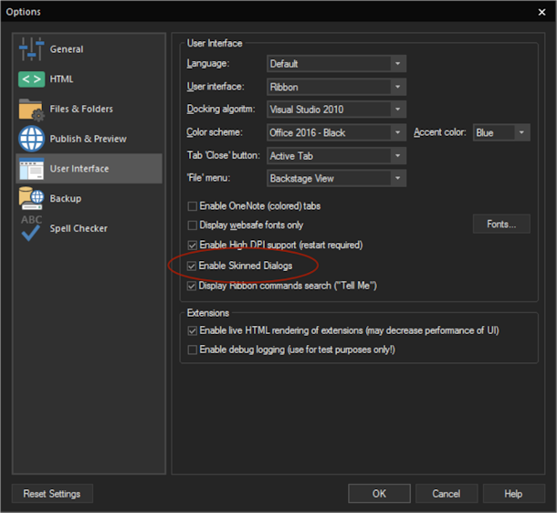
- New feature: All built-in dialogs now use the selected color scheme (like in MS Office apps). A new option has been added to enable/disable this functionality: Tools->Options->User Interface->Enable skinned dialogs.
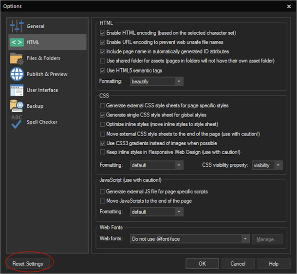
- New feature: Added 'Reset settings' to Options. This will restore the default settings.
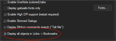
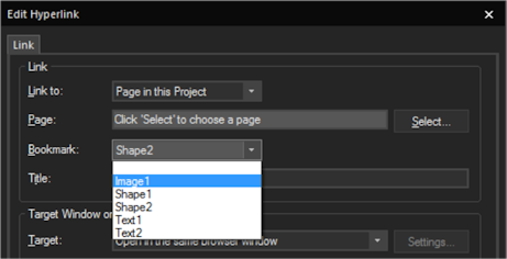
- New feature: Added 'Display all objects in Links->Bookmark' option. When this option is enabled then the Bookmark dropdown menu in Links will display all objects (instead of just bookmarks and layers). This basically makes it possible to turn any object into a bookmark!
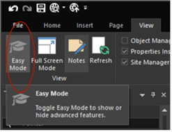
- New feature: Added 'Easy Mode'. This option may be useful for new users who are overwhelmed by all the advanced features of WWB. When this option is enabled then advanced features (like events, animations, CMS, login tools) will be hidden in the toolbox, ribbon and properties. Easy Mode can easily be toggled to make the options available again.
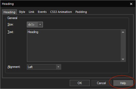
- New feature: Added a 'Help' button to most property windows to open context sensitive help.
For example, if you click the Help button in the Events window then it will directly display the ‘Events’ section in the help.
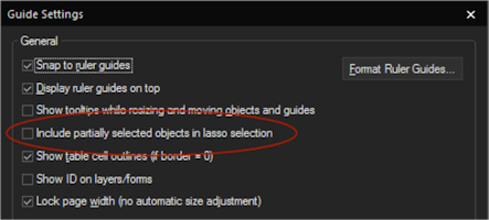
- New feature: Added 'Include partially selected objects in lasso selection' to Guide settings. This option specifies whether partially selected objects will be included in lasso (net) selection. If this option is disabled, then the entire object needs to be inside the lasso to be selected.
and more...
- New feature: Added 'Office 2016 - Black' color scheme.

- New feature: Implemented Office 2016-like Ribbon commands search ("Tell Me"). When the user types a part of command text in the box, a list of matching commands is displayed on the Main Panel.


- New feature: All built-in dialogs now use the selected color scheme (like in MS Office apps). A new option has been added to enable/disable this functionality: Tools->Options->User Interface->Enable skinned dialogs.

- New feature: Added 'Reset settings' to Options. This will restore the default settings.

- New feature: Added 'Display all objects in Links->Bookmark' option. When this option is enabled then the Bookmark dropdown menu in Links will display all objects (instead of just bookmarks and layers). This basically makes it possible to turn any object into a bookmark!


- New feature: Added 'Easy Mode'. This option may be useful for new users who are overwhelmed by all the advanced features of WWB. When this option is enabled then advanced features (like events, animations, CMS, login tools) will be hidden in the toolbox, ribbon and properties. Easy Mode can easily be toggled to make the options available again.

- New feature: Added a 'Help' button to most property windows to open context sensitive help.
For example, if you click the Help button in the Events window then it will directly display the ‘Events’ section in the help.

- New feature: Added 'Include partially selected objects in lasso selection' to Guide settings. This option specifies whether partially selected objects will be included in lasso (net) selection. If this option is disabled, then the entire object needs to be inside the lasso to be selected.

and more...
- Pablo
- Posts: 24166
- Joined: Sun Mar 28, 2004 12:00 pm
- Location: Europe
- Contact:
and more...
Those were the first 100+ new features of WWB12. There are 25+ more...
A complete list with screenshots will be available soon.
Here are a few demos to give you an idea of the new possibilities (just some random ideas):
https://www.wysiwygwebbuilder.com/suppor ... onday.html
https://www.wysiwygwebbuilder.com/suppor ... louds.html
https://www.wysiwygwebbuilder.com/suppor ... gsoon.html
https://www.wysiwygwebbuilder.com/suppor ... onuts.html
https://www.wysiwygwebbuilder.com/suppor ... exbox.html
https://www.wysiwygwebbuilder.com/suppor ... rtist.html
https://www.wysiwygwebbuilder.com/suppor ... ibiza.html
https://www.wysiwygwebbuilder.com/suppor ... phone.html
https://www.wysiwygwebbuilder.com/suppor ... wyork.html
https://www.wysiwygwebbuilder.com/suppor ... ummer.html
https://www.wysiwygwebbuilder.com/suppor ... works.html
https://www.wysiwygwebbuilder.com/suppor ... inter.html
Also there will be a bunch of new tutorials to demonstrate new features.
The upcoming weeks (months?) will be used to test/fine-tune WWB12 and make it ready for the release.
- Pablo
- Posts: 24166
- Joined: Sun Mar 28, 2004 12:00 pm
- Location: Europe
- Contact:
Re: WYSIWYG Web Builder 12 Teaser...
And to conclude this teaser... here's the (almost) complete list of new features for WYSIWYG Web Builder 12.
https://www.wysiwygwebbuilder.com/support/wb12.html
We are working very hard to release it as soon as possible, but it will not be available until we are certain that everything has been tested thoroughly.
Keep an eye on the news section of this forum and you will be the first to know the official release date;)
