This introduces the ability to create different layouts for different devices/screen widths.
Although the concept is rather easy, it may require a different way of thinking for die-hard Web Builder users.
In this FAQ we have collected frequently asked questions about Responsive Web Design, so this will always be the first place to look before you start...
This information will be expanded in the course of time based on user feedback.
Important: Learning to use Responsive Web Design takes time. Please start at the basics. Learn to walk before you run!
What is Responsive Web Design?
Responsive web design (RWD) is a web design approach aimed at creating web sites to provide an optimal viewing experience—easy reading and navigation with a minimum of resizing, panning, and scrolling—across a wide range of devices (from mobile phones to desktop computer monitors).
How can I design a responsive website with WYSIWYG Web Builder?
For an introduction to Responsive Web Design in WYSIWYG Web Builder please read these tutorials:
https://www.wysiwygwebbuilder.com/rwd_basics.html
https://www.wysiwygwebbuilder.com/respon ... esign.html
What are breakpoints?
A breakpoint is different 'view' of the same page with (mostly) the same objects, but with different positions and object sizes.
A page can have multiple breakpoints, each one optimized for a specific screen width. For example, you can have the standard desktop layout, one for tablets (1024 px) and another one for mobile phones (320 px). Common breakpoints are:
• 320 px, Mobile portrait , 480 px, Mobile landscape
• 768 px, Tablet portrait 1024 px, Tablet landscape/Netbook
• 1280 px and greater, Desktop
So with breakpoints you can have different layouts of the same page where you rearrange the objects so they look better for the target screen width (also known as 'viewport')
Which breakpoints should I add to my web page?
There is no fixed rule for implementing breakpoints. Generally you do not create a breakpoint for any particular device or for any particular screen resolution.
It all depends on your design. The idea behind breakpoints is that any design will 'break' at certain resolutions. For example, text is no longer readable, the menu is too small or the browser displays a horizontal scrollbar. Where a design 'breaks' can be different for each and every design. One design may look fine on all displays all the way down to 320px ... and then it breaks. That would mean that you would only need a breakpoint at 320. Another design may break at all sorts of different resolutions. This, then, would require all sorts of differing breakpoints.
The designer needs to decide where to start designing: from smallest to largest or largest to smallest. Although it may be the easiest to start with the default layout.
Once you get your initial design down, you then test it at various sizes to see when and where it breaks. Once you have that screen resolution you create a breakpoint and adjust. Then you move on from there.
Note: if you have a flexible layout using layout grids or flexbox then you usually only need 1 or 2 breakpoints.
Can breakpoints be wider than the default view?
Although it is possible to have breakpoints that are wider than the default view, it is generally not a good idea because it will make the default view obsolete.
So, normally the default view is the widest view and all breakpoints are smaller!
What is 'max-width'?
max-width specifies the maximum width of the rendering surface of the output device (such as the width of the browser window).
Web Builder uses the max-width in CSS3 media queries to control the size, position and visibility of objects.
For example if you add a breakpoint and set the max-width to 320px then this layout will be used if the browser window is less than or equal to 320 pixels.
What are 'responsive objects'?
'Responsive objects' are objects than can have a different size at different breakpoints.
Not all objects are responsive, for example shapes and other drawing tools will have the same size in all breakpoints. The reason for this is because only one image will be published and if you change the size of that image in one breakpoint then it would look distorted in another breakpoint. But you can use multiple shapes, one for each breakpoint and hide the ones you do not use in other breakpoints.
Which objects are not responsive?
Although we did our best to make most objects responsive, not all objects can have different sizes at different breakpoints due to their 'fixed size' nature.
The following objects are not responsive:
- Banner (*)
- Curve
- Curved Text
- Flash Video Player
- Images with filters/effects (see note ***)
- Line (Drawing tools)
- Navigation Bar
- OLE
- Polygon
- Shape (*)
- Table
- Text Art (**)
(*) Shapes and Banners can be made responsive if you set the output format to 'CSS3'
(**) Shapes, Text Art and Clip Art can be made flexible when used with Layout grids. Set the output format to 'SVG' and 'full width' to true.
(***) If you apply effects (like shadows, effects, resample, filters, rotation, image frames) to an image/slideshow then it will no longer be responsive.
If you need different sizes in breakpoints then you will need to create a copy of the object. You can also use quickly clone and hide the original object with the 'Clone and Hide' option in the object's context menu.
Can objects have different properties at different breakpoints?
Objects can have a different size, position and visibility state in each breakpoint. However all other properties will be exactly the same! For example if you change the color of an object then it will be changed in all breakpoints (because the same object is shared between all views). But you can have different objects on different breakpoints so if you want to use a different menu then you hide the menu in the breakpoint and add another one to the current breakpoint.
UPDATE: In WYSIWYG Web Builder 11 many objects have responsive styles. For example text can have different fonts/sizes. Backgrounds can be different in breakpoints. The Photo gallery can have a different number of columns, etc.
Which properties are responsive for each object is documented in the help.
Why isn't my text responsive?
Text is only responsive if the output format is set to 'Default' (in the compatibility properties of the text object) .
If the output format is set to 'use <div> for each line' or 'use <div> with position for each line' then the text is optimized for one size only.
Text is also not responsive when you are using line spacing or symbols (via Insert Symbol), because in that case the height of text will fixed for one specific size.
Note: in version 10.3 and newer you can use different fonts in different breakpoints: Use the option 'Enable Responsive Fonts' in the properties of the text object for this.

This can be useful if you need a larger font for smaller screens. Each breakpoint can have a different text size.
If this option is enabled, you can only use one font-family and font-size for the entire text object! Also the use of styles in combination with this option is not supported (because the responsive fonts will be applied to the text and that will overwrite global styles).
However the Style Manager in version also supports breakpoints, so if you wish to use styles then do not enable responsive fonts, but use responsive styles instead.
Related tutorial:
https://www.wysiwygwebbuilder.com/responsive_text.html
Is there a quick way to see which objects on my page are responsive?
Yes, you can use the keyboard combination Shift+Ctrl+R to outline all non-responsive objects on the page. The outline color is currently fixed to red.

Where do you place the "hidden" objects (eg. menus)? Should they be within or outside the borders of the breakpoint?
It's recommended to place them inside the page boundaries of the breakpoints, so the object do not affect the page width.
Can I use breakpoints in master pages and master frames?
Yes, but make sure you use the same breakpoints values in both the master page/frame and content page.
How can I test my responsive designs?
There are many dedicated websites to test responsive designs. For example: http://responsivepx.com/
But some browsers also have built-in test tools. For example in Firefox you can press CTRL+SHIFT+M to go into responsive test mode.
Are there any alternative ways to create a responsive website?
Web Builder has several other methods for creating flexible and responsive websites.
For example you can create multiple versions of your pages where each version is optimized for a different target resolution.
You can then use one of the redirect scripts in the 'Ready-to-use-JavaScripts' (available in the toolbox and Insert menu) to redirect the user to the right version of the page.
Another solution is to use a grid-like layout that automatically adjusts to the current screen resolution.
This can be done with the jQuery Masonry extension (https://www.wysiwygwebbuilder.com/masonry.html).
Example: https://www.wysiwygwebbuilder.com/suppor ... metro.html
It's also possible to use layers to create stretchable or floating layouts.
https://www.wysiwygwebbuilder.com/using_layers.html
https://www.wysiwygwebbuilder.com/anchored_layers.html
https://www.wysiwygwebbuilder.com/floating_layers.html
UPDATE: WYSIWYG Web Builder 11 now supports layout grids. This is a great way to create responsive, full width and flexible layouts.
https://www.wysiwygwebbuilder.com/layoutgrid_part1.html
Why are newly added objects hidden in other breakpoints?
New objects will be set invisible in other breakpoints. This is usually the best option because new objects generally do not have the same position in different breakpoints, so it would clutter the layout if they where added at a 'random' position.
You can use the Object Manager to make the object visible in other breakpoints and move them to the desired position.
It is also possible to change this 'auto-hide' behavior by disable the option 'Hide new objects on other breakpoints (Responsive Web Design)' in Tools->Options->General
When using events, the visibility is affected by breakpoints.
In Responsive Web Design, the software will automatically generate code for controlling the position, size and visibility of objects (with CSS3 media queries).
However in some cases controlling the visibility can conflict with other features on the page (like events that show or hide objects).
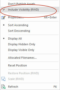
The option 'Include Visibility' in the context menu of the object makes it possible to exclude the visibility attribute from the media query, so it will not affect the state of the object when using events.
This option is also available in the context menu of the Object Manager.

Note that if 'Include Visibility' is not active then the object will have the same visibility state in all breakpoints!
You can control the default value of this property in Tools->HTML->Use 'Include visibility' as default for new objects in Responsive Web Design.
After I started using breakpoints extensions or custom HTML no longer works.
When using Responsive Design/breakpoints, the software will move all inline styles of objects to the <style> section in the header of the page. This makes it possible to use CSS3 media queries to control the position, size and visibility of objects for different breakpoints.
However in some cases this may effect the behavior of an object, HTML or extension.
To control this behavior we have added a special option in Tools->Options->HTML->Keep inline styles with Responsive Web Design (use !important).
If you enable this option then the software will not touch inline styles, but add !important to overwrite the position, size and visibility of objects with media queries.
There is a large is empty space at the bottom or right side of my page.
If you have placed objects on a breakpoint which are hidden on the default view then these objects will still affect the (default) page size.
Also objects on layer which are outside the viewport in breakpoints may cause a scrollbar at the bottom of the page.
So, make sure that all objects (even if they are hidden) are within the page boundaries.
Example:
- default view is 800x600
- mobile breakpoint is 320x1200
- the mobile breakpoint has an object at position 0, 1000. The object is hidden on the default view, but it has the same position as on the breakpoint.
This means that height of the default view is 1000 + object height.
Solution:
- Go to the default view
- make the hidden object (temporarily) visible.
- move the object inside the page boundaries (800x600).
- hide the object again.
Note that you can make hidden objects visible in the Object Manager.
Also, when using Layout Grids then make sure the page alignment is set to 'do not center page', otherwise the page will have a fixed width!
Tip: In WYSIWYG Web Builder 10.3.3 and newer you can make hidden objects visible with the option 'Render hidden objects', this makes it easier to troubleshoot layout problems.

UPDATE: WYSIWYG Web Builder 12 now supports a new layout option to control the behavior of hidden objects. Tools->Options->HTML->CSS visibility property.
This option controls the way objects are hidden. When using 'visibility:hidden' hidden objects will not be visible but they still affect the layout (just like in previous versions of WWB).
On the other hand 'display:none' removes the object from the layout so it no longer affects the size of the page.
This can be useful when hiding objects that are not inside the page boundaries in breakpoints. Note however that this may also change the behavior of event and third party code, so test thoroughly before using this option.
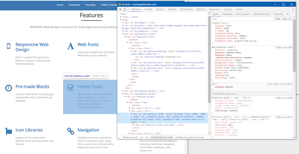
Also, the browser's debugger (F12) may be helpful to find objects outside the viewport. By selecting objects in the DOM tree, you can walk through objects and see the position on the page.

I cannot make a layer smaller even when all objects are inside the layer's boundaries.
The size of a layer is determined by its content (when overflow is set to 'none').
The layer cannot be smaller than the objects that belong to that layer, even if these objects are hidden.
So if you cannot make the layer smaller then check if there are no hidden objects on the layer that affect the layer's size.
My full width layer is not full width on all devices.
A layer will stretch to 100% of the viewport, not the page width. The layer/header/footer will stretch to the initial size of the viewport. So if you rotate a devices then the layer may no longer be full width.
A common trick to work around this, is to add the 'min-width' attribute in 'Custom style' of the layer:
-right click the layer
-select 'Object HTML'
-click 'custom style'
-paste 'min-width:970px'
(where '970' is the width of the page/layer)
Why is the undo stack cleared when switching between breakpoints?
Undo is a 'snapshot' of the current state of the page. If you switch between breakpoints then the active view is changed but you stay on the same page.
If you could undo actions that were done in another view then these actions would be applied to the current view and you would end up with 'scrambled page'. For example, all positions of the objects would be reset to the same positions of previous view.
Help! Breakpoints do not work on my mobile devices.
Some users make the mistake assuming that all mobile devices have a viewpoint of 320 pixels. However most modern phones have wider screen so the 320 breakpoint will never be displayed in that case.For example the viewport of an iPhone 6 is 375. So to optimize your layout (for example) for the iPhone 6 it should break at 375. But there are many different sizes.
For an overview of viewports for common devices please go to: http://viewportsizes.com/
Note that you do not have to implement all those widths. To cover larger screen sizes it should be enough to implement 480.
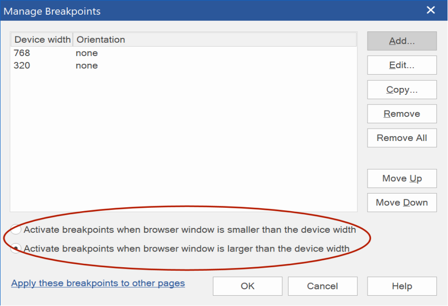
You can also enable 'Activate breakpoints when browser window is larger than the device width' in 'Manage Breakpoints', so the browser will break on the page size instead of viewport. See also the next question...
When do I use 'Activate breakpoints when browser window is larger than the device width'?
Note: This option in available in the Manage Breakpoints window.
This option changes the way breakpoints behave in the browser. By default breakpoints will be triggered if width of the browser window is the same or smaller than the defined breakpoint.
If 'Activate breakpoints when browser window is larger than the device width' is enabled then breakpoint will be triggered if width of the browser window is the same or larger than the current breakpoint and smaller than the next breakpoint. This can be useful if you want to to center the layout if the screen width is wider then the current breakpoint.

Here are some examples (resize the browser window to see the different breakpoints):
Example 1
Activate breakpoints when browser window is larger than the device width:
https://www.wysiwygwebbuilder.com/support/rwd/index.html
Activate breakpoints when browser window is smaller than the device width:
https://www.wysiwygwebbuilder.com/suppor ... ndex2.html
Example 2
Activate breakpoints when browser window is larger than the device width:
https://www.wysiwygwebbuilder.com/suppor ... width.html
Activate breakpoints when browser window is smaller than the device width:
https://www.wysiwygwebbuilder.com/suppor ... width.html
And finally one important tip: DO ONE THING AT A TIME!
Do not change too many things at once. If you only do one thing at the time then this make it easier to trace back your steps if something goes wrong.
For example: when using master frames, first a breakpoint to the master frame, make one modification to begin with (move an object or change its size).
Then add the same breakpoint to the content page. Test the page in the browser, if it works then move on to the next step, if it does not work then first try to figure out what went wrong before moving on.