Unfortunately there is no way to make text look exactly the same in all browsers. Each browser uses its own text rendering engine and they all render text in a different way.
And although WYSIWYG Web Builder uses pixels to specify the font size, this still causes different results in different browsers.
A common problem with Safari and FireFox based browsers is that they do not handle large text blocks in combination with CSS absolute positioning very well.
This will usually result in the text block being larger than designed, so it may overlap other objects in the layout.
Here are a few tips to prevent this from happening:
Split your text up into multiple (smaller) text objects
Also try not to use too any blank lines in the text. If you have more than 2 blank lines you should consider putting the second paragraph in a separate text object.
The behavior of blank lines in text is undefined. Some browsers use the current font size to determine the size between two lines while other use the default font.
This tip also applies to text based (vertical) menu's like the CSS Menu, Text Menu and Menu Bar. The size of these menus depends on the size of the text. So if you have a lot of items in the menu, please consider breaking it up into multiple smaller menus)
Use websafe fonts only
Websafe (or "web safe", "safe for the web") fonts are fonts that are common among all versions of Windows, Mac, and Linux.
It's recommended to use websafe fonts, otherwise the browser will substitute the font with another font and this will affect the layout.
Related tutorial: https://www.wysiwygwebbuilder.com/webfonts.html
Give the textbox some extra space.
Some browsers show the text a little larger and others browsers show the text a little smaller. It's usually not much but you have to leave some space at the end otherwise the last word in a textline may jump to the next line.
How to optimize text for different browsers?
- Pablo
- Posts: 24467
- Joined: Sun Mar 28, 2004 12:00 pm
- Location: Europe
- Contact:
- Pablo
- Posts: 24467
- Joined: Sun Mar 28, 2004 12:00 pm
- Location: Europe
- Contact:
How to optimize text for different browsers?
WYSIWYG Web Builder has several built-in tools in an attempt to more accurate text rendering (although there still will be differences between browsers!)
1) The text object has the folliowing output formats:
Default /Classic Mode
All code will be inside one div. This should be ok for most standard page layouts with not too much text.
Note that line height, bullets and other advanced features are not supported in this mode.
Use <div> for each line (DEPRECATED -> NOT RESPONSIVE!)
- This option is deprecated and should not be used for modern browsers. The text will not be responsive. -
Each line will be embedded inside its own <div> with its own styling. This gives more accurate results in some occasions.
Use <div> with position for each line (DEPRECATED -> NOT RESPONSIVE!)
- This option is deprecated and should not be used for modern browsers. The text will not be responsive -
Each line will be embedded inside its own div and includes position/size information (previously known as Optimized for Firefox/Safari mode).
A common problem with Mozilla based browsers is that they do not handle large text blocks in combination with CSS absolute positioning very well.
This option attempts to overcome this problem by breaking up the text into multiple <div> elements. This will result in better layouts, but also increases the amount of generated code.
Include line-height in text styles
WYSIWYG Web Builder will calculate the line-height for each font (based on the rendering in the workspace) and add it to the CSS style. In many cases this will give accurate results in various browsers with minimum of code.
When using this option the text also remains responsive!
Use <p> tags
In WYSIWYG Web builder 15, the text editor has been completely redesigned for better HTML output, faster editing and more functionality.
When 'Use <p> tags' is active, bullets, emojis and images can be included in text. This option was designed to be used with 'Enable responsive fonts', which means that all text in the text object have the same font-family and size (but can be different in breakpoints).
This option automatically adds line-height to all fonts.
Note:
There is not really a preferred output format because it all depends on your layout, so you should try what works best for you. And test it in all popular browsers to find the optimal solution.
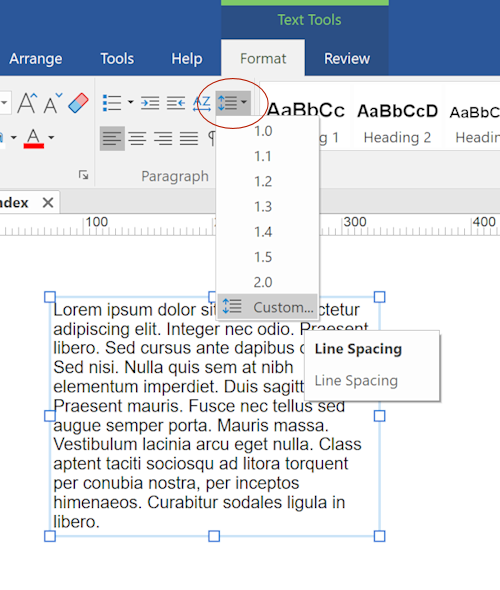
2) You can also set the Line spacing to specific values (in steps of 0.01) to the control distance between lines in the text or use Letter spacing to sets the amount of additional space between letters in the text. Both options can be found in the Format menu.

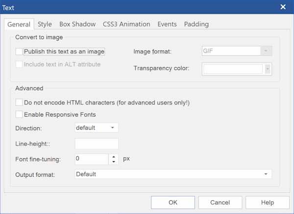
There is also an option for 'font-fine tuning'. This make it possible to 'fine-tune' fonts in steps of 0.1 pixels.
This may help fix compatibility issues with some fonts that are rendered larger in some browsers and make sure the text does not wrap to the next line.
Additionally, the 'Line height' property allows you to set a custom value for the text box. Unlike line-spacing, this option only affects the published page.
For example, using 1.1 makes all lines in the textbox 1.1 x taller. But you can also use pixels, like 12px.
Use this property only when you did not set line-spacing.

Publish this text as an image
Converts the text to image when your page is published.
This option can be useful if you want the text to be displayed exactly as in WYSIWYG Web Builder, even when you selected fonts which are not web safe.
The text will be converted to a GIF, JPG or PNG image. GIF will use single pixel transparency. JPG will use a solid background color since it does not support transparency. PNG will result in the best (anti-aliased) quality for larger fonts, but the size of the generated image will be larger.
Important note: if the text is published as a image then the object will not be responsive, because the image will only look correct for one size.
So, if you want to use this option in breakpoints (and the object has a different size) then you will have to make a clone of the text object.
Include text in ALT attribute
If text has been converted to an image then search engines will not be able to 'see' this text. Select this option if you want the original text to be included in the alt attribute
1) The text object has the folliowing output formats:
Default /Classic Mode
All code will be inside one div. This should be ok for most standard page layouts with not too much text.
Note that line height, bullets and other advanced features are not supported in this mode.
Use <div> for each line (DEPRECATED -> NOT RESPONSIVE!)
- This option is deprecated and should not be used for modern browsers. The text will not be responsive. -
Each line will be embedded inside its own <div> with its own styling. This gives more accurate results in some occasions.
Use <div> with position for each line (DEPRECATED -> NOT RESPONSIVE!)
- This option is deprecated and should not be used for modern browsers. The text will not be responsive -
Each line will be embedded inside its own div and includes position/size information (previously known as Optimized for Firefox/Safari mode).
A common problem with Mozilla based browsers is that they do not handle large text blocks in combination with CSS absolute positioning very well.
This option attempts to overcome this problem by breaking up the text into multiple <div> elements. This will result in better layouts, but also increases the amount of generated code.
Include line-height in text styles
WYSIWYG Web Builder will calculate the line-height for each font (based on the rendering in the workspace) and add it to the CSS style. In many cases this will give accurate results in various browsers with minimum of code.
When using this option the text also remains responsive!
Use <p> tags
In WYSIWYG Web builder 15, the text editor has been completely redesigned for better HTML output, faster editing and more functionality.
When 'Use <p> tags' is active, bullets, emojis and images can be included in text. This option was designed to be used with 'Enable responsive fonts', which means that all text in the text object have the same font-family and size (but can be different in breakpoints).
This option automatically adds line-height to all fonts.
Note:
There is not really a preferred output format because it all depends on your layout, so you should try what works best for you. And test it in all popular browsers to find the optimal solution.
2) You can also set the Line spacing to specific values (in steps of 0.01) to the control distance between lines in the text or use Letter spacing to sets the amount of additional space between letters in the text. Both options can be found in the Format menu.

There is also an option for 'font-fine tuning'. This make it possible to 'fine-tune' fonts in steps of 0.1 pixels.
This may help fix compatibility issues with some fonts that are rendered larger in some browsers and make sure the text does not wrap to the next line.
Additionally, the 'Line height' property allows you to set a custom value for the text box. Unlike line-spacing, this option only affects the published page.
For example, using 1.1 makes all lines in the textbox 1.1 x taller. But you can also use pixels, like 12px.
Use this property only when you did not set line-spacing.

Publish this text as an image
Converts the text to image when your page is published.
This option can be useful if you want the text to be displayed exactly as in WYSIWYG Web Builder, even when you selected fonts which are not web safe.
The text will be converted to a GIF, JPG or PNG image. GIF will use single pixel transparency. JPG will use a solid background color since it does not support transparency. PNG will result in the best (anti-aliased) quality for larger fonts, but the size of the generated image will be larger.
Important note: if the text is published as a image then the object will not be responsive, because the image will only look correct for one size.
So, if you want to use this option in breakpoints (and the object has a different size) then you will have to make a clone of the text object.
Include text in ALT attribute
If text has been converted to an image then search engines will not be able to 'see' this text. Select this option if you want the original text to be included in the alt attribute
- Pablo
- Posts: 24467
- Joined: Sun Mar 28, 2004 12:00 pm
- Location: Europe
- Contact:
Re: How to optimize text for different browsers?
Note that if you use Layout Grids (floating layout) then the layout will automatically be moved/scaled, so there in that case the difference in text rendering of browsers will not be an issue.