WWB14 Coming soon... (teaser)
WWB14 Coming soon... (teaser)
The next version of WYSIWYG Web Builder is planned for later this year, this will be a major upgrade with more than 200 new features and improvements!
This post will give you a sneak peak at some of these new features.
This topic will be regularly updated with new information, so make sure you don't miss anything...
The exact release date is unknown at this time. But we tell you more as soon as we know it!
*** Special Offer ***
If you buy version 12 today you will get version the next version for free when it becomes available!
This offer is also valid for all licenses purchased within 60 days before the official release date (as usual).
You will also get a 15% discount, so now you pay $49.95 instead of $59.95
http://www.wysiwygwebbuilder.com/purchase.html
Other registered users of WYSIWYG Web Builder will get a 50% discount when upgrading to the new version in the first few weeks after the release.
Flex Grid
Flex Grid
The Flex Grid introduces a new way for creating flexible layouts based on CSS Grid Layout (https://www.w3schools.com/css/css_grid.asp).
The CSS grid layout allows web developers to create complex responsive web layouts more easily and consistently across browsers.
'CSS Grid Layout' is a two-dimensional grid system that is native to CSS. It does not rely on floats or other hacks.
The idea behind the Flex Grid is to divide a web page into columns and rows. The columns and rows have named areas where you can drag & drop object in. The layout can be different in breakpoints. Each grid area supports its own padding, (flexbox) alignment, border and background styling.
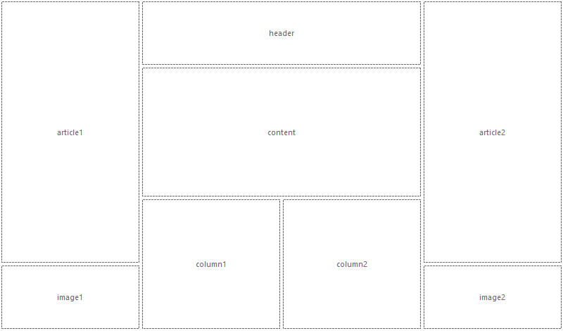
The Flex Grid object has a grid editor so you can visually define the layout (grid areas) and behavior of the grid.
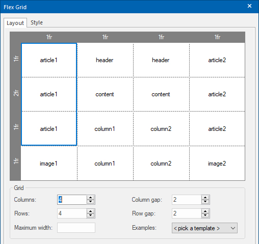
The size for each column/row can be set in pixels, percentages or the ‘fr’ unit.
‘fr’ stands for ‘fraction of available space’. You can think of this as percentages for available space after you've taken off fixed-sized and content-based columns/rows. This allows you to create layout that previously were not possible with standard HTML/CSS!

Example:
http://www.wysiwygwebbuilder.com/support/flexgrid/
The Flex Grid introduces a new way for creating flexible layouts based on CSS Grid Layout (https://www.w3schools.com/css/css_grid.asp).
The CSS grid layout allows web developers to create complex responsive web layouts more easily and consistently across browsers.
'CSS Grid Layout' is a two-dimensional grid system that is native to CSS. It does not rely on floats or other hacks.
The idea behind the Flex Grid is to divide a web page into columns and rows. The columns and rows have named areas where you can drag & drop object in. The layout can be different in breakpoints. Each grid area supports its own padding, (flexbox) alignment, border and background styling.

The Flex Grid object has a grid editor so you can visually define the layout (grid areas) and behavior of the grid.

The size for each column/row can be set in pixels, percentages or the ‘fr’ unit.
‘fr’ stands for ‘fraction of available space’. You can think of this as percentages for available space after you've taken off fixed-sized and content-based columns/rows. This allows you to create layout that previously were not possible with standard HTML/CSS!

Example:
http://www.wysiwygwebbuilder.com/support/flexgrid/
Google Fonts Manager
Google Fonts Manager
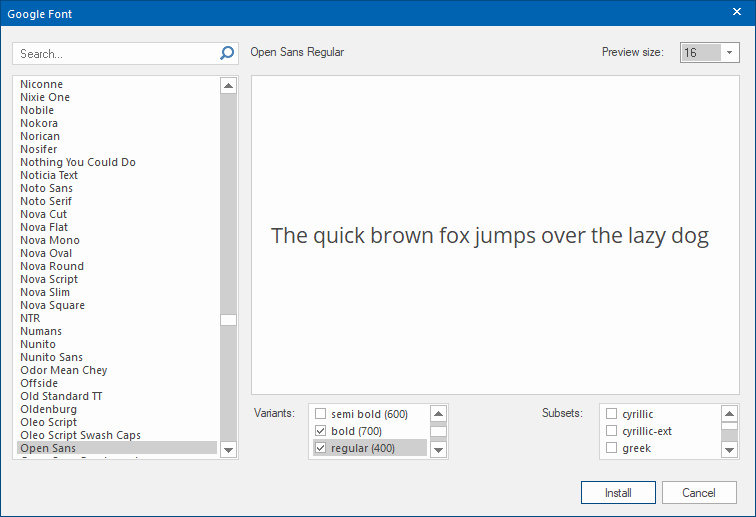
Adding Google Fonts to your website has never been easier. Google Fonts no longer have to be manually downloaded/installed from the Google website, the Google Font Manager takes care of this!
Fonts that are installed via the Font Manager will be added to the ‘web safe' fonts list and the necessary CSS code will be generated automatically when you preview or publish the website.
Font can have different variants, like light, medium, bold, regular etc. The available variants can be enabled per font.

Cards
Cards
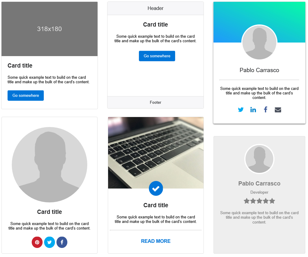
A Card is a lightweight, flexible content container. It includes options for headers and footers, a wide variety of content, styling, and powerful display options. The Card object was inspired by Bootstrap's v4 Card component.
Popover
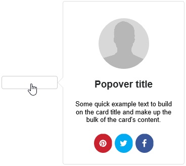
Cards can also be used as Popovers, this basically uses the Card as an advanced tooltip/pop-up box that appears when the user clicks or hovers on an element. Popovers can be placed at the top, right, bottom of left of the container object and can be activated via click, hover or focus.
Demo:
http://www.wysiwygwebbuilder.com/support/cards/
A Card is a lightweight, flexible content container. It includes options for headers and footers, a wide variety of content, styling, and powerful display options. The Card object was inspired by Bootstrap's v4 Card component.

Popover
Cards can also be used as Popovers, this basically uses the Card as an advanced tooltip/pop-up box that appears when the user clicks or hovers on an element. Popovers can be placed at the top, right, bottom of left of the container object and can be activated via click, hover or focus.

Demo:
http://www.wysiwygwebbuilder.com/support/cards/
Structured Data
Structured Data (schema.org)
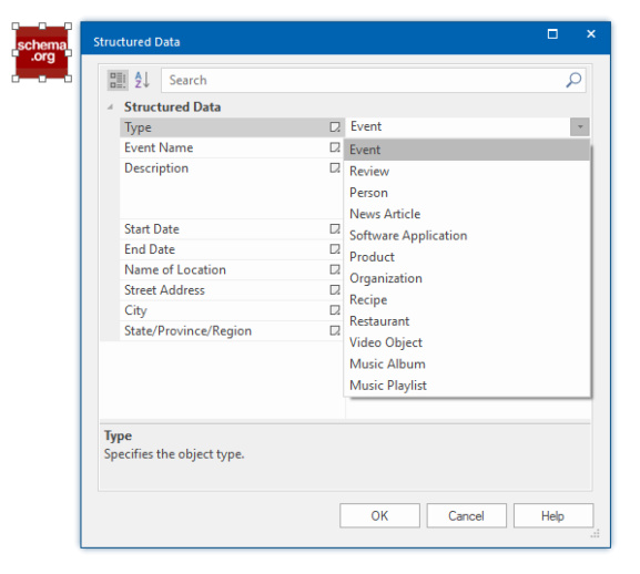
Added support for Structured Data (JSON-LD). Provide a better browsing experience for users on your website and in search engines, and improve your SEO with the built-in JSON-LD generator.
The following schemes are currently supported: Event, Review, Person, NewsArticle, SoftwareApplication, Product, Organization, Recipe, Restaurant, VideoObject, MusicAlbum, MusicPlaylist.

Twitter Cards
Twitter Cards
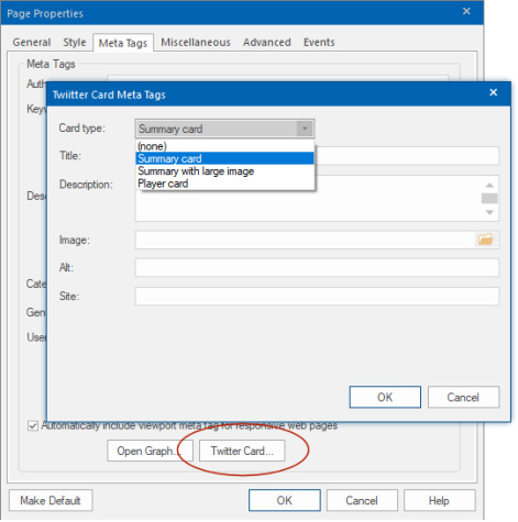
With Twitter Cards, you can attach rich photos, videos and media experiences to Tweets, helping to drive traffic to your website. If you add Twitter Card meta tags to your webpage, users who Tweet links to your content will have a “Card” added to the Tweet that’s visible to their followers. This is very similar to sharing a link on Facebook which automatically displays a preview with title, summary, and thumbnail of your page content when using Open Graph Meta Tags.
More information:
https://developer.twitter.com/en/docs/t ... outs-cards
The following Cards types are supported:
• Summary
• Summary with large image
• Player
Twitter specific meta tags can be configured in the Meta Tags section of the Page Properties.

Icon Fonts
Font Awesome/Material Icons
Implemented a new icon selection window with categories and a search option, so you can quickly find the icon you are looking for.
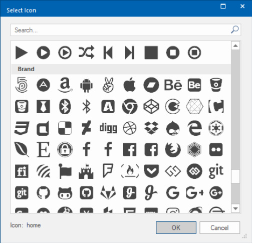
Icons Fonts
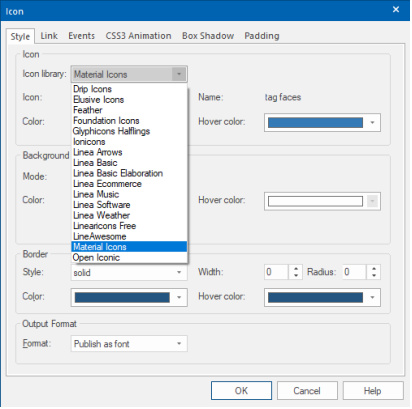
Added support for custom Icon Fonts Libraries. Add your own icon libraries or third-party icon sets. Extra Icon Fonts support the same styling options as the built-in Font Awesome.
Icon fonts add-ons packages are available for:
- Drip Icon
- Elusive Icons
- Feather
- Foundation Icons
- Glyphicons Halflings
- Ionicons
- LineAwesome
- Material Icons
- Open Iconic
- Linea Icons
- Font Awesome 5
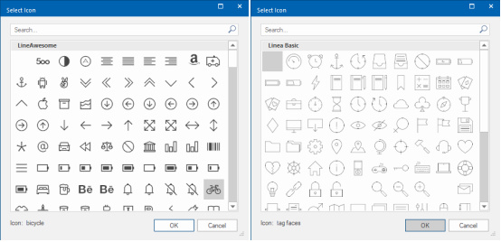
Implemented a new icon selection window with categories and a search option, so you can quickly find the icon you are looking for.
Icons Fonts
Added support for custom Icon Fonts Libraries. Add your own icon libraries or third-party icon sets. Extra Icon Fonts support the same styling options as the built-in Font Awesome.
Icon fonts add-ons packages are available for:
- Drip Icon
- Elusive Icons
- Feather
- Foundation Icons
- Glyphicons Halflings
- Ionicons
- LineAwesome
- Material Icons
- Open Iconic
- Linea Icons
- Font Awesome 5
Animations and Transitions
Animations and Transitions
Added preview for animations.
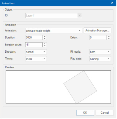
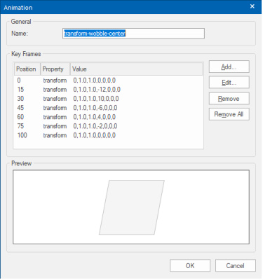
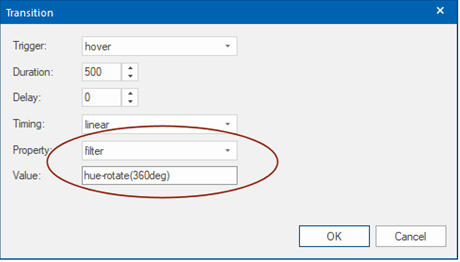
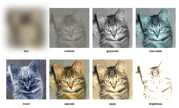
Added support for ‘filter’ property in transitions and CSS animations. This adds the possibility to animate brightness, contrast, hue, blur, invert, saturate, grayscale and sepia!
Added 'Neon' text animation.

Added 'Fire' text animation.

Added several text letterspacing animations. For example: ‘letterspacing focus in’ and ‘letterspacing expand’.

Plus, more than 25 other new animations, including:
• animate-border-fade
• background position
• focus-in / focus-out
• jello
• ken-burns
• pop
• push
• shadow-top-bottom / shadow-left-right
• slide-in-elliptic/ slide-out-elliptic
• text-popup
• transform diagonal
• and many others
Animation demos (just a few):
http://wysiwygwebbuilder.com/support/an ... index.html
http://wysiwygwebbuilder.com/support/an ... lters.html
Added preview for animations.


Added support for ‘filter’ property in transitions and CSS animations. This adds the possibility to animate brightness, contrast, hue, blur, invert, saturate, grayscale and sepia!


Added 'Neon' text animation.

Added 'Fire' text animation.

Added several text letterspacing animations. For example: ‘letterspacing focus in’ and ‘letterspacing expand’.

Plus, more than 25 other new animations, including:
• animate-border-fade
• background position
• focus-in / focus-out
• jello
• ken-burns
• pop
• push
• shadow-top-bottom / shadow-left-right
• slide-in-elliptic/ slide-out-elliptic
• text-popup
• transform diagonal
• and many others
Animation demos (just a few):
http://wysiwygwebbuilder.com/support/an ... index.html
http://wysiwygwebbuilder.com/support/an ... lters.html
Navigation
Overlay Menu
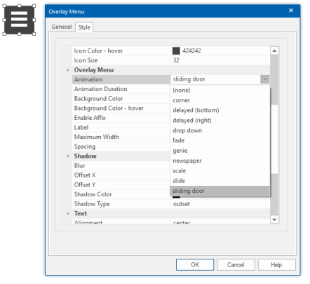
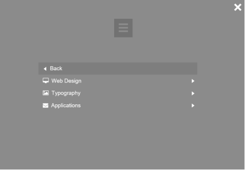
Added new 'Overlay Menu' object. This implements a multi-level, responsive full screen menu. With 10 show/hide animations. social icons support and many styling options.
Themeable Menu (previously known as ‘jQuery Menu’)
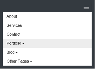
Added ‘Bootstrap’ menu type. This option implements a responsive Bootstrap-inspired drop-down menu with an optional logo.

Tab Menu
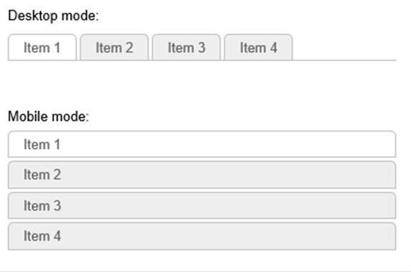
Added responsive mode. When the viewport gets smaller than the specified breakpoint value, the Tab Menu will switch to stacked (vertical) mode so it can also be used on smaller screens.
Text Menu
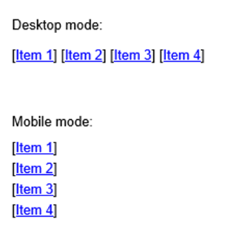
Added responsive mode. This works in combination with Layout->Type->Responsive. When the viewport gets smaller than the specified breakpoint value, the Text Menu will switch from horizontal to vertical.
CSS Menu
Border styles of the main menu now support for individual sides.

Panel Menu
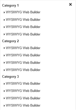
Added responsive mode. When the viewport gets smaller than the specified breakpoint value, the Panel Menu will switch to full screen mode (with close button).
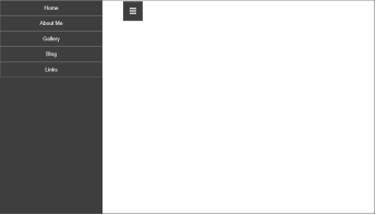
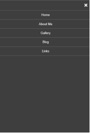
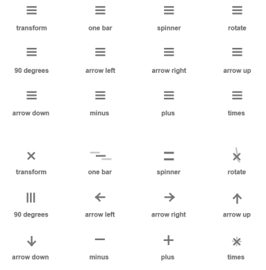
Added 'hamburger animations'. By using special characters, the Panel Menu button will display a hamburger menu symbol instead of text. When clicked, the bars will animation into a close symbol. 12 animations are available.
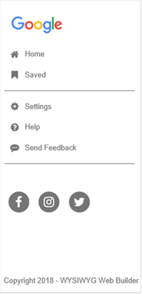
- Added the possibility to add footer text. For example, to add a copyright message at the bottom of the menu.
- Added the possibility to add a logo to the menu.
- Added menu padding. This sets the padding around the entire menu.
- Added support for 'Social Icons'. To add a social icon set the of the menu item and leave the 'text' field empty.
- Added support for dividers. Set the text to '---' to insert a divider.
Demo:
http://wysiwygwebbuilder.com/support/pa ... index.html
Mega Menu
Added responsive mode. When the viewport gets smaller than the specified breakpoint value, the Mega Menu will display a hamburger icon to trigger a full screen menu.

And more...
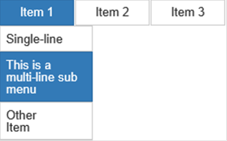
You can now use <br> in menu text, which makes it possible to have multi-line text. Note that this mainly useful for menu items that do not have the same size like sub menu, panel/overlay menu items.
Added 'Synchronize with another menu" option. Enabling this option will synchronize the links of the menu with the specified menu. This may be useful when you have multiple menus on the page, for example a desktop and mobile menu. So, you will have to change the link(s) only once.

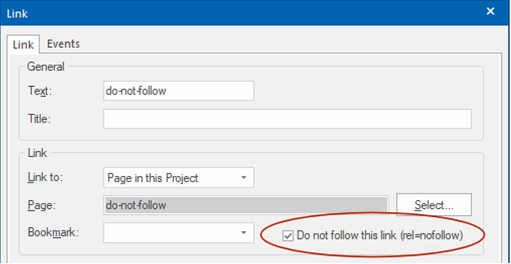
Added 'Do not follow this link' option to links. Enabling this option adds 'rel=nofollow' to prevent robots/search engines following the link.
Added new 'Overlay Menu' object. This implements a multi-level, responsive full screen menu. With 10 show/hide animations. social icons support and many styling options.


Themeable Menu (previously known as ‘jQuery Menu’)
Added ‘Bootstrap’ menu type. This option implements a responsive Bootstrap-inspired drop-down menu with an optional logo.


Tab Menu
Added responsive mode. When the viewport gets smaller than the specified breakpoint value, the Tab Menu will switch to stacked (vertical) mode so it can also be used on smaller screens.

Text Menu
Added responsive mode. This works in combination with Layout->Type->Responsive. When the viewport gets smaller than the specified breakpoint value, the Text Menu will switch from horizontal to vertical.

CSS Menu
Border styles of the main menu now support for individual sides.

Panel Menu
Added responsive mode. When the viewport gets smaller than the specified breakpoint value, the Panel Menu will switch to full screen mode (with close button).


Added 'hamburger animations'. By using special characters, the Panel Menu button will display a hamburger menu symbol instead of text. When clicked, the bars will animation into a close symbol. 12 animations are available.

- Added the possibility to add footer text. For example, to add a copyright message at the bottom of the menu.
- Added the possibility to add a logo to the menu.
- Added menu padding. This sets the padding around the entire menu.
- Added support for 'Social Icons'. To add a social icon set the of the menu item and leave the 'text' field empty.
- Added support for dividers. Set the text to '---' to insert a divider.

Demo:
http://wysiwygwebbuilder.com/support/pa ... index.html
Mega Menu
Added responsive mode. When the viewport gets smaller than the specified breakpoint value, the Mega Menu will display a hamburger icon to trigger a full screen menu.


And more...
You can now use <br> in menu text, which makes it possible to have multi-line text. Note that this mainly useful for menu items that do not have the same size like sub menu, panel/overlay menu items.

Added 'Synchronize with another menu" option. Enabling this option will synchronize the links of the menu with the specified menu. This may be useful when you have multiple menus on the page, for example a desktop and mobile menu. So, you will have to change the link(s) only once.

Added 'Do not follow this link' option to links. Enabling this option adds 'rel=nofollow' to prevent robots/search engines following the link.

Master Page
Master Page
Added a new (easier) way to implement master pages. In addition to Master Frame you can now also use another page as background template. This does not require a content place holder.
Basically, the master page will be used as 'background' of the content page and you place all other objects on top of this. If the master page includes a footer then it will automatically be moved based on the content.

Demo of the master page:
http://www.wysiwygwebbuilder.com/suppor ... index.html
Demo of the master page with breakpoints:
http://www.wysiwygwebbuilder.com/suppor ... x-rwd.html
Demo of the master page with Layout Grids:
http://www.wysiwygwebbuilder.com/suppor ... tgrid.html
Added a new (easier) way to implement master pages. In addition to Master Frame you can now also use another page as background template. This does not require a content place holder.
Basically, the master page will be used as 'background' of the content page and you place all other objects on top of this. If the master page includes a footer then it will automatically be moved based on the content.

Demo of the master page:
http://www.wysiwygwebbuilder.com/suppor ... index.html
Demo of the master page with breakpoints:
http://www.wysiwygwebbuilder.com/suppor ... x-rwd.html
Demo of the master page with Layout Grids:
http://www.wysiwygwebbuilder.com/suppor ... tgrid.html
Site Search
Site Search
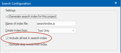
- Added 'Include all text in search index' option in Search Index settings. This will use all text from the page instead of just unique words. This will increase the size of the search index, but the search results will look better and it makes it possible to search for phrases.
- Added 'Display query time' option. This displays the total time it took to execute the search query.
- Added item padding property. This specifies the padding between result items.
- Added option to make search terms bold (Term Style).
- Added option to include the URL in search results (Display URL).
- Added an option to set maximum number of characters to display in the results. The description text contains the context of the keyword within the text (Max. length).
- Added the possibility to use quotes in the search queries to search for an exact phrase. Example: 'open source'. To make this useful, the option 'Include all text in search index' should be enabled!

- Added the possibility to use the minus character before a word to exclude all results that include that word. Example: web -designer
- In addition to jQuery Dialog, you can now also display the results in a Bootstrap modal: Show results in jQuery Dialog->Settings->Layout mode->Bootstrap.
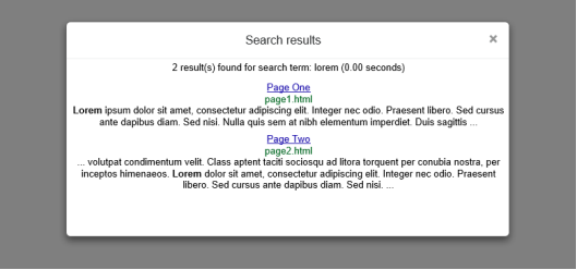
- New feature: Added support for pagination (Results per page).
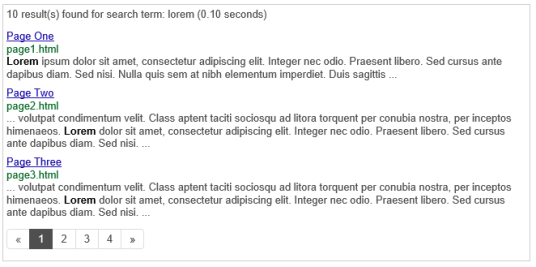
- Most search related code is now part of wb.sitesearch.min.js, this makes it possible to share the code between multiple page and results in a smaller footprint.
- Results font-family now supports @font-face/Google Fonts.
- Added 'Include all text in search index' option in Search Index settings. This will use all text from the page instead of just unique words. This will increase the size of the search index, but the search results will look better and it makes it possible to search for phrases.

- Added 'Display query time' option. This displays the total time it took to execute the search query.
- Added item padding property. This specifies the padding between result items.
- Added option to make search terms bold (Term Style).
- Added option to include the URL in search results (Display URL).
- Added an option to set maximum number of characters to display in the results. The description text contains the context of the keyword within the text (Max. length).
- Added the possibility to use quotes in the search queries to search for an exact phrase. Example: 'open source'. To make this useful, the option 'Include all text in search index' should be enabled!

- Added the possibility to use the minus character before a word to exclude all results that include that word. Example: web -designer
- In addition to jQuery Dialog, you can now also display the results in a Bootstrap modal: Show results in jQuery Dialog->Settings->Layout mode->Bootstrap.

- New feature: Added support for pagination (Results per page).

- Most search related code is now part of wb.sitesearch.min.js, this makes it possible to share the code between multiple page and results in a smaller footprint.
- Results font-family now supports @font-face/Google Fonts.
Blog / Article
Blog / Article
- Added the ability to change the editor color. This can be useful if you are using white text.
- Added ‘bootstrap’ layout template. A Bootstrap-like card layout.
- Added ‘clean’ layout template. A simple template with text and date only.
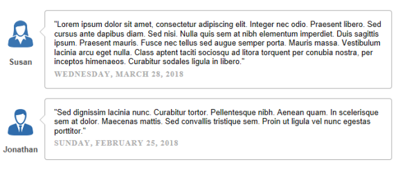
- Added ‘testimonial’ layout template.
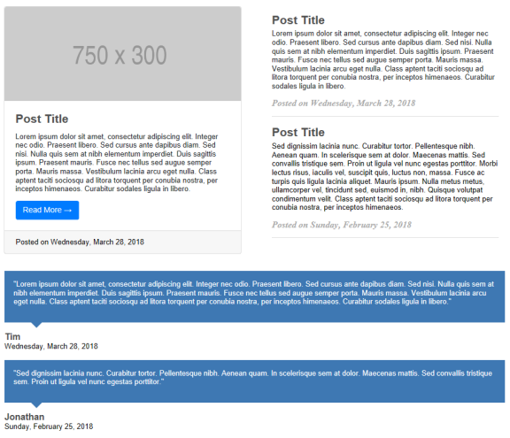
- Added ‘quote’ layout template.
- Added the ability to change the editor color. This can be useful if you are using white text.
- Added ‘bootstrap’ layout template. A Bootstrap-like card layout.
- Added ‘clean’ layout template. A simple template with text and date only.
- Added ‘testimonial’ layout template.

- Added ‘quote’ layout template.

Layout Grid
Layout Grid
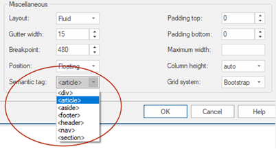
- Added semantic HTML5 tag support.
- Added padding properties to columns. Padding is responsive.

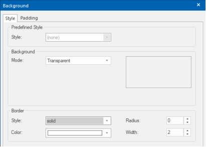
- Added border properties to columns. This make it possible to configure borders for each column. Border properties are responsive.
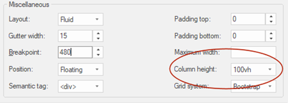
- Added the ability to make layout grids full screen: Column height->100vh (100% of the viewport height).
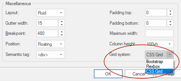
- Added support for 'CSS Grid Layout' (in addition to Bootstrap and Flexbox).
- Added semantic HTML5 tag support.

- Added padding properties to columns. Padding is responsive.

- Added border properties to columns. This make it possible to configure borders for each column. Border properties are responsive.

- Added the ability to make layout grids full screen: Column height->100vh (100% of the viewport height).

- Added support for 'CSS Grid Layout' (in addition to Bootstrap and Flexbox).

Box Shadow
Box Shadow
Added support for shadow type: inset. This changes the shadow from an outer shadow (outset) to an inner shadow.
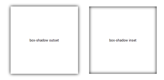
Added support for shadow type: inset. This changes the shadow from an outer shadow (outset) to an inner shadow.

Borders
Borders
Borders are now rendered with all properties (style, radius, individual borders) in the workspace.
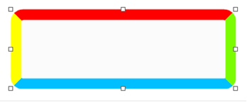
Added support for transparent borders (alpha).

Demo:
http://wysiwygwebbuilder.com/support/ba ... index.html
Borders are now rendered with all properties (style, radius, individual borders) in the workspace.

Added support for transparent borders (alpha).

Demo:
http://wysiwygwebbuilder.com/support/ba ... index.html
Background
Added ‘image+fade’ option in background properties. This will add a fading gradient overlay effect to the background.Background
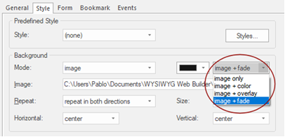

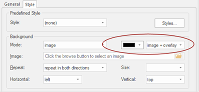
Background mode -> image now displays the color picker to select the color for image + color and image + overlay.
Added support for Google Maps background rendering.
You can now use a (static) Google Map image as background in most objects.

Page
Page
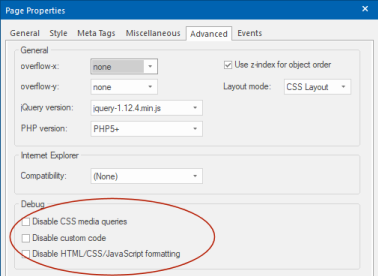
Added 'Disable CSS media query' option to Page Properties. When this option is enabled, then breakpoints will not be published. This may be useful for testing purposes.
Added 'Disable HTML/CSS/JavaScript formatting'. This option disables beautify/minify options for the current page. This may be useful for testing purposes or when you have added code to the page which does not support formatting.
Added 'Disable custom code'. When this option is enabled, then custom code with not be included in the published page. This way you can test the page without custom code. For example, in case something does not work, so you do not have to remove all code.
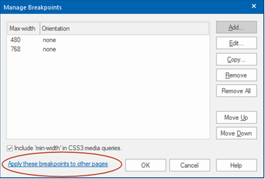
Added 'Apply these breakpoints to other pages' in Manage Breakpoints. This option applies the breakpoints to other (selected) pages if they do not already exist. Note that this does not affect the layout.
Added 'Disable CSS media query' option to Page Properties. When this option is enabled, then breakpoints will not be published. This may be useful for testing purposes.
Added 'Disable HTML/CSS/JavaScript formatting'. This option disables beautify/minify options for the current page. This may be useful for testing purposes or when you have added code to the page which does not support formatting.
Added 'Disable custom code'. When this option is enabled, then custom code with not be included in the published page. This way you can test the page without custom code. For example, in case something does not work, so you do not have to remove all code.

Added 'Apply these breakpoints to other pages' in Manage Breakpoints. This option applies the breakpoints to other (selected) pages if they do not already exist. Note that this does not affect the layout.

Photo Gallery/Photo Collage/Slide Show
Photo Gallery/Photo Collage
When loading new images, the gallery will automatically use the meta data of the image (if available).
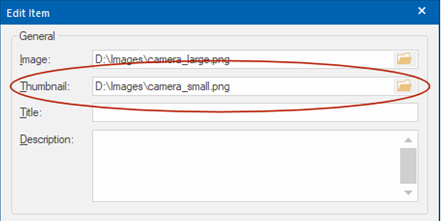
Added the ability to set a separate 'Thumbnail' image. This allows you to use a different (smaller) version of the image for thumbnails. It is also still possible to automatically generate a thumbnail image. This can be useful for example if you want a use a square image for the preview and the full-size image with normal aspect ratio.
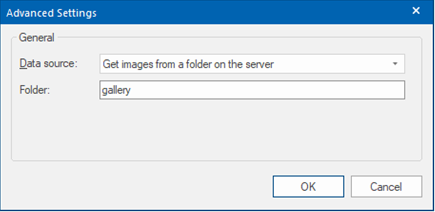
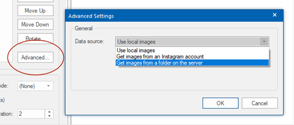
Added the ability to get images from a folder on the server. If the images contain description meta data then this will automatically be used for the title.
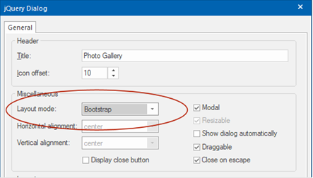
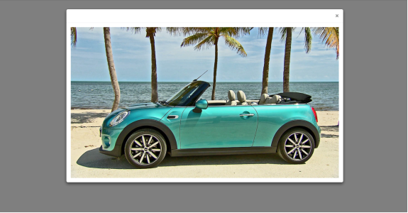
Added support for Bootstrap modal in jQuery Dialog settings. This implements a responsive modal popup.
Slideshow
When loading new images, the gallery will automatically use the meta data of the image (if available).
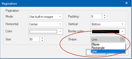
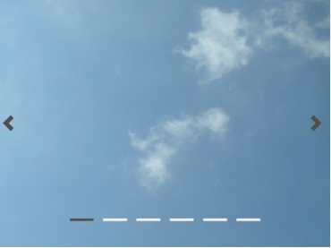
Added 'Line' shape option to pagination, inspired by Bootstrap-4 Carousel indicators.
Added new built-in navigation arrows, inspired by Bootstrap-4 Carousel arrows.
Added the ability to get images from a folder on the server.
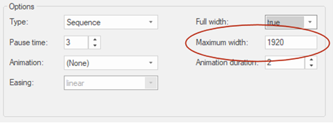
Added ‘Maximum width’ property which limits the width of the slide show when used in full width (floating) mode. In previous versions this was fixed to 1920.
Added ‘Full screen background’ slideshow mode. The images will cover the entire viewport. The slideshow will be fixed at the background, so it will not scroll with the rest of the content. Full screen background uses CSS3 animations, no JavaScript.

When loading new images, the gallery will automatically use the meta data of the image (if available).
Added the ability to set a separate 'Thumbnail' image. This allows you to use a different (smaller) version of the image for thumbnails. It is also still possible to automatically generate a thumbnail image. This can be useful for example if you want a use a square image for the preview and the full-size image with normal aspect ratio.

Added the ability to get images from a folder on the server. If the images contain description meta data then this will automatically be used for the title.

Added support for Bootstrap modal in jQuery Dialog settings. This implements a responsive modal popup.


Slideshow
When loading new images, the gallery will automatically use the meta data of the image (if available).
Added 'Line' shape option to pagination, inspired by Bootstrap-4 Carousel indicators.

Added new built-in navigation arrows, inspired by Bootstrap-4 Carousel arrows.

Added the ability to get images from a folder on the server.

Added ‘Maximum width’ property which limits the width of the slide show when used in full width (floating) mode. In previous versions this was fixed to 1920.

Added ‘Full screen background’ slideshow mode. The images will cover the entire viewport. The slideshow will be fixed at the background, so it will not scroll with the rest of the content. Full screen background uses CSS3 animations, no JavaScript.

Image / Picture
Image / Picture
The application now officially supports SVG images. The images will be rendered with a new built-in SVG in rendering engine.

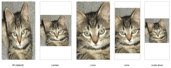
Added ‘Object-fit’ property. Specifies how the image should be resized to fit its container. Requires a modern browser! For example, Internet Explorer does not support this property! https://caniuse.com/#feat=object-fit

• fill
The image is sized to fill the element's content box. If necessary, the object will be stretched or squished to fit.
• contain
The image is scaled to maintain its aspect ratio while fitting within the element's content box.
• cover
The image is sized to maintain its aspect ratio while filling the element's entire content box. The object will be clipped to fit.
• none
The image is not resized.
• scale-down
When the container is smaller than the image, it will be scaled down.
The application now officially supports SVG images. The images will be rendered with a new built-in SVG in rendering engine.

Added ‘Object-fit’ property. Specifies how the image should be resized to fit its container. Requires a modern browser! For example, Internet Explorer does not support this property! https://caniuse.com/#feat=object-fit

• fill
The image is sized to fill the element's content box. If necessary, the object will be stretched or squished to fit.
• contain
The image is scaled to maintain its aspect ratio while fitting within the element's content box.
• cover
The image is sized to maintain its aspect ratio while filling the element's entire content box. The object will be clipped to fit.
• none
The image is not resized.
• scale-down
When the container is smaller than the image, it will be scaled down.

Carousel
Carousel
Added 'Line' shape option to pagination, inspired by Bootstrap-4 Carousel indicators.
Added new built-in navigation arrows, inspired by Bootstrap-4 Carousel arrows.
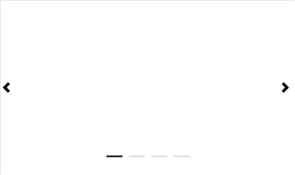
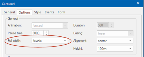
Added 'Flexible' mode. When this option is selected the child elements of the Carousel will be floating (instead of fixed). In this case the Carousel will be fully responsive and it can also be used inside layout grids. In 'Flexible mode' the Carousel can also be set to use the full height of the viewport.
Added 'Line' shape option to pagination, inspired by Bootstrap-4 Carousel indicators.
Added new built-in navigation arrows, inspired by Bootstrap-4 Carousel arrows.

Added 'Flexible' mode. When this option is selected the child elements of the Carousel will be floating (instead of fixed). In this case the Carousel will be fully responsive and it can also be used inside layout grids. In 'Flexible mode' the Carousel can also be set to use the full height of the viewport.

Lightboxes
Lightboxes
Lightbox preview image now automatically keeps aspect ratio of the image.
Added support for 3 new (third party) responsive lightboxes: lightcase, tosrus, venobox. Will be available in 'Free extras'
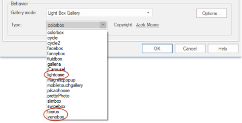
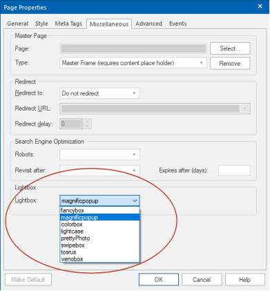
The lightbox (in Page Properties) now supports: colorbox, lightcase, prettyphoto, swipebox, tosrus, venobox. These lightboxes can be used for YouTube, Vimeo, HTML5 Video, Inline frames and links.
Added the ability to add a border (style, color, width, radius) to the lightbox preview image in YouTube, Vimeo and HTML5 video.
Added the possibility to use fancybox v3.
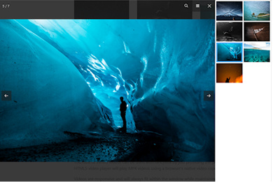
Lightbox preview image now automatically keeps aspect ratio of the image.
Added support for 3 new (third party) responsive lightboxes: lightcase, tosrus, venobox. Will be available in 'Free extras'

The lightbox (in Page Properties) now supports: colorbox, lightcase, prettyphoto, swipebox, tosrus, venobox. These lightboxes can be used for YouTube, Vimeo, HTML5 Video, Inline frames and links.

Added the ability to add a border (style, color, width, radius) to the lightbox preview image in YouTube, Vimeo and HTML5 video.
Added the possibility to use fancybox v3.

Property Inspector
Property Inspector
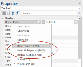
Added 'Reset Property (RWD)'. This will reset the selected value, so will be the same across all breakpoints.
Added 'Reset All Properties (RWD)'. This will reset all responsive values of the object.
The Property Inspector now displays a 'Responsive' icon if the property has different values in breakpoints, so you can quickly see whether the object has responsive properties.
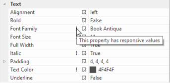
Added commands section with shortcuts to 'More properties', Events, Flexbox, Margin, Padding and Animations.

Added 'Reset Property (RWD)'. This will reset the selected value, so will be the same across all breakpoints.
Added 'Reset All Properties (RWD)'. This will reset all responsive values of the object.

The Property Inspector now displays a 'Responsive' icon if the property has different values in breakpoints, so you can quickly see whether the object has responsive properties.

Added commands section with shortcuts to 'More properties', Events, Flexbox, Margin, Padding and Animations.

Color picker
Color picker
Added 'Alpha slider' to color picker, making easier to set the alpha value of background and border colors.
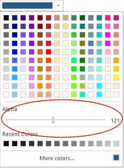
Added 'Alpha slider' to color picker, making easier to set the alpha value of background and border colors.

Page Properties
Added 'Use Safari mobile background fix'. This option implements a workaround for issues with full width (parallax/fixed/cover) background images on Safari mobile (iOS) browsers. This sets background-attachment to ‘scroll’, so the full image will be displayed.


Global Replace
Global Replace
Added the ability to replace internal links.
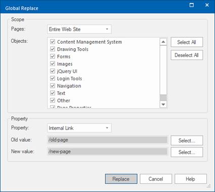
Added the ability to replace internal links.

User defined variables
User defined variables
Added $PROJECT_CSS$ system variable. This makes it possible to specify a different name for the global (external) style sheet, instead of using the project name.
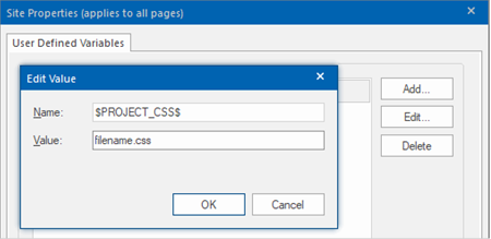
Added $PROJECT_CSS$ system variable. This makes it possible to specify a different name for the global (external) style sheet, instead of using the project name.

Publish
Publish
Make a backup of the complete project (including images) in zip format.

Make a backup of the complete project (including images) in zip format.

Wizard
Wizard
Added new 'Wizard' object. This implements a wizard like component, which can be used (for example) to create a multi-page form. The wizard can either be modal (popup) or used as a standard element.
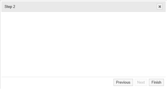
Wizard is based on jQuery Dialog and has the same properties. The main difference with the Dialog object is that you can add multiple pages (steps). Adding objects works the same as with other containers, simply drag & drop the objects inside the drop area. Click the 'Next or 'Previous' button to go to another step. If the Wizard is used as a form, then the 'Finish' button will act as a submit button, otherwise it will simply close the Wizard.
Added new 'Wizard' object. This implements a wizard like component, which can be used (for example) to create a multi-page form. The wizard can either be modal (popup) or used as a standard element.

Wizard is based on jQuery Dialog and has the same properties. The main difference with the Dialog object is that you can add multiple pages (steps). Adding objects works the same as with other containers, simply drag & drop the objects inside the drop area. Click the 'Next or 'Previous' button to go to another step. If the Wizard is used as a form, then the 'Finish' button will act as a submit button, otherwise it will simply close the Wizard.
Dialog
Dialog
Added border width property.
Added box-shadow properties.
Added animation duration and easing properties.

Added 'Bootstrap' mode. This will use Bootstrap's modal instead of jQuery UI.
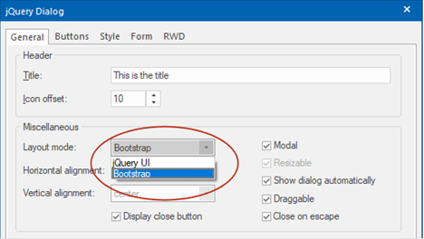
Added the ability to use the dialog as a form.

Added floating mode. When this option is enabled objects inside the dialog float instead of having a fixed position, so you can create flexible layouts.

Added 'Buttons' properties. Buttons will be added at the bottom of the dialog and can be used to close the dialog or trigger other actions (events). This feature replaces the previous hardcoded button options.
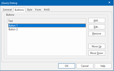
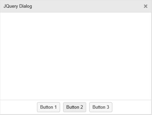
Added 'Button alignment' and 'Button margin' properties. These specify the alignment and margins of the buttons in the footer of dialog.
Added the ability to customize the style of the buttons.
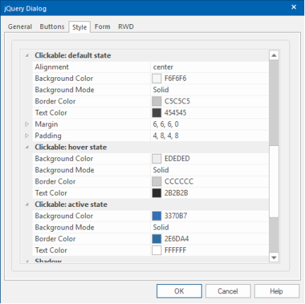
Added 'Breakpoint' property. When the viewport gets smaller than the specified breakpoint value, the dialog will switch to full width mode. For use with floating mode!

Added border width property.
Added box-shadow properties.
Added animation duration and easing properties.

Added 'Bootstrap' mode. This will use Bootstrap's modal instead of jQuery UI.

Added the ability to use the dialog as a form.

Added floating mode. When this option is enabled objects inside the dialog float instead of having a fixed position, so you can create flexible layouts.

Added 'Buttons' properties. Buttons will be added at the bottom of the dialog and can be used to close the dialog or trigger other actions (events). This feature replaces the previous hardcoded button options.


Added 'Button alignment' and 'Button margin' properties. These specify the alignment and margins of the buttons in the footer of dialog.
Added the ability to customize the style of the buttons.

Added 'Breakpoint' property. When the viewport gets smaller than the specified breakpoint value, the dialog will switch to full width mode. For use with floating mode!

Tabs
Tabs
Added show and hide animations. This animates showing/hiding the panels.

Added the ability to use the Tabs object as a form (Properties->Form->Enable Form).
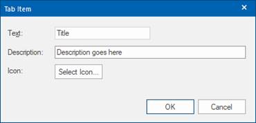
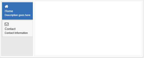
Added the possibility to add a description and icon (FontAwesome/material icon) to tabs.

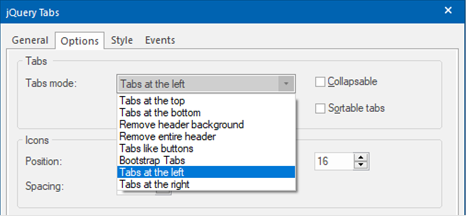
Added support for vertical tabs: Tabs at the left and Tabs at the right.
Added show and hide animations. This animates showing/hiding the panels.

Added the ability to use the Tabs object as a form (Properties->Form->Enable Form).
Added the possibility to add a description and icon (FontAwesome/material icon) to tabs.


Added support for vertical tabs: Tabs at the left and Tabs at the right.


Progress bar
Progress bar
Added the ability to show percentages in the progress bar.

Added the ability to show percentages in the progress bar.

Themeable Button
Themeable Button
(previous known as jQuery Button)
Added the ability to set the button(s) to full width in Layout grid.
This may be useful to create flexible (radio) button rows.
Example: Flexible row of radio buttons

(previous known as jQuery Button)
Added the ability to set the button(s) to full width in Layout grid.
This may be useful to create flexible (radio) button rows.
Example: Flexible row of radio buttons

Events
Events
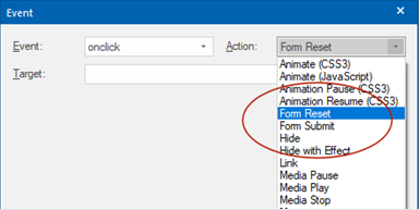
Added 'Form Submit' and 'Form Reset' actions to events. These actions can be used to submit or reset a form through events! For example, to submit a form via a button that is not part of the form.
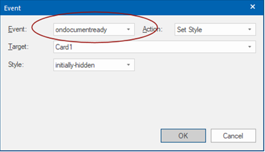
Added 'ondocumentready' to page events. This event is will be triggered once the page Document Object Model (DOM) is ready for JavaScript code to execute. This can be useful for example, to apply a style to an object.
Added 'Form Submit' and 'Form Reset' actions to events. These actions can be used to submit or reset a form through events! For example, to submit a form via a button that is not part of the form.

Added 'ondocumentready' to page events. This event is will be triggered once the page Document Object Model (DOM) is ready for JavaScript code to execute. This can be useful for example, to apply a style to an object.

Scroll Events and Transitions
Scroll Events and Transitions
Added 'Disable scroll events on small screens' to the Page Properties. This option adds the ability to disable scroll events on small screens (e.g. phones).
Added 'Disable scroll transitions on small screens' to the Page Properties. This option adds the ability to disable scroll transitions on small screens (e.g. phones).
'Minimum width' specifies the width at which the scroll events/ transitions will be disabled.
Added 'Exclude browsers' to the Page Properties. This option adds the ability to disable scroll events and transitions on specific browsers (e.g. iOS, Android).

Login Tools
Signup/Edit Profile
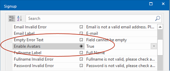
- Added the ability for the user to set an avatar image. The image can be displayed on the page with the "Login Name' object.
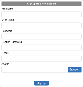
Login Name
- Added border, background, padding, vertical alignment properties.
- Added 'Display Avatar' option. This will display the avatar of the logged in user.
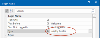
Login
- Added 'User Roles' functionality. Users roles are used to create different types of users. These users will only have access to the pages that have configure this role. The roles are customizable in the properties of the Login admin.
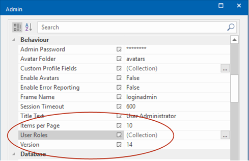
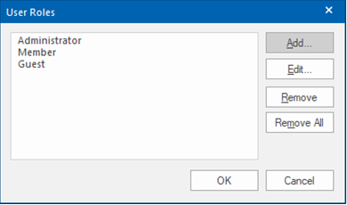
Login Admin
- Redesigned the layout of the Login Admin for a modern look and feel.

- Added table cell padding
- Added styling options for button and input fields.

- Added support for striped and hover rows.

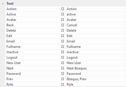
- Added the ability to customize/translate the text of the various items (headers, buttons).
- Added search/filter option

- Added pagination.

- Added 'avatar' support (see 'Signup/Edit Profile).

- Added the ability for the user to set an avatar image. The image can be displayed on the page with the "Login Name' object.


Login Name
- Added border, background, padding, vertical alignment properties.
- Added 'Display Avatar' option. This will display the avatar of the logged in user.

Login
- Added 'User Roles' functionality. Users roles are used to create different types of users. These users will only have access to the pages that have configure this role. The roles are customizable in the properties of the Login admin.


Login Admin
- Redesigned the layout of the Login Admin for a modern look and feel.

- Added table cell padding
- Added styling options for button and input fields.

- Added support for striped and hover rows.

- Added the ability to customize/translate the text of the various items (headers, buttons).

- Added search/filter option

- Added pagination.

- Added 'avatar' support (see 'Signup/Edit Profile).

Form
Form
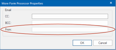
- Added 'From' property to built-in form processor settings. This will set the 'from' address of email sent messages to the specified email address. If you leave the field empty then it will work like in previous versions: either the 'email' input will be used (if it exists) or the 'to' address.
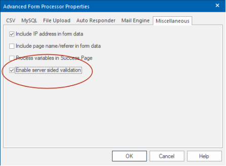
- Added server sided input validation (Form Properties->Advanced->Miscellaneous). This adds extra security to the form by also validating the input on the server side (using PHP), so even if JavaScript is disabled or the form has been modified (by spammers/hackers) the submitted data will still be validated. This feature uses the same settings as the JavaScript (client side) validation.
Form Conditions
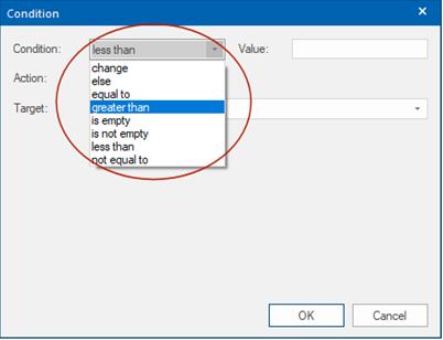
- Added 'Less than' and 'Greater than' conditions. It is also possible to create a range (greater than/less than combined).
- Added 'else' conditions. This can be used in combination with 'equal to', 'not equal to', 'greater than' and 'less than'.
Editbox / Textarea
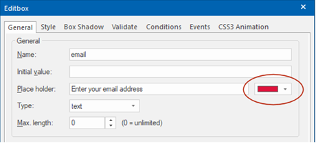
- Added the possibility to set the color of the placeholder text.
- Added 'From' property to built-in form processor settings. This will set the 'from' address of email sent messages to the specified email address. If you leave the field empty then it will work like in previous versions: either the 'email' input will be used (if it exists) or the 'to' address.

- Added server sided input validation (Form Properties->Advanced->Miscellaneous). This adds extra security to the form by also validating the input on the server side (using PHP), so even if JavaScript is disabled or the form has been modified (by spammers/hackers) the submitted data will still be validated. This feature uses the same settings as the JavaScript (client side) validation.

Form Conditions
- Added 'Less than' and 'Greater than' conditions. It is also possible to create a range (greater than/less than combined).
- Added 'else' conditions. This can be used in combination with 'equal to', 'not equal to', 'greater than' and 'less than'.

Editbox / Textarea
- Added the possibility to set the color of the placeholder text.

User Interface
User Interface
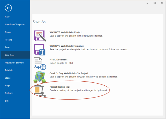
- Added 'Project backup in zip' option to File menu. This will create a full backup of the project and images etc on a local disk.
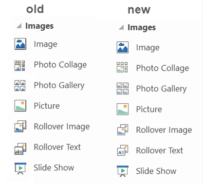
- Many DPI improvements. For example, all built-in images/icons/toolbars now have high resolution versions for use on high DPI screens.
- Added ‘Set initial zoom level based on DPI scaling’ option (Tools->Options->User Interface). On some computers with a high resolution (4k) display, the initial workspace may be too small. By enabling this option, the DPI value of your system will be used as the initial zoom level. For example, 144 dpi sets the zoom level to 150%.
- Added 'ctrl+click+drag' support to quickly duplicate objects just like in Word/PowerPoint:
• select the object that you want to duplicate.
• hover over the object with your mouse and press the CTRL key.
• while still pressing the CTRL key, click and drag the object to the new location.
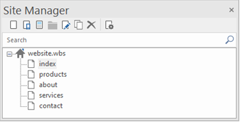
- Added 'Search' option to Site Manager to filter pages in the list and quickly find a page.
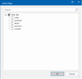
- Added 'Search' option to Page selection dialog (for internal links) to quickly find a page.
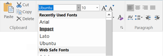
- Added 'Recently Used Fonts' to the font dropdown list in the Ribbon and Format toolbar.
- Added 'Project backup in zip' option to File menu. This will create a full backup of the project and images etc on a local disk.

- Many DPI improvements. For example, all built-in images/icons/toolbars now have high resolution versions for use on high DPI screens.

- Added ‘Set initial zoom level based on DPI scaling’ option (Tools->Options->User Interface). On some computers with a high resolution (4k) display, the initial workspace may be too small. By enabling this option, the DPI value of your system will be used as the initial zoom level. For example, 144 dpi sets the zoom level to 150%.
- Added 'ctrl+click+drag' support to quickly duplicate objects just like in Word/PowerPoint:
• select the object that you want to duplicate.
• hover over the object with your mouse and press the CTRL key.
• while still pressing the CTRL key, click and drag the object to the new location.
- Added 'Search' option to Site Manager to filter pages in the list and quickly find a page.

- Added 'Search' option to Page selection dialog (for internal links) to quickly find a page.

- Added 'Recently Used Fonts' to the font dropdown list in the Ribbon and Format toolbar.

HTML/CSS/JavaScript
HTML/CSS/JavaScript
- All built-in JavaScript files are now loaded from the 'js' sub folder instead of embedded in the executable. This reduces the size of the application and memory usage. And it also makes it easier to replace the files (for advanced users).
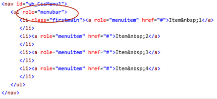
- More objects now support ARIA role attributes. For example: tabs, accordion, search, blog, news feed ticker, navigation etc.
- The 'margin' property is now responsive for most objects.
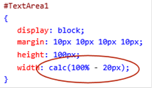
- If a full width object has margin then the margin value will be subtracted from the total width using css's calc function so the object does not become wider than its container.
- Added 'Load built-in JavaScript files asynchronously' option in Tools->Options->HTML. Note: only useful when using external JavaScript file!

Example:

More information about this feature: https://www.w3schools.com/tags/att_script_async.asp
- All built-in JavaScript files are now loaded from the 'js' sub folder instead of embedded in the executable. This reduces the size of the application and memory usage. And it also makes it easier to replace the files (for advanced users).
- More objects now support ARIA role attributes. For example: tabs, accordion, search, blog, news feed ticker, navigation etc.

- The 'margin' property is now responsive for most objects.
- If a full width object has margin then the margin value will be subtracted from the total width using css's calc function so the object does not become wider than its container.

- Added 'Load built-in JavaScript files asynchronously' option in Tools->Options->HTML. Note: only useful when using external JavaScript file!

Example:

More information about this feature: https://www.w3schools.com/tags/att_script_async.asp
Ready-to-use-JavaScript
Ready-to-use-JavaScript
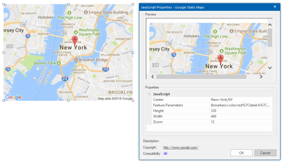
- Google Maps scripts now display a preview image in the workspace (instead of the generic JavaScript logo).
- Added ‘Countdown Days’ script.

- Added ‘Typewriter’ and ‘Typewriter Deluxe’ scripts.
The typewriter scripts simulate typing text. Typewriter Deluxe also includes a cursor and reverse mode.

- Text scripts now show a preview of the text in the workspace.
- Added support for Google Fonts.
- Added support for Global Replace (fonts and colors)
- Google Maps scripts now display a preview image in the workspace (instead of the generic JavaScript logo).

- Added ‘Countdown Days’ script.

- Added ‘Typewriter’ and ‘Typewriter Deluxe’ scripts.
The typewriter scripts simulate typing text. Typewriter Deluxe also includes a cursor and reverse mode.

- Text scripts now show a preview of the text in the workspace.
- Added support for Google Fonts.
- Added support for Global Replace (fonts and colors)
News Viewer
News Viewer
- Added support for background transparency (alpha).
- Added border radius option.
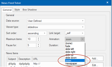
- Added ‘zoom’ and ‘newspaper’ animations.
- Added support for background transparency (alpha).
- Added border radius option.
- Added ‘zoom’ and ‘newspaper’ animations.

Flexbox
Flexbox
- Flexbox properties (flex grow, flex shrink, align self, flex basis) of objects are now responsive, so you can use different values in breakpoints.
- Added 'background image+overlay' support to Flex Container.
- Plus many improvements in the flexbox layout engine.
- Flexbox properties (flex grow, flex shrink, align self, flex basis) of objects are now responsive, so you can use different values in breakpoints.
- Added 'background image+overlay' support to Flex Container.
- Plus many improvements in the flexbox layout engine.
Layer
Layer
- Added 'breakpoint' property to Panel Layer. When the viewport is smaller than the specified breakpoint value, the panel layer will become full width.
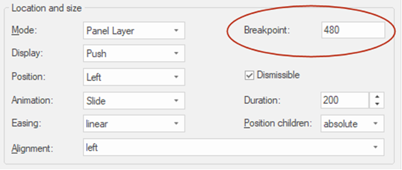
- Added 'breakpoint' property to Panel Layer. When the viewport is smaller than the specified breakpoint value, the panel layer will become full width.

HTML code view
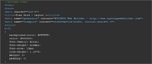
- HTML / code viewer has a better contrast for dark color schemes.

Templates
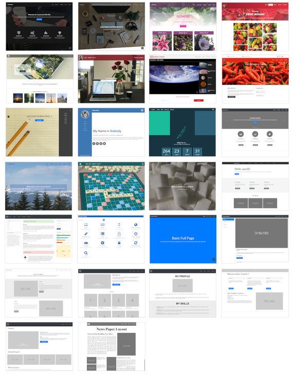
25 new (free) responsive templates.

Blocks
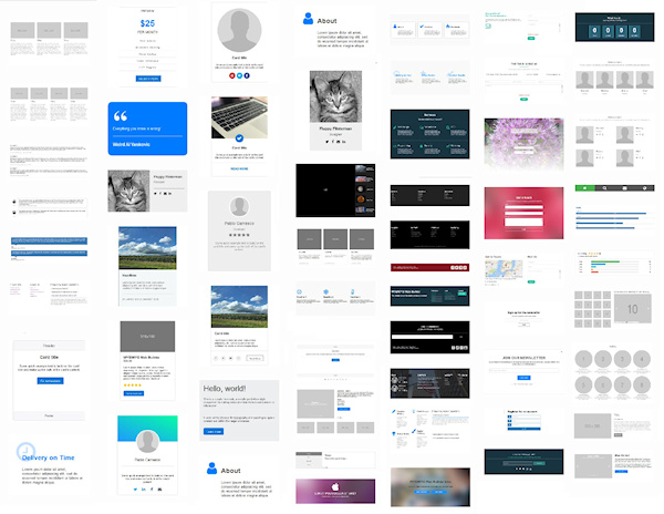
Added more than 50 new blocks. Available as (free) add-on packs.
Including:
- feature blocks
- cards
- headers/footers
- forms
- photo gallery
- carousels
- count down/wait for it...
- intros
and many more
Including:
- feature blocks
- cards
- headers/footers
- forms
- photo gallery
- carousels
- count down/wait for it...
- intros
and many more

Tutorials
Added new online tutorials with an introduction to some of the new features.
An Introduction to Flex Grid
http://wysiwygwebbuilder.com/flexgrid_part1.html
http://wysiwygwebbuilder.com/flexgrid_part2.html
An Introduction to Cards
http://wysiwygwebbuilder.com/cards.html
How to add a site search to your website?
http://wysiwygwebbuilder.com/sitesearch.html
How to use Master Pages?
http://wysiwygwebbuilder.com/master_page.html
Icon Fonts
http://wysiwygwebbuilder.com/iconfonts.html
Add Rich Snippets to your website using Structured Data (schema.org)
http://wysiwygwebbuilder.com/structured_data.html
Shape
Shape
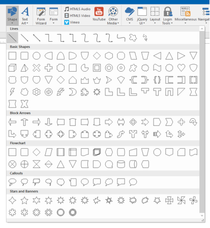
- Improved: Shapes in 'Insert Shape' gallery are now rendered larger and sharper.
- New feature: Add ‘Full width’ mode to Shape, Text Art and Clip Art for use with SVG output mode. This makes it possible to have scalable/flexible shapes/text/clipart in layout grids.

- Improved: Shapes in 'Insert Shape' gallery are now rendered larger and sharper.

- New feature: Add ‘Full width’ mode to Shape, Text Art and Clip Art for use with SVG output mode. This makes it possible to have scalable/flexible shapes/text/clipart in layout grids.
