Greetings all,
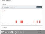
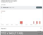
I have a problem with one page: https://drevelina.co.il/article2
1. Text too small to read
2. Clickable elements too close together (i don't have on this page)
And at the same time google-mobile friendly test - PASS (sometimes - FAILL, but run once again - PASS)
using last version, 15.4.0 (today updated to 15.4.5)
Thanks,
Google mobile usability
Forum rules
PLEASE READ THE FORUM RULES BEFORE YOU POST:
viewtopic.php?f=12&t=1901
MUST READ:
http://www.wysiwygwebbuilder.com/forms.html
http://www.wysiwygwebbuilder.com/form_wizard.html
Frequently Asked Questions about Forms
PLEASE READ THE FORUM RULES BEFORE YOU POST:
viewtopic.php?f=12&t=1901
MUST READ:
http://www.wysiwygwebbuilder.com/forms.html
http://www.wysiwygwebbuilder.com/form_wizard.html
Frequently Asked Questions about Forms
-
levitmic
-

- Posts: 38
- Joined: Wed Sep 05, 2018 2:36 pm
- Contact:
- Pablo
- Posts: 24219
- Joined: Sun Mar 28, 2004 12:00 pm
- Location: Europe
- Contact:
Re: Google mobile usability
1. You can set the font-size to anything you like. You can also have difference font-size for different device sizes.
https://www.wysiwygwebbuilder.com/responsive_text.html
2. To add spacing between elements you can use 'margin'.
https://www.wysiwygwebbuilder.com/responsive_text.html
2. To add spacing between elements you can use 'margin'.
-
levitmic
-

- Posts: 38
- Joined: Wed Sep 05, 2018 2:36 pm
- Contact:
Re: Google mobile usability
Pablo,
In all breakpoints correspond style (different font size). Once google sees that right(PASS), another time not.
I can't find the problem.
attached project: https://we.tl/t-ZsjK4fvI16
In all breakpoints correspond style (different font size). Once google sees that right(PASS), another time not.
I can't find the problem.
attached project: https://we.tl/t-ZsjK4fvI16
- Pablo
- Posts: 24219
- Joined: Sun Mar 28, 2004 12:00 pm
- Location: Europe
- Contact:
Re: Google mobile usability
Where in your project do I need to look to see the problem?
Can you please be more specific?
Notes:
It's not common to add a 1280 breakpoint to your page. 1280 is usually the default view and all breakpoints should be lower.
If you share your project to get help then please remove all non-relevant content from the project.
Related FAQ:
https://www.wysiwygwebbuilder.com/forum ... 10&t=82134
-
levitmic
-

- Posts: 38
- Joined: Wed Sep 05, 2018 2:36 pm
- Contact:
- Pablo
- Posts: 24219
- Joined: Sun Mar 28, 2004 12:00 pm
- Location: Europe
- Contact:
Re: Google mobile usability
What do I need to do to see the problem?
What did you expect to happen?
Can you please be more specific?
What did you expect to happen?
Can you please be more specific?
-
levitmic
-

- Posts: 38
- Joined: Wed Sep 05, 2018 2:36 pm
- Contact:
Re: Google mobile usability
Google Mobile Usability in quite frequently says that i have a problem with Text too small to read and Clickable elements too close together.
I don't have any clickable elements in article2(I think so). Also text size is 13px. Where are these problems located i don't know.
I also have no idea where to look.


I don't have any clickable elements in article2(I think so). Also text size is 13px. Where are these problems located i don't know.
I also have no idea where to look.


- Pablo
- Posts: 24219
- Joined: Sun Mar 28, 2004 12:00 pm
- Location: Europe
- Contact:
Re: Google mobile usability
My advise:
- remove the 1280 breakpoint
- use response fonts, and make the font larger on smaller screens.
- remove the 1280 breakpoint
- use response fonts, and make the font larger on smaller screens.
