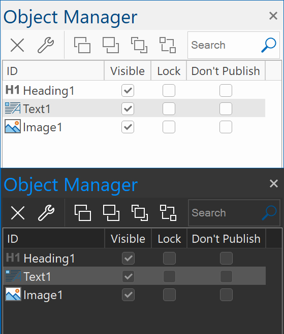
WW18 Selections in Site Manager very hard to see
Forum rules
IMPORTANT NOTE!!
DO YOU HAVE A QUESTION OR PROBLEM AND WANT QUICK HELP?
THEN PLEASE SHARE A "DEMO" PROJECT.
PLEASE READ THE FORUM RULES BEFORE YOU POST:
http://www.wysiwygwebbuilder.com/forum/viewtopic.php?f=12&t=1901
MUST READ:
http://www.wysiwygwebbuilder.com/getting_started.html
WYSIWYG Web Builder FAQ
-
lindgm
-

- Posts: 41
- Joined: Wed Sep 09, 2020 8:36 pm
WW18 Selections in Site Manager very hard to see
When selecting a page in the Site Manager or an item in the Menu Bar by leftklicking on it, it is very hard to see the selection mark.
- Pablo
- Posts: 23916
- Joined: Sun Mar 28, 2004 12:00 pm
- Location: Europe
- Contact:
Re: WW18 Selections in Site Manager very hard to see
The colors are standard system colors, so as a developer I have no control over this.
But you can change the color scheme in Tools -> Options -> User Interface
Also, are you using the latest update (18.0.4)? It looks ok for me.

But you can change the color scheme in Tools -> Options -> User Interface
Also, are you using the latest update (18.0.4)? It looks ok for me.

-
lindgm
-

- Posts: 41
- Joined: Wed Sep 09, 2020 8:36 pm
Re: WW18 Selections in Site Manager very hard to see
I have WW18 version 18.04 and default settings both for WW18 and Windows 10.
In WW17 the marking is OK, but not in WW18
In WW17 the marking is OK, but not in WW18
- Pablo
- Posts: 23916
- Joined: Sun Mar 28, 2004 12:00 pm
- Location: Europe
- Contact:
Re: WW18 Selections in Site Manager very hard to see
What do you see?
-
lindgm
-

- Posts: 41
- Joined: Wed Sep 09, 2020 8:36 pm
Re: WW18 Selections in Site Manager very hard to see
A very weak grayout if I inspect it closely
- crispy68
-

- Posts: 3103
- Joined: Thu Oct 23, 2014 12:43 am
- Location: Acworth, GA
- Contact:
Re: WW18 Selections in Site Manager very hard to see
Maybe you should check the settings on your monitor? Maybe it could use some tweaking to make the colors a bit better?
- Pablo
- Posts: 23916
- Joined: Sun Mar 28, 2004 12:00 pm
- Location: Europe
- Contact:
Re: WW18 Selections in Site Manager very hard to see
Can you please include a screenshot?
Also, is the color different when you set focus to the item?
Also, is the color different when you set focus to the item?
-
bayernalbert
-

- Posts: 24
- Joined: Thu Oct 16, 2014 10:00 am
Re: WW18 Selections in Site Manager very hard to see
I have exactly the same issue.
- Pablo
- Posts: 23916
- Joined: Sun Mar 28, 2004 12:00 pm
- Location: Europe
- Contact:
Re: WW18 Selections in Site Manager very hard to see
Can you please include a screenshot?
Also, is the color different when you set focus to the item?
Also, is the color different when you set focus to the item?
-
bayernalbert
-

- Posts: 24
- Joined: Thu Oct 16, 2014 10:00 am
Re: WW18 Selections in Site Manager very hard to see
I changed Docking algoritm (Options -> User Interface) from Visual Studio 2017 to Default.
Now everything is fine. The contrast is good. THX
Now everything is fine. The contrast is good. THX
- jerryco
-

- Posts: 943
- Joined: Fri Mar 27, 2009 2:42 pm
- Location: Purmerend, Holland
Re: WW18 Selections in Site Manager very hard to see
Is it bad again when you change from Default to Visual Studio 2017?
// Love is the acceptance of nothing / Account age is no guarantee of efficiency ;-) ->
Above, Beyond, and @wwonderfull! <- Genuinely helps you with a powered up site that counts! Five Times Excellence!
Above, Beyond, and @wwonderfull! <- Genuinely helps you with a powered up site that counts! Five Times Excellence!