https://basstuuk.nl
Website Basstuuk.nl changed.
I used images a lot because plasterers are visually adjusted.
I used the following extensions.
WBWD: TopSCroll
WBWD: Animated Card
WBWD: Fade Text
WBWD: Footer Reveal
WBWD: WBWD Rotating CTA Button
(RZ): Innerborder
(RZ): Elegant Cursor
(RZ): Elegant Click
Webbuilder FX WhatsApp
Letter FX
Letter FX is not responsive
Thanks to Ron (Crispy) for the support to make it responsive
Webbuilder Wysiwyg Animated Drop Down Menu
Many thanks to Ron (Crispy) if there were problems.
Greetings Bas
Website basstuuk.nl changed
Forum rules
PLEASE READ BEFORE YOU POST or your post may be deleted!
This forum is for users to display their websites created with WYSIWYG Web Builder.
Rules for posting in this section:
1) Do not ask any WYSIWYG Web Builder help or support related questions here.
2) Do not Promote your website on somebody elses thread.
3) Do not start more than one thread about your site.
4) Do not say anything negative or mean about somebody's site. Constructive criticism is great and encouraged, but being deliberately nasty will not be tolerated.
5) Do not post any site that is not created with WYSIWYG Web Builder.
6) Do not BUMP your post unnecessarily/repetitively.
7) Do not speak/type in another language than English. That way everyone can understand you.
- basstuuk
-

- Posts: 151
- Joined: Fri Apr 03, 2009 10:55 am
- Location: Zoetermeer
- Contact:
-
resajj
-

- Posts: 36
- Joined: Thu May 17, 2012 9:42 am
Re: Website basstuuk.nl changed
hoi ziet er goed uit.
vraagje waar heb je dat WhatsApps vandaan?
gr rene
vraagje waar heb je dat WhatsApps vandaan?
gr rene
- basstuuk
-

- Posts: 151
- Joined: Fri Apr 03, 2009 10:55 am
- Location: Zoetermeer
- Contact:
Re: Website basstuuk.nl changed
Hallo Rene,
stuur een mailtje via mijn website.
Groet Bas
stuur een mailtje via mijn website.
Groet Bas
- wixily
-

- Posts: 142
- Joined: Sun Jan 30, 2022 5:57 pm
- Contact:
Re: Website basstuuk.nl changed
Neatly done. I like the simplicity of the website - Nice work.
- basstuuk
-

- Posts: 151
- Joined: Fri Apr 03, 2009 10:55 am
- Location: Zoetermeer
- Contact:
Re: Website basstuuk.nl changed
Hello Wixily
Thanks for the feedback
Have you ever thought about an extension for WhatsApp.
I know someone already has an extension, but it is very expensive.
Not in proportion to what Wysiwyg costs.
Greetings Bas
Thanks for the feedback
Have you ever thought about an extension for WhatsApp.
I know someone already has an extension, but it is very expensive.
Not in proportion to what Wysiwyg costs.
Greetings Bas
- basstuuk
-

- Posts: 151
- Joined: Fri Apr 03, 2009 10:55 am
- Location: Zoetermeer
- Contact:
Re: Website basstuuk.nl changed
Hello Wixily
Thanks for the feedback
Have you ever thought about an extension for WhatsApp.
I know someone already has an extension, but it is very expensive.
Not in proportion to what Wysiwyg costs.
Greetings Bas
Thanks for the feedback
Have you ever thought about an extension for WhatsApp.
I know someone already has an extension, but it is very expensive.
Not in proportion to what Wysiwyg costs.
Greetings Bas
- wixily
-

- Posts: 142
- Joined: Sun Jan 30, 2022 5:57 pm
- Contact:
Re: Website basstuuk.nl changed
Actually not really. But that wouldn't be a bad idea. With regards to the cost of the extension you can send a personal message to the owner to see if he can discount it for you.basstuuk wrote: Thu Dec 14, 2023 3:10 pm Hello Wixily
Thanks for the feedback
Have you ever thought about an extension for WhatsApp.
I know someone already has an extension, but it is very expensive.
Not in proportion to what Wysiwyg costs.
Greetings Bas
- wwonderfull
-

- Posts: 1642
- Joined: Fri Aug 21, 2020 8:27 am
- Contact:
Re: Website basstuuk.nl changed
The wheel spinning is creative idea not sure if people of older age get headache with that but just for a notice mentioned it as it also can take reading space for people who are reading contents so they have to read the content from below the logo. So in terms of aesthetics it is fine in the gap of other user experience.
Other than that the site is well built unique design which suits the websites perspective and upholds the vision.
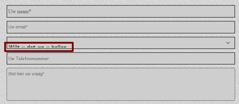
I think the borders of the cards needed a bit more space or gap between each of of them. And under the text I found the borders too close to the text meaning overlapping along with that the text does not have enough contrast to the background as the pocket jeans texture color could not make the text color popout even the deep blue text.

On the contact page I found this:

Other than that the site is well built unique design which suits the websites perspective and upholds the vision.
I think the borders of the cards needed a bit more space or gap between each of of them. And under the text I found the borders too close to the text meaning overlapping along with that the text does not have enough contrast to the background as the pocket jeans texture color could not make the text color popout even the deep blue text.

On the contact page I found this:

Last edited by wwonderfull on Thu Feb 01, 2024 6:02 pm, edited 2 times in total.
- basstuuk
-

- Posts: 151
- Joined: Fri Apr 03, 2009 10:55 am
- Location: Zoetermeer
- Contact:
Re: Website basstuuk.nl changed
Thank you for the feedback 
I am now on holiday in Gambia when I get back I will see what went wrong

Greetings Bas
I am now on holiday in Gambia when I get back I will see what went wrong
Greetings Bas