I'm using a 4 column text block with photos. Via the Layout Grid, the columns themselves are equal but my objective is to equalize the bottom of each column which I can't seem to do in the set-up and it comes out more uneven in preview. I am seeking equalized boxes. With the exception of of a column or two, the textboxes have scrollbars as there's hidden text behind it. I was looking for documentation or videos on this also. Thank you.
***SOLVED***Balancing Scroll Bar Text Columns with Scrollbars
Forum rules
PLEASE READ THE FORUM RULES BEFORE YOU POST:
viewtopic.php?f=12&t=1901
MUST READ:
http://www.wysiwygwebbuilder.com/respon ... esign.html
Please read this first before posting any questions! Also check out the example project to get an idea how the RWD concept works.
Responsive Web Design FAQ:
http://wysiwygwebbuilder.com/forum/view ... 10&t=63817
-
scribeman01
-

- Posts: 109
- Joined: Mon Nov 18, 2024 7:58 pm
- Location: United States - Wisconsin
***SOLVED***Balancing Scroll Bar Text Columns with Scrollbars
https://drive.google.com/drive/folders/ ... drive_link
I'm using a 4 column text block with photos. Via the Layout Grid, the columns themselves are equal but my objective is to equalize the bottom of each column which I can't seem to do in the set-up and it comes out more uneven in preview. I am seeking equalized boxes. With the exception of of a column or two, the textboxes have scrollbars as there's hidden text behind it. I was looking for documentation or videos on this also. Thank you.
I'm using a 4 column text block with photos. Via the Layout Grid, the columns themselves are equal but my objective is to equalize the bottom of each column which I can't seem to do in the set-up and it comes out more uneven in preview. I am seeking equalized boxes. With the exception of of a column or two, the textboxes have scrollbars as there's hidden text behind it. I was looking for documentation or videos on this also. Thank you.
Last edited by scribeman01 on Sun Jan 26, 2025 1:41 am, edited 1 time in total.
-
Pablo

- Posts: 24089
- Joined: Sun Mar 28, 2004 12:00 pm
- Location: Europe
- Contact:
Re: Balancing Scroll Bar Text Columns with Scrollbars
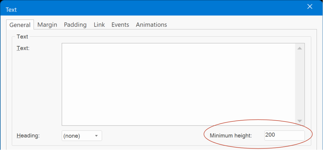
You can do this with cards and the "minimum height" property.
-
scribeman01
-
- Posts: 109
- Joined: Mon Nov 18, 2024 7:58 pm
- Location: United States - Wisconsin
Re: Balancing Scroll Bar Text Columns with Scrollbars
Excellent Pablo. So I am utilizing the cards and for text body, looking for "collapsible" text option. Whereas the amount of "hidden" text expands in that column if viewer clicks on it. I could utilitze the "read more" - looking to see if doing it as a "pop-up" is an option. Currently the "hidden text" is overlapping below the minimum text column default of "250" in the preview. Thanks!
-
scribeman01
-
- Posts: 109
- Joined: Mon Nov 18, 2024 7:58 pm
- Location: United States - Wisconsin
Re: Balancing Scroll Bar Text Columns with Scrollbars
https://drive.google.com/drive/folders/ ... drive_link
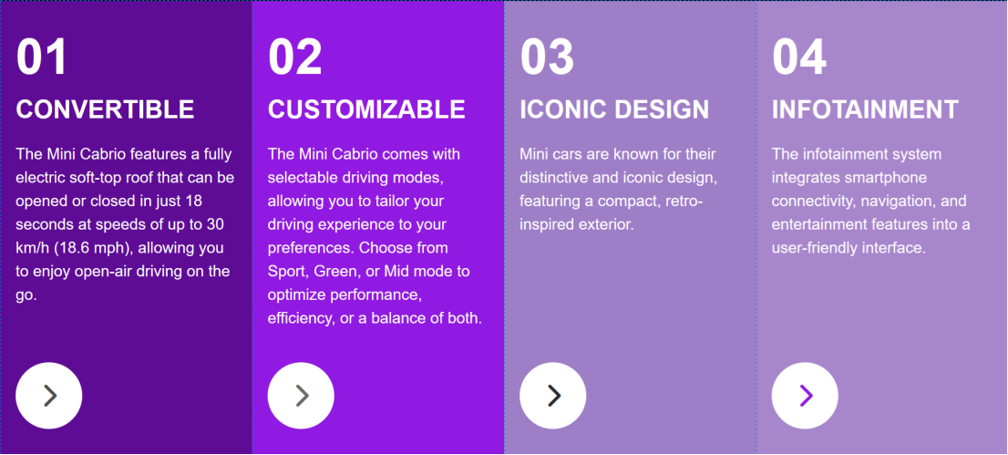
Thank you Pablo but having a very frustrating time. The cards does not adjust well with the different breakpoints as I would like. With the 4 column text/picture object, I get a good breakpoint screen size, layout with my 800 & 480 px breakpoints. With cards, it squeezes my captions into tiny columns that insanely squeeze compactly vertically. So now, I did try and equalize the text areas in each column which it doesn't do. Each column is set to 11pt. Apparently the line spacing is NOT the leading (the text disappears). The vertical alignment is set to bottom. Then, the padding in the headers is not consistant- have them set as fixed, have gone back & forth with the text areas between true & false for the fitting the whole width. Now, the body text in each column has disappeared from the preview! At this point, all I want are relatively similar columns with 7 lines of the first lines in the text (as collapsible - click on a button to read more with a button for the popup to extend for the whole text in the column.) It shouldn't be this complicated and I do peruse what you have online and the videos before I post here. I've looked at the "Accordian" for this too. I'm not opposed to trying again with the cards if I can get the same breakpoint results as I do here but I've blown the whole day on this and totally frustrated. Thank you.
Thank you Pablo but having a very frustrating time. The cards does not adjust well with the different breakpoints as I would like. With the 4 column text/picture object, I get a good breakpoint screen size, layout with my 800 & 480 px breakpoints. With cards, it squeezes my captions into tiny columns that insanely squeeze compactly vertically. So now, I did try and equalize the text areas in each column which it doesn't do. Each column is set to 11pt. Apparently the line spacing is NOT the leading (the text disappears). The vertical alignment is set to bottom. Then, the padding in the headers is not consistant- have them set as fixed, have gone back & forth with the text areas between true & false for the fitting the whole width. Now, the body text in each column has disappeared from the preview! At this point, all I want are relatively similar columns with 7 lines of the first lines in the text (as collapsible - click on a button to read more with a button for the popup to extend for the whole text in the column.) It shouldn't be this complicated and I do peruse what you have online and the videos before I post here. I've looked at the "Accordian" for this too. I'm not opposed to trying again with the cards if I can get the same breakpoint results as I do here but I've blown the whole day on this and totally frustrated. Thank you.
-
onlye
-

- Posts: 491
- Joined: Sun Jun 17, 2018 12:36 am
- Location: Gluckstadt, MS USA
- Contact:

Re: Balancing Scroll Bar Text Columns with Scrollbars
If you put the cards in a card container then you can select the cards and use the Flexbox Properties (Arrange Menu) and set the Minimum Width. This will keep the card from being too small.
When you create your cards create and format the first card then use the + sign on the right to create a new card with the same formats.
I looked at your project but didn't see any pages using cards?
When you create your cards create and format the first card then use the + sign on the right to create a new card with the same formats.
I looked at your project but didn't see any pages using cards?
onlye
Gluckstadt, MS USA
Gluckstadt, MS USA
-
scribeman01
-
- Posts: 109
- Joined: Mon Nov 18, 2024 7:58 pm
- Location: United States - Wisconsin
Re: Balancing Scroll Bar Text Columns with Scrollbars
Ah Onlye, you just filled a little void in my brain here - - MINIMUM WIDTH. Ah, that's very cool! I just reloaded the file with the card columns. Not seeing "Minimum Width". The mode is: "Card Deck". Should I have used "Card Deck?" What am I doing wrong? So perhaps it would to stack the columns instead as we get to the smaller tabloid and phone sizes? Also, if I stick with the card format, then, I would incorporate the "Read More" button which I want to utilize for extending collapsible text in the majority of columns that I want to reduce the height where not all the type is appearing? My other problem will be lining up the respective photo with each card column which I am trying to do with a layout grid divided into 4 columns with the same widths. But the photos don't sync with the columns when reduced. Anyway, I just re-uploaded the updated project sample - this time with cards with the photos. Each card is part of a block design - in a layout grid with Flexbox properties. I've seen minimum width before but of course when I want to use it . . . Thank you Sir!
https://drive.google.com/drive/folders/ ... drive_link
https://drive.google.com/drive/folders/ ... drive_link
-
wwonderfull

-

- Posts: 1639
- Joined: Fri Aug 21, 2020 8:27 am
- Contact:
Re: Balancing Scroll Bar Text Columns with Scrollbars
The url you gave it has a zip and some folders but nothing inside.
-
onlye
-
- Posts: 491
- Joined: Sun Jun 17, 2018 12:36 am
- Location: Gluckstadt, MS USA
- Contact:
Re: Balancing Scroll Bar Text Columns with Scrollbars
I used a Card Container. Select a Card in the Container and then Arrange from the main menu. Choose Flexbox from the menu and the properties will open. The minimum width property is there. The Card Container gives you a number of options for layout/response.
onlye
Gluckstadt, MS USA
Gluckstadt, MS USA
-
scribeman01
-
- Posts: 109
- Joined: Mon Nov 18, 2024 7:58 pm
- Location: United States - Wisconsin
Re: Balancing Scroll Bar Text Columns with Scrollbars
Good morning Onlye, I am sorry about the shared folder not manifesting for you to see but will work with your guidance as I'm also still grasping how to make smooth FlexGrid transitions bewteen breakpoints. i appreciate staying in touch with you on this as I go thru this learning curve.
-
scribeman01
-
- Posts: 109
- Joined: Mon Nov 18, 2024 7:58 pm
- Location: United States - Wisconsin
Re: Balancing Scroll Bar Text Columns with Scrollbars
When I put a card in a card container then you can select the cards and use the Flexbox Properties (Arrange Menu) and set the Minimum Width. This will keep the card from being too small.
When you create your cards create and format the first card then use the + sign on the right to create a new card with the same formats.
Yeppers, I'm seeing the "minimum width" in the arrange menu in the "Arrange" "Box" sub-option. Yippee! So because the captions have a fair amount of copy in each, I want to shorten the verticals of the text areas - hide the surplus text, and then use that "read more" button to expand the text or use the scroll (ie Read More / Less Content). Thanks!