I have been a long time user of webbuilder... for desktops.
Have done much reading but for some reason my responsive web does not show up correctly on my mobile phone.
Seems ok on my laptop, not sure about a tablet haven't got one.
Width on all my desktop pages is set to 1000 in webbuilder 20.0.3.
Height is set on pages just depends how much info on each.
Have set two breakpoints...320 and 768px.
With no breakpoints set, on my phone the web shows up tiny.
If either of the breakpoints are set, the web shows up too large for the phone screen.
Does this make sense?
Doesn't to me i must be doing something wrong.
Thanks for your help
No luck with responsive web on mobile phone
Forum rules
PLEASE READ THE FORUM RULES BEFORE YOU POST:
viewtopic.php?f=12&t=1901
MUST READ:
http://www.wysiwygwebbuilder.com/respon ... esign.html
Please read this first before posting any questions! Also check out the example project to get an idea how the RWD concept works.
Responsive Web Design FAQ:
http://wysiwygwebbuilder.com/forum/view ... 10&t=63817
-
wwonderfull

-

- Posts: 1646
- Joined: Fri Aug 21, 2020 8:27 am
- Contact:
Re: No luck with responsive web on mobile phone
Please provide a demo project and if possible, your website's hosted URL so we can check the issue. We are sure it is a common misadjustment because as being professionals at wwb layout design at least I can assure you that the websites made in wwb are 100% mobile responsive.
That possibly means your website was built with absolute layers and not by using responsive grids.With no breakpoints set, on my phone the web shows up tiny.
-
Mal
-

- Posts: 19
- Joined: Sat Nov 05, 2022 3:19 am
Re: No luck with responsive web on mobile phone
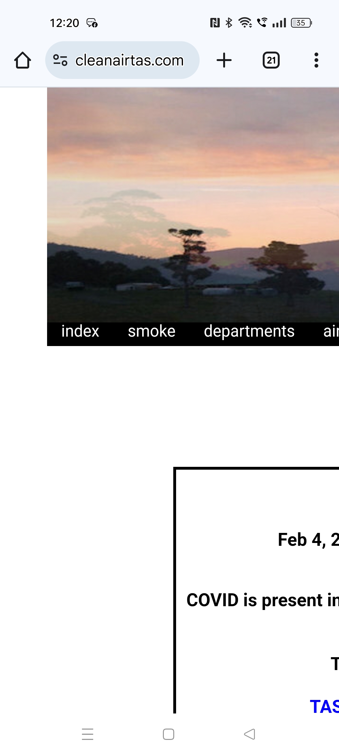
This is the site... https://cleanairtas.com/
Screen shot of how it appears on the phone:
https://cleanairtas.com/smoke/images/Sc ... 480b12.jpg
Thank you.
Screen shot of how it appears on the phone:
https://cleanairtas.com/smoke/images/Sc ... 480b12.jpg
Thank you.
-
AliGW

-

- Posts: 286
- Joined: Thu Dec 19, 2024 3:41 pm
Re: No luck with responsive web on mobile phone
I don't think that's a responsive site. It looks like you've built it with absolute sizes and positions, as you might have done in the past if you were ever a WebPlus user.
You'll need to provide a demo site (there's information under the Forum Rules link up top in the pink section about how to do that).
Here's the FAQ: viewtopic.php?f=10&t=82134
You'll need to provide a demo site (there's information under the Forum Rules link up top in the pink section about how to do that).
Here's the FAQ: viewtopic.php?f=10&t=82134
Ali
Retired, but still loving to learn & very busy.
https://alisongwright.me.uk
Novice with WWB, but was an avid user of Serif WebPlus before.
Fairly expert at Microsoft Excel (but not VBA).
Retired, but still loving to learn & very busy.
https://alisongwright.me.uk
Novice with WWB, but was an avid user of Serif WebPlus before.
Fairly expert at Microsoft Excel (but not VBA).
-
crispy68

-

- Posts: 3162
- Joined: Thu Oct 23, 2014 12:43 am
- Location: Acworth, GA
- Contact:
Re: No luck with responsive web on mobile phone
You say that you added two breakpoints but did you resize each object in the breakpoints? There is absolutely no change in size of the objects as the screen is decreased which means every object is the same width as in the default view.
As AliGW stated, you are using absolute positioned objects so you cant just add breakpoints and stop there. You will need to resize each object to fit within the breakpoint width so it looks correct when the breakpoint is reached.
However, before I would go thru this effort to fix this, I would have you switch over and use layout grids for your layout as your layout now is very simple. It's quicker and will yield better results for mobile.
-
BaconFries

-
- Posts: 6258
- Joined: Thu Aug 16, 2007 7:32 pm
Re: No luck with responsive web on mobile phone
Looking at the url and it source it shows that you have indeed added two breakpoints. This doesn't mean that the software will automatically make it responsive for you, you yourself are still required to resize objects for those breakpoints. As suggested you should look at using the likes of Layout Grids for your layout. I recommend you read through the following tutorials to understand how to use.
Responsive Web Design FAQ
Layout Grid FAQ
Advanced Layout Grid Features
An introduction to the Layout Grid - Part 1
An introduction to the Layout Grid - Part 2
How to create Responsive Text?
Responsive Web Design FAQ
Layout Grid FAQ
Advanced Layout Grid Features
An introduction to the Layout Grid - Part 1
An introduction to the Layout Grid - Part 2
How to create Responsive Text?
-
Mal
-
- Posts: 19
- Joined: Sat Nov 05, 2022 3:19 am
Re: No luck with responsive web on mobile phone
Thank you.
I started this web back in about 2010, forget now which early version it was but have always only ever used this program.
I do it voluntary and now at my age to start afresh is not easy, especially if i have to relearn and redo the whole site.
Web designers around here have never heard of WWB and look at me funny.
The content is there, rather than me just dump it, how much is it of a job for someone like you people who knows what they are doing to resurrect this WWB project?
-
wwonderfull
-
- Posts: 1646
- Joined: Fri Aug 21, 2020 8:27 am
- Contact:
Re: No luck with responsive web on mobile phone
It is funny how they have never made professional looking sites or have been using jpg brochures as websites all their life and never found wwb. And if they talk about WordPress then tell them 'hold my plugins'.Web designers around here have never heard of WWB and look at me funny.
The content is there, rather than me just dump it, how much is it of a job for someone like you people who knows what they are doing to resurrect this WWB project?
How much as a job as you mentioned for professionals here on our forum.. I would say there is a section where you can pay to hire people to do this work as time has it's value. If they want they can help you out on this. You can contact anyone you like from there from their proposal.
viewforum.php?f=126
-
BaconFries
-
- Posts: 6258
- Joined: Thu Aug 16, 2007 7:32 pm
Re: No luck with responsive web on mobile phone
Then possibly WWB6/7..I started this web back in about 2010, forget now which early version it was but have always only ever used this
If so then you may not want to be hiring someone to rebuild if you do it voluntaryI do it voluntary and now at my age to start afresh is not easy
Although it is all there I counted 30 pages with many having lost of textual content with lots of links to pdfs and external sites so time consuming to say the least to fix.The content is there, rather than me just dump it, how much is it of a job for someone like you people who knows what they are doing to resurrect this WWB project?
As suggested you can post at the following asking what is could possibly cost and take it from there.
Professionals for hire
-
Mal
-
- Posts: 19
- Joined: Sat Nov 05, 2022 3:19 am
Re: No luck with responsive web on mobile phone
Thank you for your replies...
I definately remember WWB6 and 7. Wasn't sure about WWB5.
Yes I would be prepared to pay to save it, depends though of course. Time costs, I woud never expect not to pay.
I would go through it all to verify links etc. before hiring someone.
That scarred me off. I was hoping to stick with WWB.
Thanks so much for your responses.
I definately remember WWB6 and 7. Wasn't sure about WWB5.
Yes I would be prepared to pay to save it, depends though of course. Time costs, I woud never expect not to pay.
I would go through it all to verify links etc. before hiring someone.
This is interesting because someone once said they would convert it to Wordpress.And if they talk about WordPress then tell them 'hold my plugins'.
That scarred me off. I was hoping to stick with WWB.
Thanks so much for your responses.
-
bkjohns
-
- Posts: 308
- Joined: Wed Nov 14, 2018 5:54 pm
Re: No luck with responsive web on mobile phone
Don't give up on yourself or WWB as a responsive web design tool. It really seems daunting at first but a quick look at existing sites/templates available will give you a heads up on what is going on in the background. Just drop a layout grid onto the workspace in a recent version of WWB (get the trial for free), add a text box with a couple of paragraphs of filler text, drag the text box into the layout grid and then preview it. Resize the browser to see what happens. When you see it really responsive and not that hard to do you will realize it is worth the learning curve to go deeper into what can be done. Tutorials available on the WWB site, the Help files in the program and this forum are great helps when you need it. It really is worth it.
-
BaconFries
-
- Posts: 6258
- Joined: Thu Aug 16, 2007 7:32 pm
Re: No luck with responsive web on mobile phone
There is also some video tutorials available the following although using older versions they describe how to use layout grids and are still valid and a good starting point for you.
Crispy68 (Forum Member)
Part 1
https://youtu.be/5FwsPWInF-k?feature=shared
Part 2
https://youtu.be/PQ-Kyfr1ZXs?feature=shared
Dapson Ishmael (Forum Member)
Part 1
https://youtu.be/U-D8vXH1SJg?feature=shared
Part 2
https://youtu.be/_JKabhIT_yg?feature=shared
Greg Hughes
Part 1
https://youtu.be/_VncgH_cPVM?feature=shared
Part 2
https://youtu.be/8X-C_vgPwaw?feature=shared
See also all the links I referenced. Good Luck.
-
Lasa
-

- Posts: 549
- Joined: Sat Oct 06, 2018 3:08 pm
Re: No luck with responsive web on mobile phone
To get a feel for it ...
simply add a layoutgrid to a blank page, set the width of the layoutgrid to 1000 and remove the left panel, and set remaining panel to center.
Go to your website page and copy a good chunk of text (no pictures)
and then add a text box underneath the layoutgrid. (outside layoutgrid)
Paste the copied text into the text box.
now grab the left top of the text box and drag it into the layoutgrid above it.
Now you have a responsive beginning.
add another layoutgrid to the page again set the width to 1000 and remove the left panel, and set remaining panel to center.
it will go under the first one.
add a picture box under the second layoutgrid. Find the image you want to add on your pc.
Then drag the picture from the top left corner into the new layergrid.
That's the basic premise of building the site.
Over simplistic but the rest is fine tuning.
Lasa
-
Mal
-
- Posts: 19
- Joined: Sat Nov 05, 2022 3:19 am
Re: No luck with responsive web on mobile phone
I appreciate your offers to help me.Don't give up on yourself or WWB as a responsive web design tool.
Thank you so much for the effort you have put in..
My problem is I am dealing with what is going on here (the reason for the web content) and I do not have the time or energy to be learning a new way to build a site.
I will see if I can get someone to build maybe just my first page which I can edit, so it is out there . If not, I will take it down and put the time into dealing with things another way ie Facebook, letters, or in person as i am doing now).
Thanks again.
-
onlye
-
- Posts: 511
- Joined: Sun Jun 17, 2018 12:36 am
- Location: Gluckstadt, MS USA
- Contact:

Re: No luck with responsive web on mobile phone
I'd be willing to create one page of the site using layout grid. You can see what you think. drop me an email to bubba@onlye.org
onlye
Gluckstadt, MS USA
Gluckstadt, MS USA
-
BaconFries
-
- Posts: 6258
- Joined: Thu Aug 16, 2007 7:32 pm
Re: No luck with responsive web on mobile phone
Here is a "Demo" of a template that may suit your needs the 1st is the download 2nd the Demo.Note credits go to Pablo for the template.
Styles
Demo:
https://www.wysiwygwebbuilder.com/suppo ... neric.html
Styles
Demo:
https://www.wysiwygwebbuilder.com/suppo ... neric.html