Page 1 of 1
How to do this with layout
Posted: Fri Jun 26, 2020 3:16 am
by wrsalasr
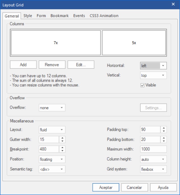
Hi, I am using layout with two columms to place an image and a text with responsive designs, it look ok in my PC and Laptop, this is how my layout is configured:

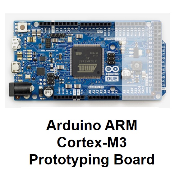
but in my movil is shown like this:

I need it to be seen like this:

someone can tell me how can I do this?
Re: How to do this with layout
Posted: Fri Jun 26, 2020 3:59 am
by lac8383
Try changing the break point to something larger than the default of 480 (e.g. 600, 768) so it breaks earlier. Also, click on the column 5x, select edit and add some padding to the top and bottom on the column 5x, say 40 for both.
When resizing the browser down during a preview, the text dropped under the picture in my testing. Hopefully, that appears to be the same on a mobile device.
Re: How to do this with layout
Posted: Fri Jun 26, 2020 5:37 am
by Pablo
Based on your screenshot it looks like the image has a fixed size
To make it flexible set 'full width' to true.
Re: How to do this with layout
Posted: Fri Jun 26, 2020 3:56 pm
by wrsalasr
Hi lac8383, you were right, problem solved, thanks
